| Boing Boing ( @ 2013-03-29 06:32:00 |
|
|
|
|
|
|
|
|
|
|
|
|
|
|
It’s rare that any of us gets to start at the top: Brandon Crawford’s first hit for the San Francisco Giants was a grand slam, Tatum O’Neal’s first movie, Paper Moon, netted her an Oscar for best supporting actress at the tender age of 10. It happens, but not that often.
Rarer still are those who start on top and stay there (for the record, I have great hopes for Crawford). But a charmed life on the high plateau describes the career of Bill Gold, who designed a couple of thousand movie posters for Warner Bros. over the course of 70 years. Now 92 and retired for most of the 21st century except when it came to creating posters for Clint Eastwood films, Gold began his encampment at Warners with a movie that’s synonymous with the word “classic.”
“Casablanca was the first thing I worked on,” Gold says when I spoke with him over the phone recently. “Yankee Doodle Dandy followed right after that. They were almost simultaneous.”
Not bad, to be 21 and have a film starring Humphrey Bogart and another starring James Cagney drop into your lap. But that sort of thing would happen a lot to Gold. Which is not to say that everything he touched turned instantly to his namesake metal. Like the rest of us, he had to work at it.
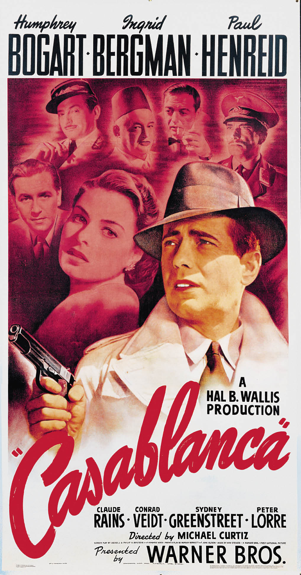
“We had finished the poster,” he recalls of the first iteration of Casablanca, which featured a full-color bust of Bogart in the foreground, wearing his trademark fedora and overcoat, with Ingrid Bergman, Paul Henreid and the rest of the cast rendered in a smoky pink behind him. “Warner Bros. looked at it for a while, and after few days they said, ‘Is there anything we can do to make this more exciting? More dramatic? It just kind of sits there.’ And I said, ‘Well, maybe. Let me take it back to the office.’ I brought it back the next day; I had put a gun in his hand.”
Gold had left the gun out, he says, because Bogart didn’t use a gun in the movie, “until the end,” he reminds me, “in the airport scene when he shoots the Nazi. I didn’t want to reveal that, or the relationship between the two stars. I didn’t want people to know there was a secret love affair until they came to see the film.” In the years that followed, Gold would put a lot of guns in the hands of a lot of leading men, especially Clint Eastwood, for whom he designed some 40 posters.
Drafted in 1942, Gold spent part of World War II in the Air Force Photography Unit before returning to Warners in 1946, pretty much picking up where he left off. By 1948, he was the art director of the studio’s in-house advertising department, and during the 1950s, he created posters for a string of who’s-who of directors, from Alfred Hitchcock (Strangers on a Train, Dial M For Murder, The Wrong Man) and Elia Kazan ( A Streetcar Named Desire, Baby Doll, East of Eden) to George Stevens (Giant) and John Ford (Mister Roberts). Some of these posters were traditionally Hollywood in their style, such as the cheery, red-white-and-blue composition for Mister Roberts, while others, such as his poster for The Prince and the Showgirl starring Marilyn Monroe and Laurence Olivier, exude Mid-century Modern cool.

After Warners pulled the plug on its in-house ad unit in 1959, Gold started his own shop, with Warners as a major client. Unlike contemporaries such as Saul Bass (“We worked together in the early ’60s, I don’t remember what year it was.”), who was known for his distinctive, graphic approach, Gold was something of a chameleon, pushing his posters into realms that had more to do with the nature of the film than his personal aesthetic. Thus, Splendor in the Grass, starring Natalie Wood and Warren Beatty, used typography and photography, respectively, to tell and sensationalize the film’s lurid story, while Gold’s decision to hire illustrator Bob Peak to create the central image for My Fair Lady perfectly suited the romantic sentimentality of that George Cukor chestnut, which was the second of six films Gold worked on that won the Academy Award for best picture.
Gold most famous collaboration with Peak came in 1967 for the musical Camelot. While Peak is often credited as the poster’s designer, it was Gold who decided Peak was the right artist to execute the narrative collage the cinematic spectacle demanded. It was also Gold who directed Peak to take his inspiration from Gustav Klimt’s “The Kiss,” which resulted in the illustration’s metallic hues, as well as the secondary image of Guinevere with her head bent back in the arms of Lancelot.
An even more fruitful partnership began in 1971. “The head of advertising at Warner Bros. came to me and said, ‘You know, Clint Eastwood is looking for somebody to do the campaign on Dirty Harry. I’d like to bring your work to his attention. The producer, Don Siegel, is going to be there. You’ll get to meet them.’ Well, I didn’t get to meet Clint that time, but they took the campaign we did for Dirty Harry to Clint’s office, and Don Siegel was there. Now Siegel was famous for hating everything, but he looked at the campaign and said, ‘Don’t change a thing. I love it.’”
Apparently Gold had long since learned his lesson about leading men and guns. In fact, one poster for the campaign actually put Eastwood’s character, Harry Callahan, a bit to the side and behind his .44 Magnum. “Don was a very creative guy,” Gold says. “He knew what he was looking at, he knew where the possibilities were. After that, they wanted me on everything.”
As it turned out, the first-time’s-the-charm serendipity of Dirty Harry was a bit of a fluke. “In the case of Clint’s movies, he’s the trademark. But each time you do a campaign, it requires a different kind of idea. One of the reasons, I think, why Clint wanted me on every movie he did was that I always gave him alternatives, sometimes 20 or 30 of them. He totally enjoyed that.”

While the impact of the Dirty Harry poster was driven by its emphatic graphic design, as was Gold’s black-and-white composition for The Exorcist, other movie campaigns lent themselves to illustrations similar in approach, if not style, to those Bob Peak had created for My Fair Lady and Camelot. For these, Gold turned to another illustrator, Richard Amsel, who worked with Gold on posters for McCabe and Mrs. Miller, The Life and Times of Judge Roy Bean and The Sting, to name a few. Gold also worked with airbrush artist Philip Castle, who did the sinister illustration of the Malcolm McDowell character, Alex, on the poster for Stanley Kubrick’s A Clockwork Orange.
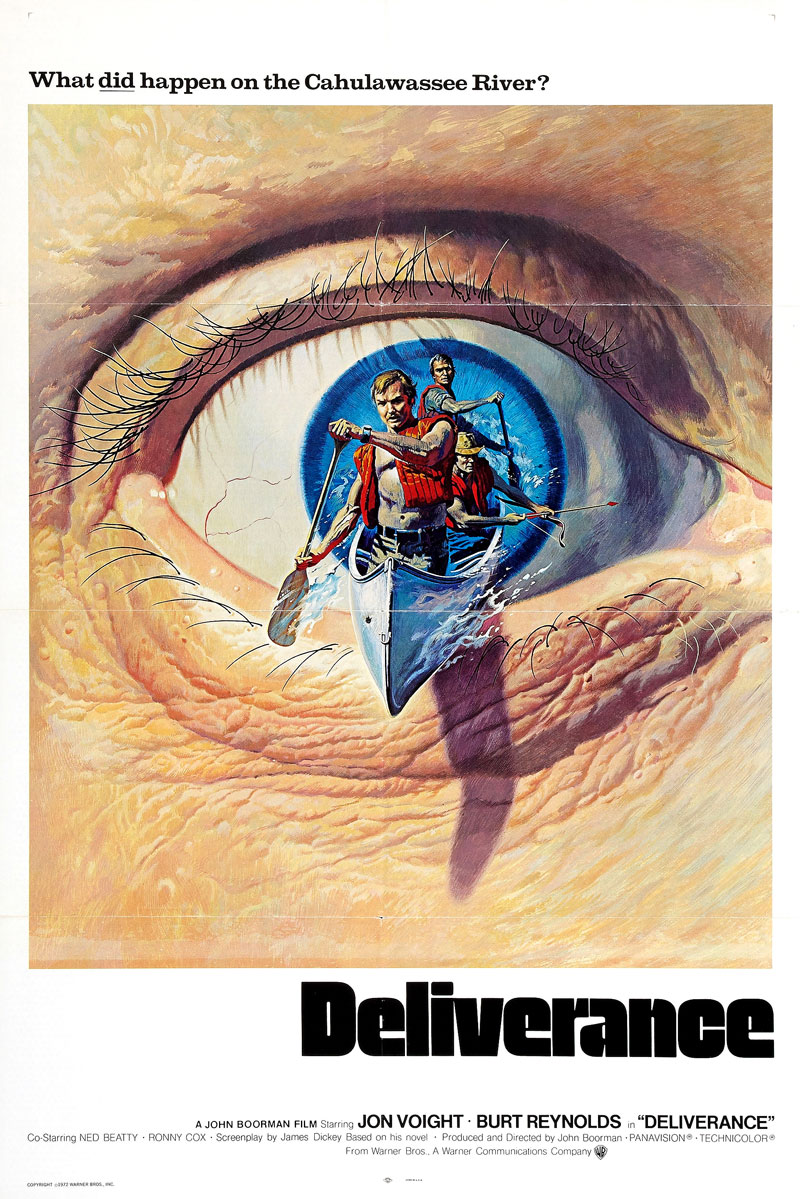
For any given movie campaign, numerous posters were produced. For the domestic release of Deliverance, Gold delivered an image of two arms rising out of the water, holding a shotgun aimed at three men in a canoe. The tagline on the poster read, “What didhappen on the Cahulawassee River?” It worked for U.S. audiences, but what about Europeans? For those potential viewers, Gold stuck with the tagline and the canoers, but had them emerging from a wide-open eyeball, giving the plot suggested by the tagline a sense of surrealism the American version lacked.
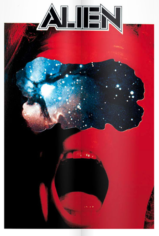
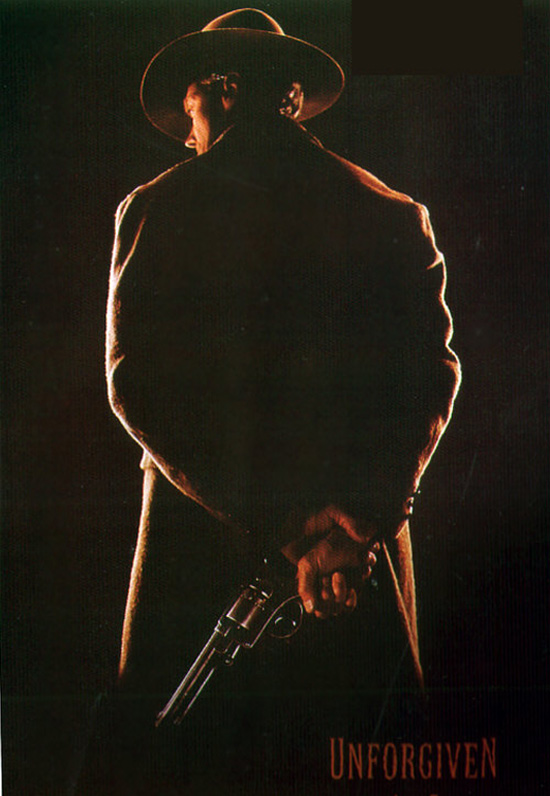
To hear Gold tell it, the rest of the century was an almost endless stream of tight deadlines, followed by the inevitable revisions, for films as diverse as Alien and Unforgiven. Little wonder that these days, the details have begun to blur. “They all blend into one montage in my mind,” he says now with a laugh, “one big, horrible montage.” Still, Gold knows he’s had it good, having the opportunity to form an enduring relationship with Eastwood, as well as the chance to meet true Hollywood royalty like Humphrey Bogart and Lauren Bacall.
“Sure, I met them both,” he remarks casually, adding that it wasn’t like they were best of friends, or anything. “I was just a poster guy,” he says. “They didn’t know how many posters I was going to do.”

Unused concept poster
For the last word about Bill Gold, check out Christopher Frayling’s 450-page Bill Gold: Posterworks (Amazon), which was published in 2010 by Reel Art Press as a limited edition of 1,500 copies, each weighing more than 16 pounds. On DVD, The Best of Warner Bros. 100 Film Collection, 2013, includes a poster featuring a collage of 100 of Bill Gold’s most iconic Warner Bros. posters. And on April 2, the studio’s latest DVD set, The Best of Warner Bros. 20 Film Collection: Romance, will be released. The collection includes only three pre-Bill Gold titles (Gone With the Wind is one of them), plus gems like Casablanca, Rebel Without a Cause and The Bodyguard.


