[Most Recent Entries] [Calendar View] [Friends View]
Tuesday, May 28th, 2013
| Time | Event |
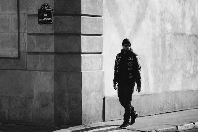
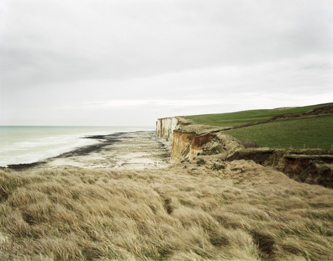
| 1:42p | Loneliness and feeling in photographs by Barbaros Cangürgel
Inspired by the theories of Jean Baudrillard, poetry, music and literature, the Turkish artist creates an atmosphere of feelings, loneliness and delicacy. MORE PHOTOS HERE |
| 1:52p | |
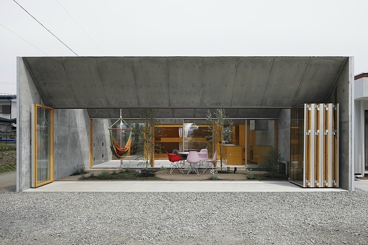
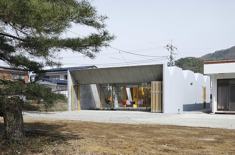
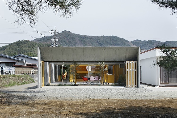
| 2:00p | Outside In by Takeshi Hosaka Architects Located in Yamanashi Prefecture, Japan, this minimalistic house extension was designed in 2011 by Takeshi Hosaka for a couple in their 30′s and their three daughters. |
| 2:00p | 21 Wedding Hairstyle Ideas
|
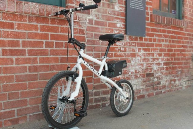
| 2:16p | LIFEbike: Electric Bicycle
Revelo LIFEbike brings a completely fresh approach to electric bicycle design, shaving weight and adding to the fun factor. |
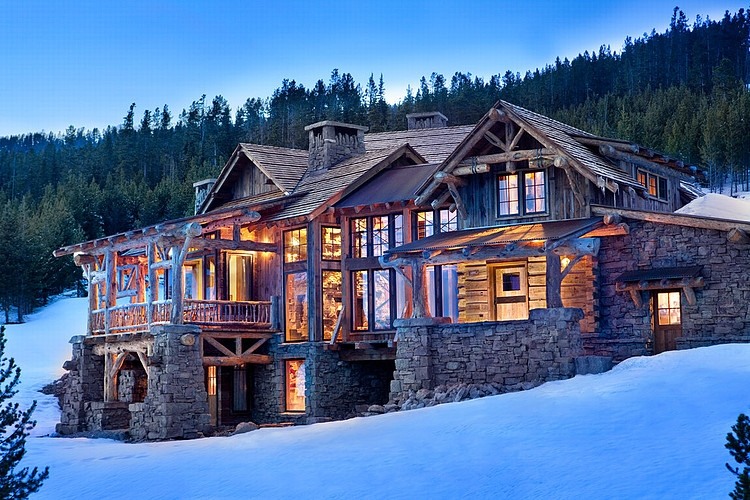
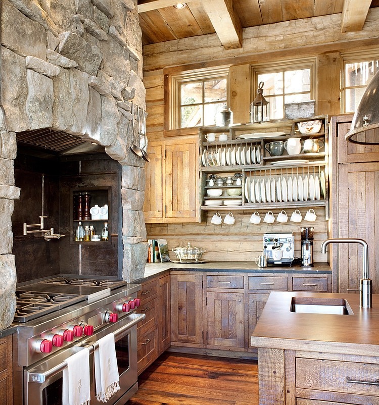
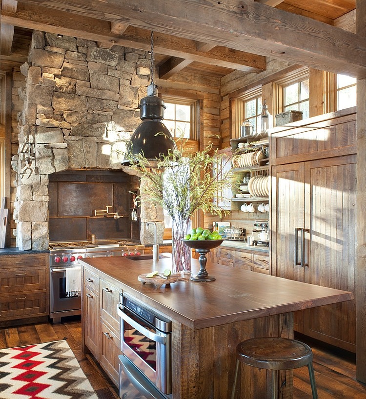
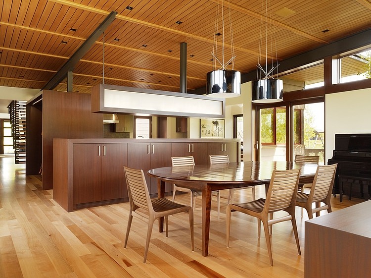
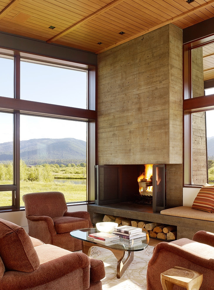
| 3:00p | High Times by Peace Design Luxuriuos rustic mountain residence designed by Peace Design and Highline Partners. |
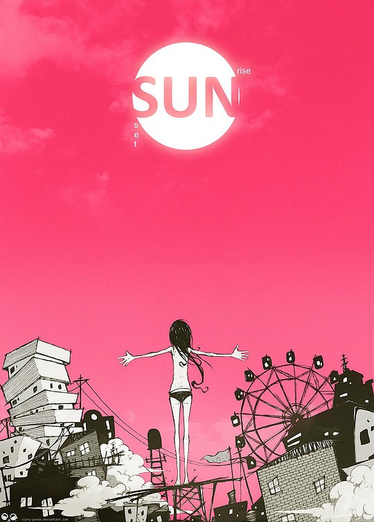
| 3:03p | Stunning Manga Illustrations by Scary-Panda Collection of stunning Manga inspired illustrations by Yogyakarta, Indonesia – based artist / illustrator Scary-Panda. We made sure to pick the very best artworks from this author’s portfolio … for more, follow the link at the very bottom. Enjoy! |
| 3:05p | Mobile Applications That Geeks Will Love Geeks take pride in mastering their crafts, showcasing their knowledge, and engaging themselves in the topics they love. Most app developers make accomplishing these tasks easier by creating geek-friendly applications, and by downloading these apps, they can easily engage in some of their favorite activities. Here are some of the geekiest apps that nerds from all over the world would surely love to have on their smartphones and tablets. |
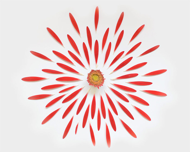
| 3:05p | Expressive Beauty: Exploded Flowers by Fong Qi Wei Fong Qi Wei is a thoughtful photographer from Singapore. Using photography as his medium, Fong strives to make images that will touch your feelings. His art seeks to get your attention and make you think about the message presented on a deeper level. His latest series called ‘Exploded Flowers’ captures the expressive glamor of singular blooms. The radial symmetry reminds us of the expressive beauty of flowers.
|
| 3:12p | BEST LIBRARIES AROUND THE WORLD (CONT) I really love to discover and visit new libraries everyday. With that in mind I have done hours of research trying to find the most interesting libraries in the world. As you can see this is the second ranking I have created (read the first one here). I have tried to balance these two lists between architecturally interesting libraries and libraries with interesting collections, but most of these libraries are actually fascinating in both aspects. I’d love to spend a day in any of these libraries, and I hope you’ll agree.
1.SENDAI MEDIATHEQUE, JAPAN 2-1, Kasuga-machi, Aoba-ku Toyo Ito, 2001
The Mediatheque is located on a tree-lined avenue in Sendai, its transparent facade allowing for the revelation of diverse activities that occur within the building. The interior of each level of the mediatheque is designed by a different designer. On the ground floor Kazuyo Sejima places the administrative offices behind a translucent screen. The second and third levels house the Shimin Library and include a browsing lounge with internet access with furniture designed by K.T Architecture.
The fourth and fifth levels contain gallery space; one level an exhibition space with moveable walls and the other an exhibition space with mainly fixed walls with rest area seating by Karim Rashid. The sixth level houses the multimedia library dedicated to audio-visual with green and white furniture designed by Ross Lovegrove and a 180 seat cinema.
Opening hours Mediatheque 9am -10pm (closed December 29 – January 3). Shimin Library 10am – 8pm (closed Mondays except holiday Mondays, days after national holidays, 4th Thursday every month and December 28 – January 4).
2.VENNESLA LIBRARY AND CULTURE HOUSE, NORWAY Helen & Hard, 2011
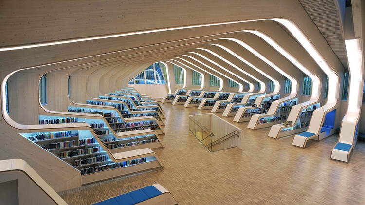
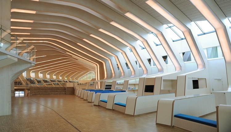
Wood in all its glory: 27 ribs made of prefabricated glue-laminated timber elements and CNC-cut plywood boards are the basic components of this library. The Gaudi-esque timber beams and columns gradually shift shape according to technical and programmatic demands achieving a strong spatial identity well deserved for the cultural centre.
The new library building completed in 2011 has won several architecture prizes and has been praised both within Norway and abroad. Enjoy reading here…
|
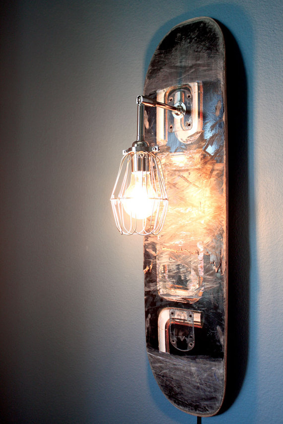
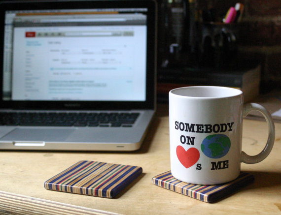
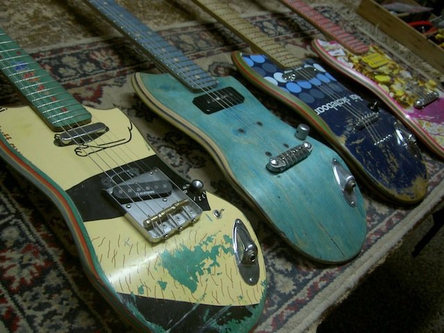
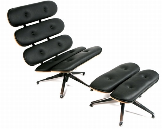
| 3:20p | 25 Useful Products Made From Repurposed Skateboards When a skateboard breaks, throwing it in the trash is the wrong thing to do. Getting creative and turning trash into treasure should be your top priority. Since skateboard decks are very well manufactured, they’re able to withstand high stress and impact. Using them as building blocks for something crafty is a wise decision. Plus, there is no better feeling than enjoying the fruits of your labor. Today we collected twenty-five examples of repurposed skateboards. These awesome outcomes should get those creativity juices flowing inside your head. You can even start selling your unique hand crafted products on Etsy like Dave DeWitt. He sells sunglasses made from recycled skateboard decks. How awesome is that?
|
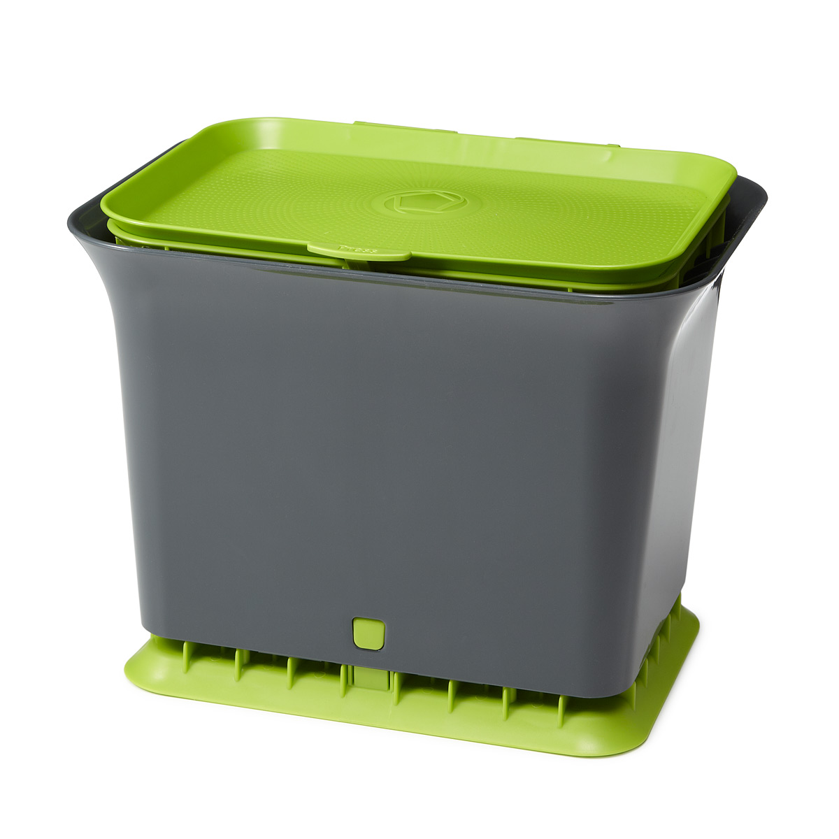
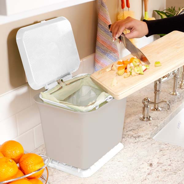
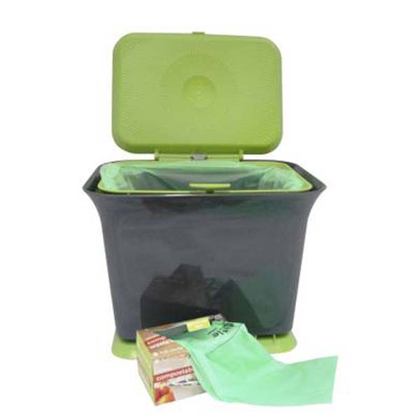
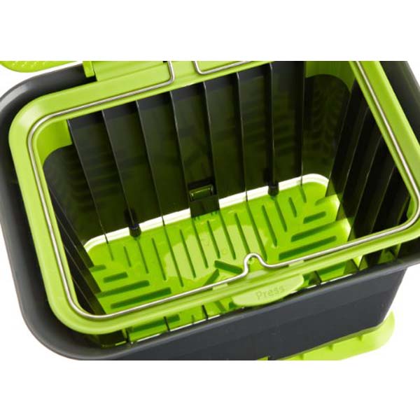
| 3:23p | Odor-free Kitchen Composter Unlike traditional sealed composting containers, this composter allows air to flow through your organic waste, allowing for aerobic breakdown. Waste decomposes more slowly and stays drier as a result. This means less mess, less odor and no flies. Source: IPPINKA |
| 3:24p | |
| 3:27p | 5 Steps To a Less Expensive, More Effective Website Let me be frank: your website is bleeding money. There might be an exception here and there, but the great majority of websites spend far, far too much money in their quest for solvency. Some of these expenses seem necessary, the only means to a certain end. Other expenses fly under the radar. The website owner either doesn’t know of any alternatives, or doesn’t know how to even address the problem. Most websites qualify as small businesses, and few if any small businesses can survive while wasting money. Website owners seeking ways to reduce cost and run a tighter ship can follow these five steps to run a less expensive, more effective website. The bonus in all this: you’ll be a smarter, savvier website owner as you work through the steps. 1. Examine hosting options
If you perform enough research on web hosts, you’ll find that there are almost too many options. Dozens, maybe even hundreds, of companies offer hosting of all types, leaving website owners mired in the paradox of choice. How can we be sure we’re making the right decision when so many present themselves? Chances are we won’t make the right decision. In web hosting, the wrong decision can prove quite costly. The only solution is to conduct thorough research not only of the hosting companies themselves, but of website hosting itself. You might find your eyes glazing over at first as you encounter unfamiliar jargon and acronyms, but those terms will become clear in time. The benefit to you is a clearer understanding of exactly what you need, and the most efficient path to obtaining proper hosting. You might not be qualified for a system administrator position, but you’ll be able to make the correct decisions about hosting your website — and not fall victim to web host salesmen who prey on ignorant prospects. 2. Rethink customer acquisition Different types of websites will require different methods of customer acquisition, but the need for, and cost of, customer acquisition is present for any website. Yet so many websites waste their money trying the new-new thing, the method that all the internet marketers are hyping. Perhaps you’re even paying an individual or an agency to handle your customer acquisition needs. Chances are, then, that you’re spending too much money to acquire each customer. For e-commerce and other businesses that actively sell products and services, SEO and PPC rank among the most effective methods of customer acquisition. They’re both search-based, and when people search they reveal intent. Search marketers can leverage this intent into conversions. The truth is, so can you. It will cost you a few hundred dollars in the form of a subscription to a site such as SEO Book, but that’s money you’re spending on learning rather than paying an agency to do your dirty work for you. In the process you’ll learn more about your customers, too — things that previously only your SEO agency knew. Digital publishers, on the other hand, waste their time with PPC and SEO. Since their sites are not directly commercial in nature, PPC is a waste of money. Publishers will almost always pay more for a click than they will gain from ad impressions from that visit. In terms of SEO, publishers need only the basics for on-site optimization. The other SEO factors, such as link building, come naturally when promoting content. A heavy social media presence, where publishers can connect directly with readers, serves as a much more efficient customer acquisition method. |
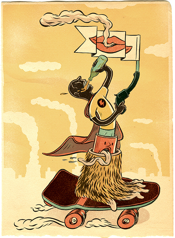
| 3:27p | Fireball tim’s Wacky Rides Monday EP 2… The ALASKAN ROCKET MOOSE!
SHARE this week’s episode with anyone with kids out there because EVERY kid wants to see how the mighty Moose of Alaska get around up in the snowy state… and keep the streets clean. It’s powerful. It’s comfortable. It’s THE ALASKAN ROCKET MOOSE! Plus, a wee bit of Bug & Sammy’s Surfboard… now in color. WATCH!! |
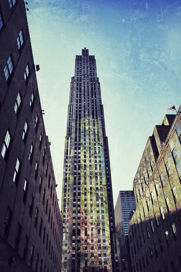
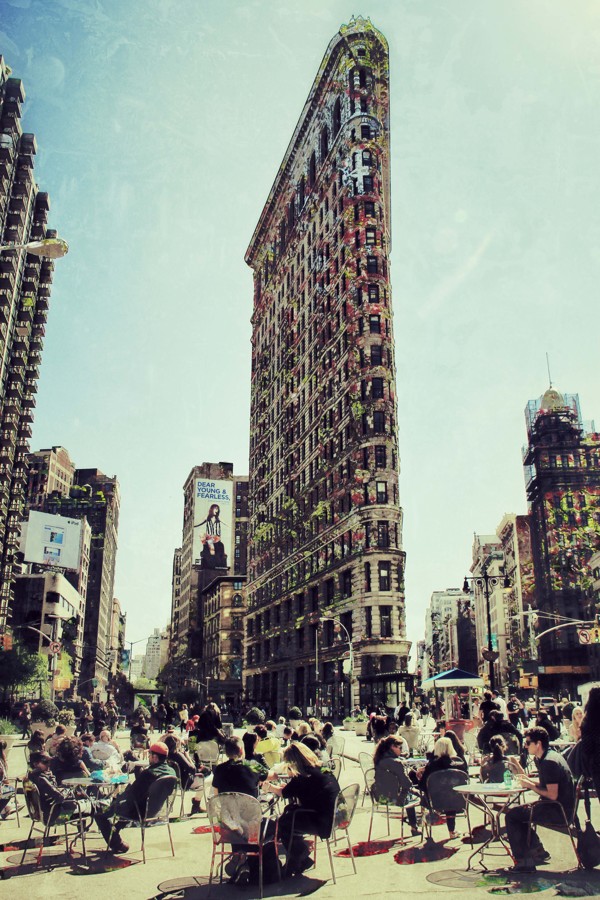
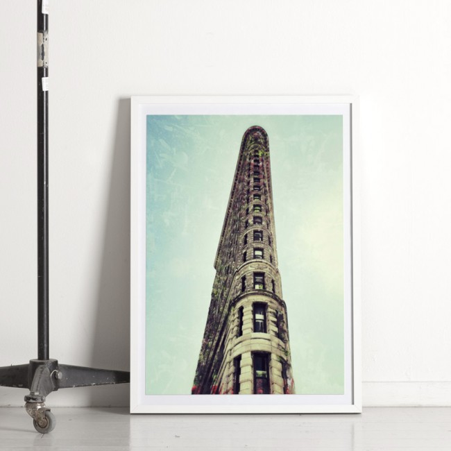
| 3:30p | “Architextures” by @Vlopz “Architextures” is the Travel + double exposure exploration of New York architecture + Central Park by vlopz |
| 3:32p | The Next Generation Startups Starting a new business is far from easy. It takes time, dedicated staff, and a lot of financial assistance. The past involved so much failure by not planning. Many would empty their savings accounts and take out loans against their mortgage. This caused many people to not only lose their business if they could not keep afloat but also their homes. The Next Generation of Startups is looking towards smarter financing methods. Here are 5 ways they are financing their new business startups.
Eliminate the Paycheck A startup has to make many sacrifices. The first method of getting enough finances is to plan to spend less. This is hard to do but not impossible. The founders of a startup should not expect to give themselves a paycheck. This is why many startups founders plan for a few years to save their money up to work on this opportunity full time. By saving up the money themselves in savings accounts, CD’s and IRA’s they can save loads of interest rates from loans. Seek Investments from Family and Friends The Next Generation of startups has many young entrepreneurs. The world is seeing the advantages and usefulness of startups. The Next Generation should invest time in propositioning to their family and friends about their dream. They need to do more than just explain or paint a bland picture in their minds. They should give the same respectful presentation tailored to the audience of whomever they are presenting their startup dream to. They should paint the picture of how beneficial it is to their audience. |
| 3:49p | Sources of Inspiration for a Web Designer. How to Cope with a Routine Part of Work? Most jobs get monotonous at a certain point, and web design isn’t any exception. Is there a way to avoid the boredom? How do you get inspired and where do you find the source of inspiration for a simple web design? There are a whole lot of places to look, and many techniques to implement. All you need is imagination and an open mind for new, interesting, and unusual ideas. |
| 3:55p | Best Design Restaurants in Paris Paris is one of the top gastronomical cities in the world, it is also one of the most expensive. This food-centered city doesn’t have a single “best” or “hottest” restaurant. What Paris does have is a lot of exceptionally good restaurants to match whatever neighborhood, day of the week, or price you’re looking for. Bellow there’s a list of the best design restaurants in the city of lights. From the most desirable districts of France capital here the restaurant guide of Paris, where design meets with modernity and fashion in every ways. |
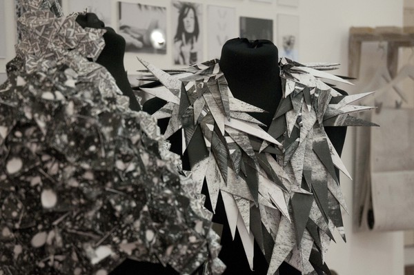
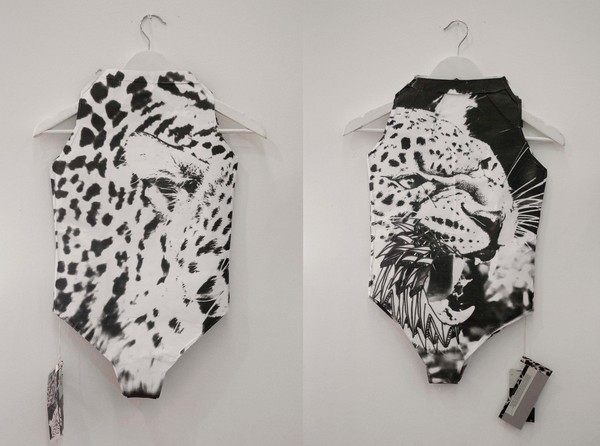
| 3:59p | Clothes and accessories made of paper by Alma Aloni
Project design by israeli artist Alma Aloni proposes clothes and accessories made of paper. MORE PICs HERE |
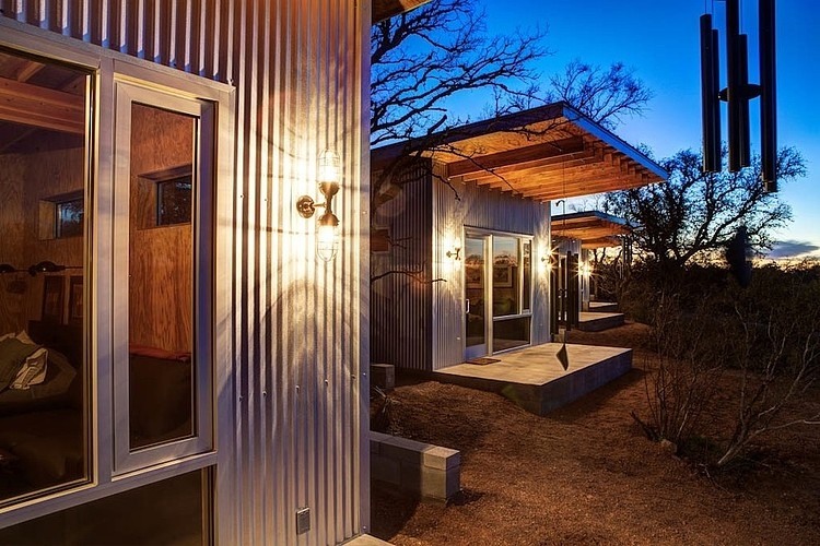
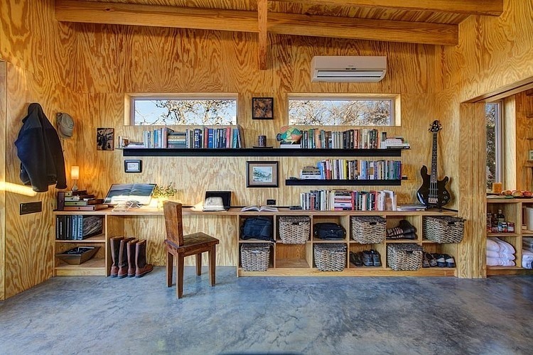
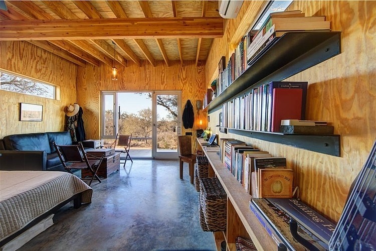
| 4:00p | Modern Retreat by Matt Garcia Design Beautiful modern retreat designed by Matt Garcia Design in 2012 situated in Llano, Texas. |
| 4:07p | Happy Memorial Day in a Summer Mood
Happy Memorial Day for everyone. Let memories become a hope for a better future.
|
| 4:08p | KNEWWD ISSUE THREE Part Three Ashley Genova KNEWWD ISSUE THREE Part Three Director: Jordan Beckham For more info contact @knewwd @jordanbeckham @mjwhalendesign |
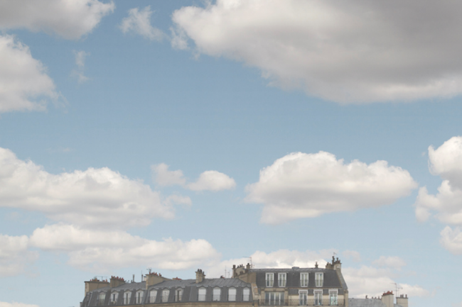
| 4:14p | Head in the Clouds by Kaitlin Rebesco Head in the Clouds is amazing fine art series by Kaitlin Rebesco, talented and professional American photographer currently based in New York. via Photography Blogs.
|
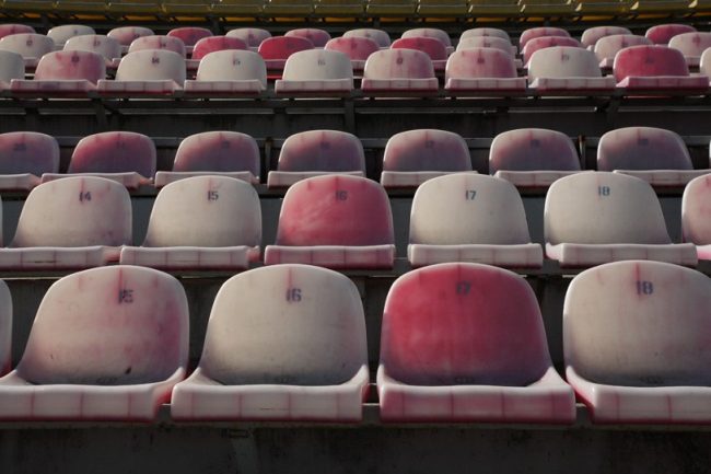
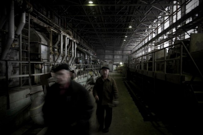
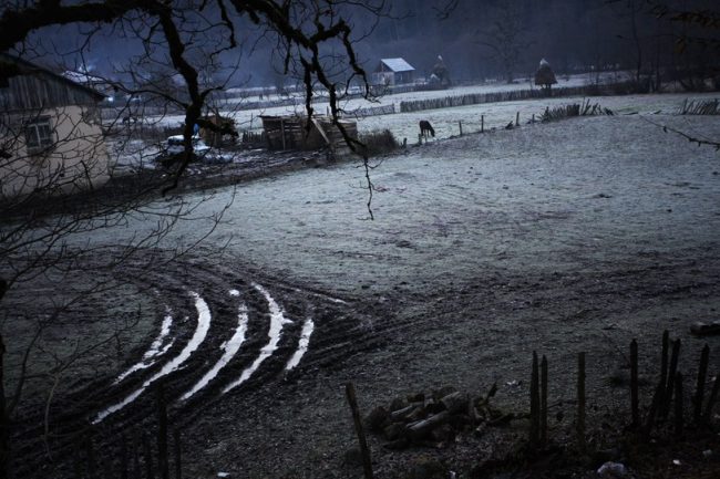
| 4:46p | Photography by Mikhail Galustov Mikhail Galustov is a freelance photographer and filmmaker. He studied international television journalism at the Moscow State University and worked as a staff photographer with the Russia’s largest daily newspaper, the Kommersant, in Moscow. via Photography Blogs.
|
| 5:01p | |
| 5:04p | Kentucky Monthly Cover The original work was drawn by Aaron Kizer with ink pens and watered down Valspar wall paint.
|
| 5:09p | Thomas Babeau for Black Rainbow x CHMPGN 2013
We already featured Thomas Babeau‘s work whether it’s his shoot with Alice David or a selection of woman fashion photoshoot. Today we’re featuring his latest work as a photographer for some men apparel brands.
|
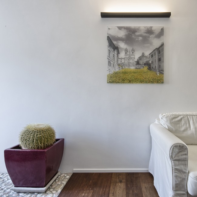
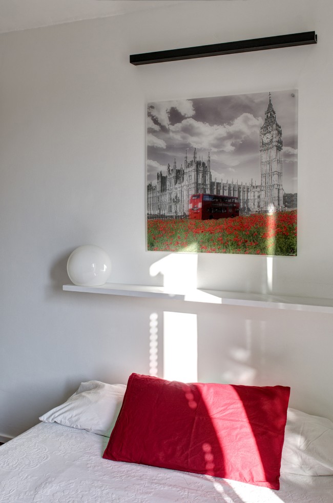
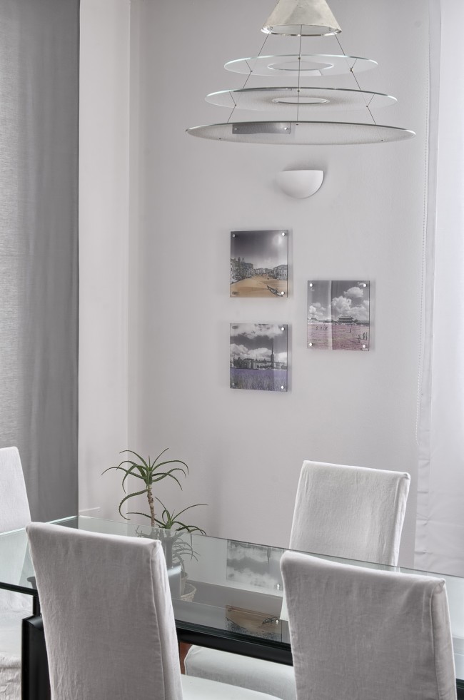
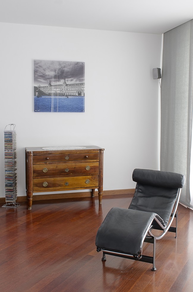
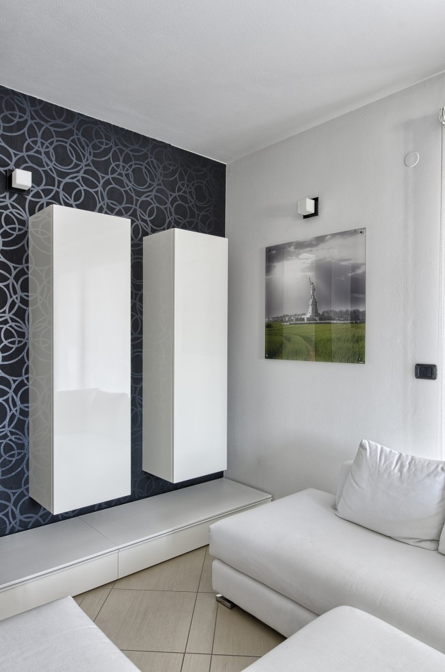
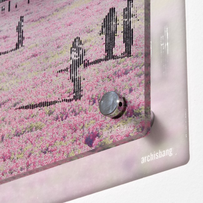
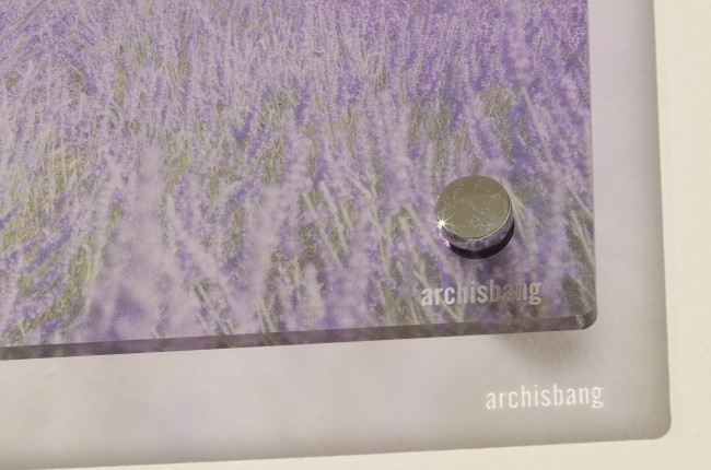
| 5:14p | City Visions Design VISIONS, decoration panelswww.cityvisionsdesign.comVisions is a unique range of digital art images printed on transparent plexiglass plates, a collection of 12 themes and 144 combinations, inspired by the most popular cities of the world and the beauty of nature. 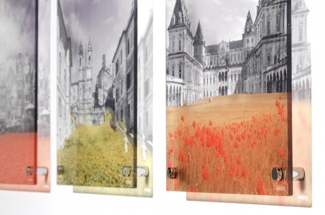 An original piece of furnishing, made up with an innovative mix of photography and digital print, which will give any room a unique
3D effects images giving the impression of optical illusions, games, patches of color: light, colour and transparency are the main features of Visions.
Specifications: digital print on transparent plexiglass plate, 5mm thick, available size 30x30cm or 80x80cm. Metal fasteners are included. |
| 5:22p | BMW Concept Ninety
|
| 5:33p | Digital Marketing Trio Of 2013 2013 will house some of the biggest growth spurts in digital marketing that we’ve ever seen. The number of social network users is growing astronomically. There are now over 1 billion smartphone users on the planet and 175,000 new blogs born everyday. It’s clear that social, content, and mobile / SMS marketing are a key trio marketers will be focused on in 2013. Here are some fresh statistics to wet your whistle…
|
| 5:37p | Win this Utrecht Painting Set
We have teamed up with art blog SOTR to host this fantastic give-away. One reader will win a Utrecht paint kit that includes a wooden case with leather handle, 12 acrylic paint tubes, four 300 Taklon brushes, aluminum brush trays, a canvas board, and more. |
| 5:44p | Graphic design, digital art, designer tees and designer ‘stuff’. Graphic design, digital art, designer tees and designer ‘stuff’ by |
| 5:57p | The Power Of SMS Marketing With the wide adoption of text messaging over the last decade, one newer marketing stream has completely exploded in popularity. SMS marketing has become the go-to marketing avenue for businesses and organizations who need to get their message out asap. This graphic, entitled “The Power Of SMS Marketing” highlights some really eye opening statistics surrounding this younger marketing stream and will help you to understand exactly why it’s so popular.
|
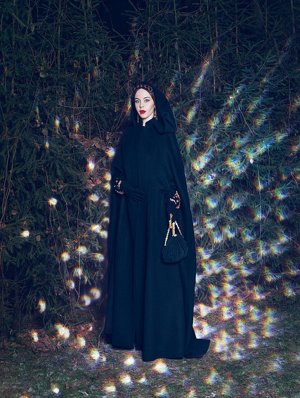
| 6:01p | Garage #2 by Nickolas Sushkevich Fashion portraits of Russian fashion designer and my muse, Ulyana Sergeenko. Printed in Second issue of Garage Magzine. |
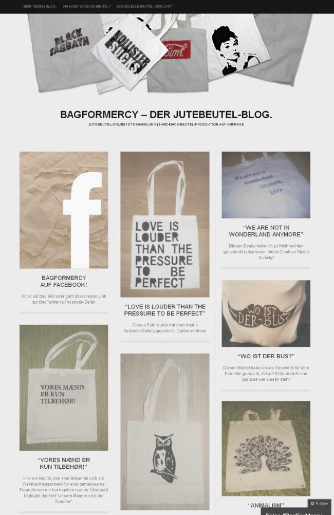
| 6:27p | Handmade Totebags. Visit BagForMercy to see the handmade and individual results! BagForMercy also functions as a showroom for inspiring pictures of totebags, which are sent by visitors or facbook-users. |
| 6:28p | |
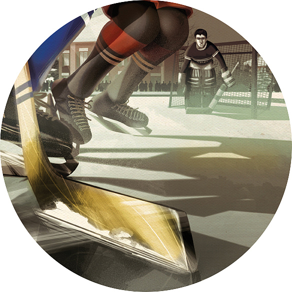
| 7:01p | Ambri’ Piotta HC Vintage Posters by Francesca D’Ottavi Series of vintage posters, made to celebrate the Ambrì Piotta Ice Hockey team. |
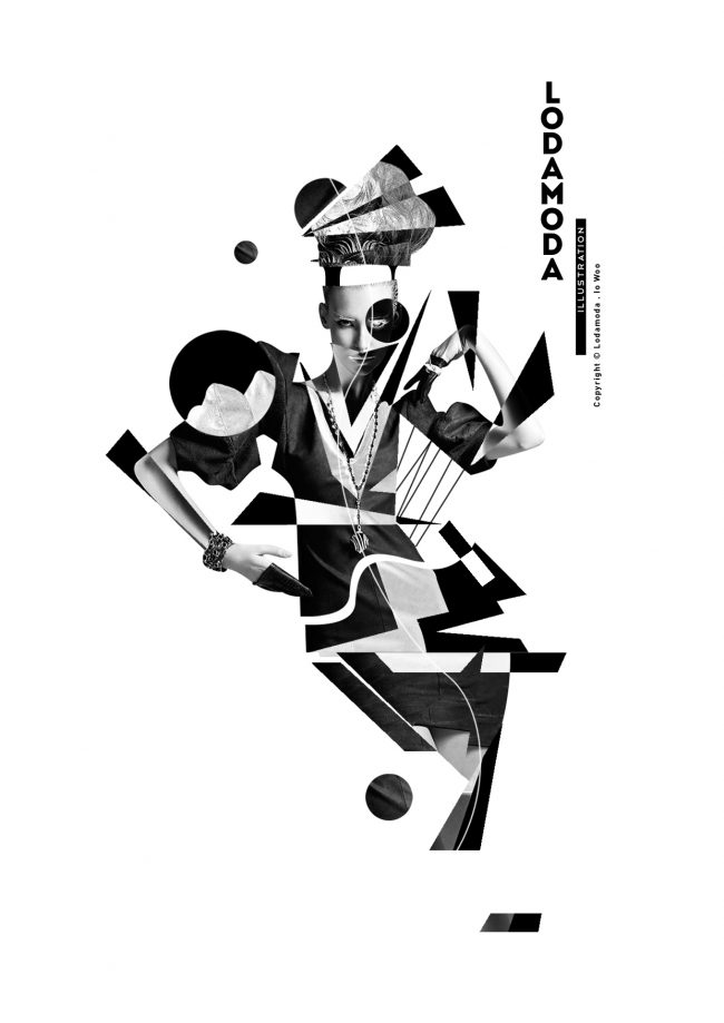
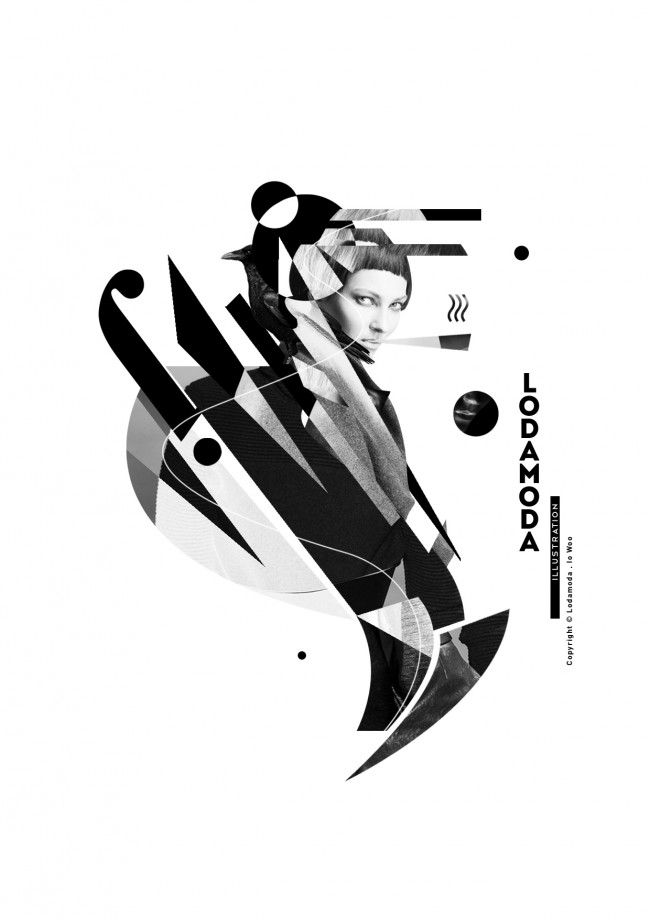
| 7:14p | Lodamoda – Io Woo Io Woo is a Graphic Design Student From Jakarta,Indonesia, Behind his Interest and Ambition of Fashion and Graphic Design, He say ” Lodamoda is derived from the Italian language , Loda or Lodare which means praise, and Moda which mean Fashion/Mode”. It’s Nice Freshly Digital Art which One set with black and white photos and typos mixing with the rendering unstructured dynamic rather very effective! more stuff here.
|
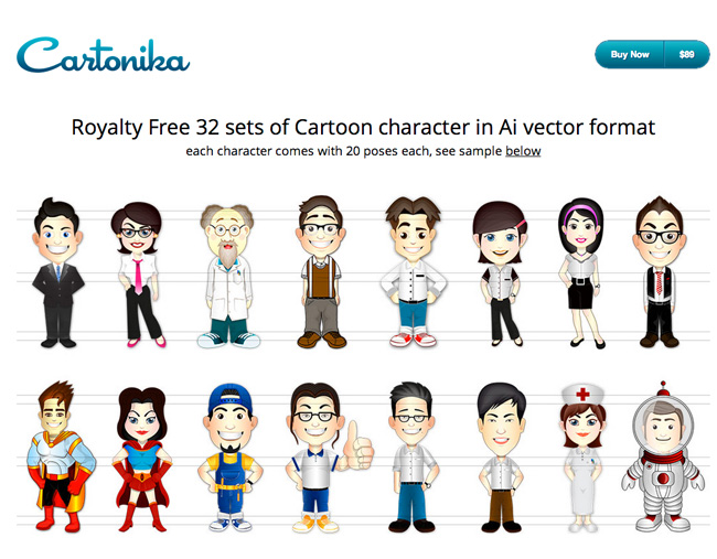
| 7:14p | Cartonika: Vector Cartoon Characters – only $37!
|
| 7:14p | Photography by August Huang Amazing photographs by August Huang, talented photographer based in Taoyuan, Taiwan. via Photography Blogs.
|
| 7:46p | Lodamoda – Io Woo
Io Woo-Jakarta,Indonesia. Behind his Interest and Ambition of Fashion and Graphic Design, He say ” Lodamoda is derived from the Italian language , Loda or Lodare which means praise, and Moda which mean Fashion/Mode”. It’s Nice Freshly Digital Art which One set with black and white photos and typos mixing with the rendering unstructured dynamic rather very effective ! more stuff here
|
| 7:50p | Photography by Trevor Ray Hart Trevor Ray Hart has built a distinctive photographic style that is much sought after internationally with both Commercial and Editorial clients. via Photography Blogs.
|
| 8:00p | Indian Springs Ranch Residence by Carney Logan Burke The Peaks View residence designed by Carney Logan Burke Architects is sited near Wilson, Wyoming, in a grassy meadow, adjacent to the Teton mountain range. |
| 8:32p | Landscape Photography by Pall Gudjonsson Amazing landscapes by Pall Gudjonsson, talented semi-professional photographer based in Kópavogur Iceland. via Photography Blogs.
|
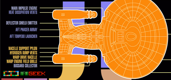
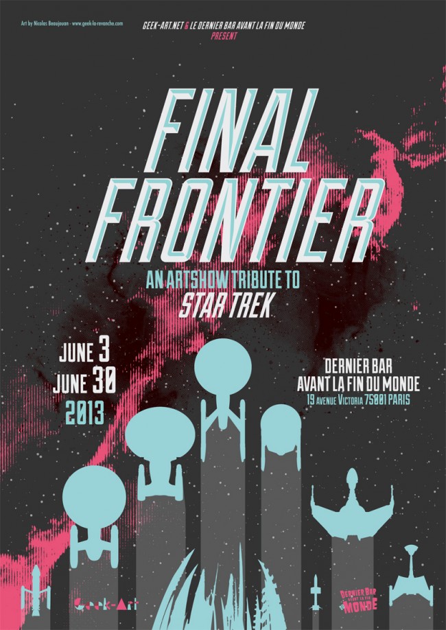
| 8:44p | Final Frontier Star Trek tribute by Geek-Art in Paris June 3, 2013 Geek-Art (Geek-Art.net) a leading purveyor of discovering emerging talent in illustration and design will be hosting a show called the Final Frontier a Star Trek tribute show. The show will open June 3 and showcase the work till the 30th at Dernier Bar Avant la Fin du Monde in Paris. The show features an international group of artists including Paul Shipper, Marie Bergeron, Matt Ferguson, Samuel Ho, Patrick Connan, Sublevel Studio, Nicolas Beaujouan. For more info visit www.geek-art.net
 Paul Shipper - Star Trek Origins 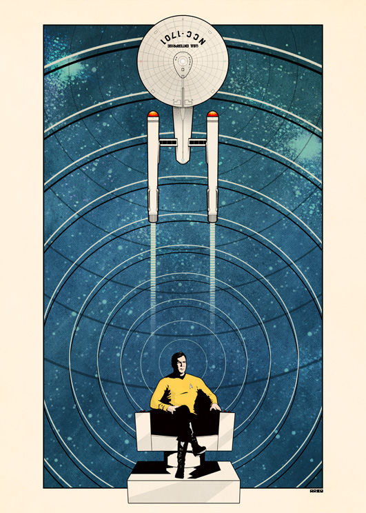 Matt Ferguson - The Captain 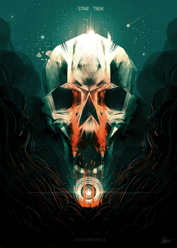 Marie Bergeron - Star Trek Into Darkness  Sam Ho - Borg Queen 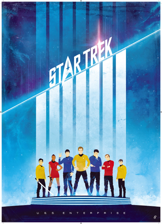 Patrick Connan - Star Trek 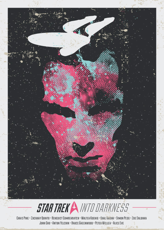 Nicolas Beaujouan - Into Darkness |
| 8:51p | Jessica Hart for Calzedonia swimwear The Australian model and former Sports Illustrated cover star has been unveiled as the new face of Calzedonia swimwear. |
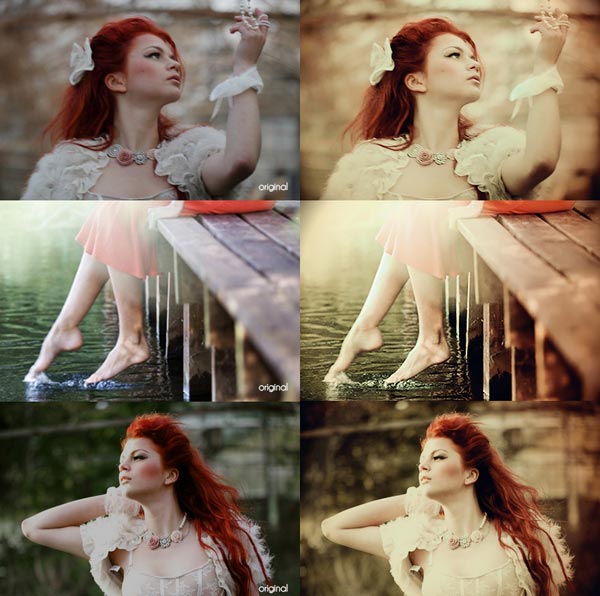
| 8:57p | Best Free Photoshop Actions For Wedding Photography
Today I am unfolding free best Photoshop Actions for vintage, retro & wedding photography effects. You can download them… |
| 9:01p | |
| 9:07p | Ultimate Tactical Crossbow for Zombie Apocalypse
|
| 9:07p | Beautiful BMW x Pininfarina Gran Lusso Coupe
|
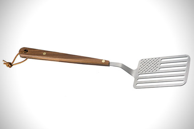
| 9:07p | Star Spangled BBQ Spatula
|
| 9:07p | Mind Blowing Abandoned Luxury Vehicles in Dubai
|
| 9:18p | Photography by Simon Flint Beautiful photographs by Simon Flint, talented semi-professional photographer based in New Ollerton, England. via Photography Blogs.
|
| 9:44p | Portrait Photography by Spencer Heyfron Born and raised in England, Spencer Heyfron relocated to New York City to pursue a career in photography ten years ago. via PhotoHab.
|
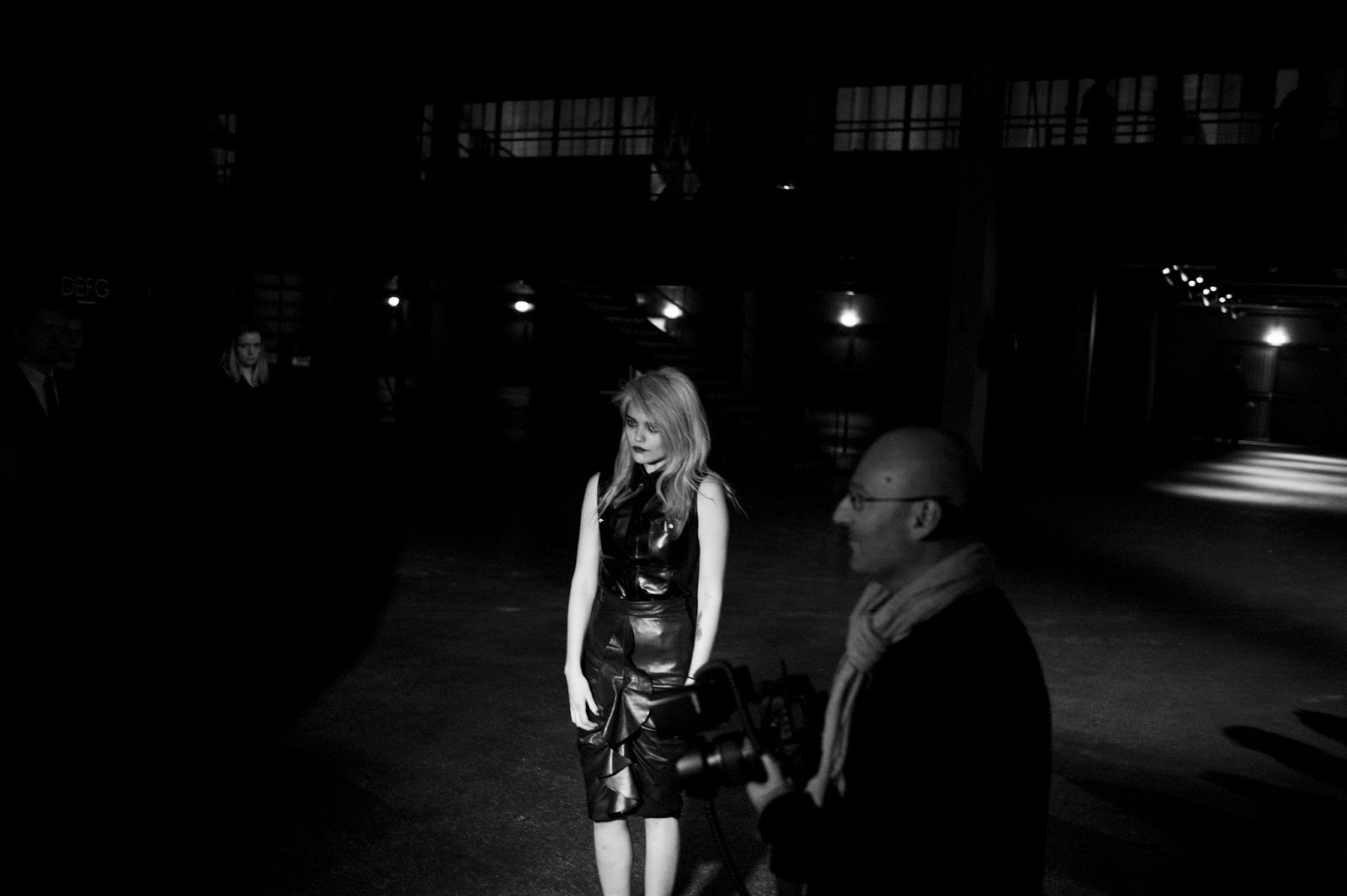
| 9:50p | Relive PFW A/W 2013 with Skylar Williams – Day 5: Celine, Givenchy, KENZO
Relive Paris Fashion Week AW 2013 through the lense of Las Vegas based photographer Skylar Williams. Every day for one week we are presenting you his coverage of one day of PFW. The fifth day features the shows of Celine, Givenchy, KENZO, Barbara Casasola, Costume Nationale and Maxime Simoens . Look out for a new spread featuring Paco Rabanne, Stella McCartney and many more tomorrow. See all the pictures (50+) on WhiteLies Magazine (whiteliesmag.com)
|
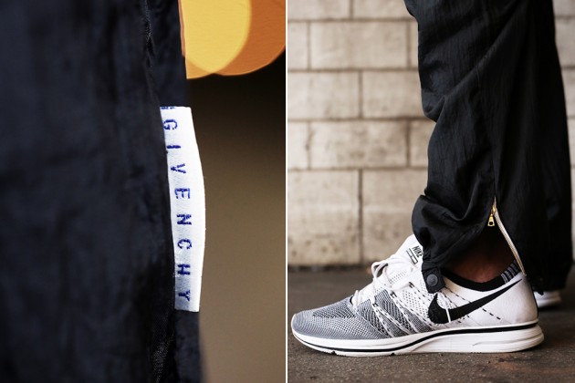
| 9:51p | Fruition Las Vegas x Dr. Romanelli 4G Givenchy Archive Collection
Fruition Las Vegas collaborated with master tailor Dr. Romanelli to recreate an exquisite capsule collection based around Givenchy‘s apparel canon. Cross-blending Fruition’s extensive knowledge on contemporary streetwear with Dr. Romanelli’s penchant for custom tailoring and patchwork, the result of the collaboration draws from archival Givenchy sportswear to create an activity-focused fashion capsule that may coexist effortlessly alongside Givenchy’s Fall/Winter 2013 ready-to-wear. See the whole collection on WhiteLies Magazine (whiteliesmag.com)
|
| 10:01p | |
| 10:29p | Photography by Dave Jones Beautiful photographs by Dave Jones, photographer from Oakengates — Shropshire who currently based in Llantrisant — Mid Glamorgan, South Wales — UK. via PhotoHab.
|
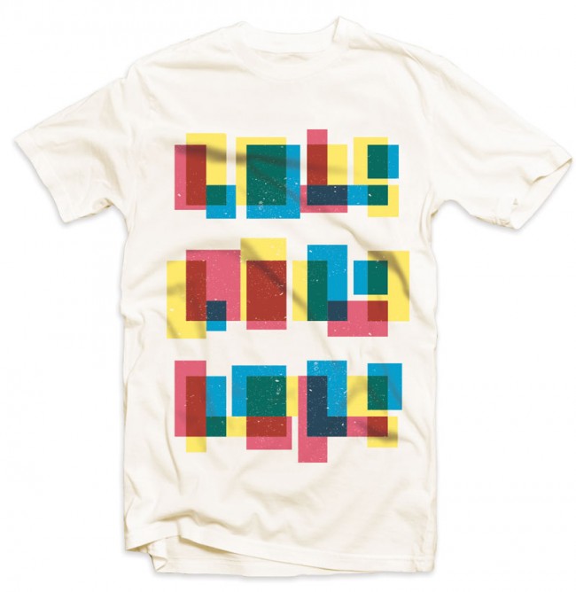
| 10:36p | LOLS! “LOL – It’s original definition was “Laughing out loud” (also written occasionally as “Lots of Laughs”), used as a brief acronym to denote great amusement in chat conversations. Now, it is overused to the point where nobody laughs out loud when they say it. More accurately, the acronym “lol” should be redefined as “Lack of laughter.” Available at Quoted Tee.
|
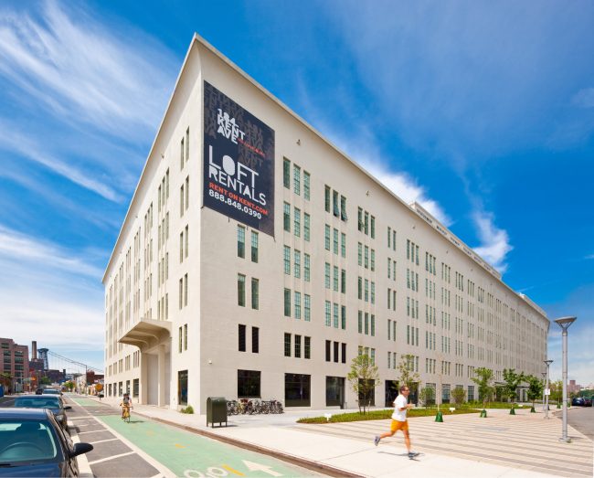
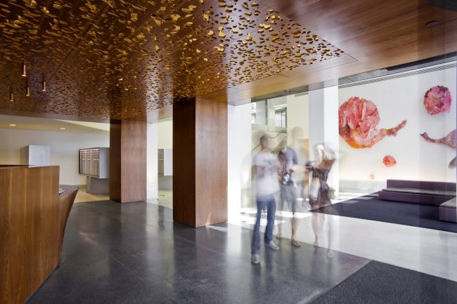
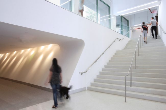
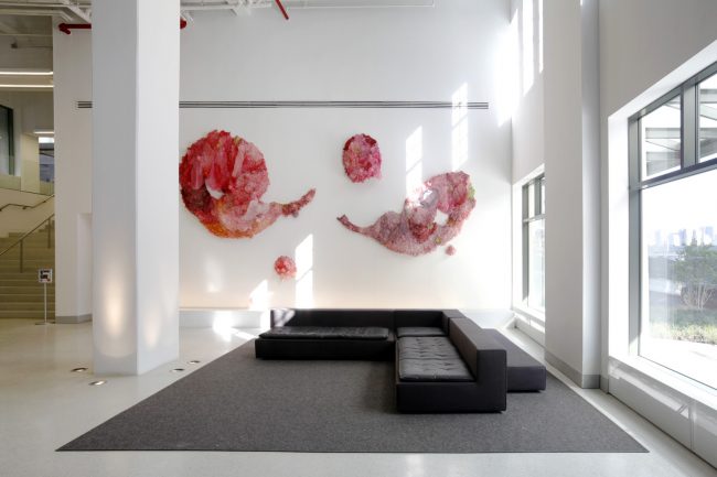
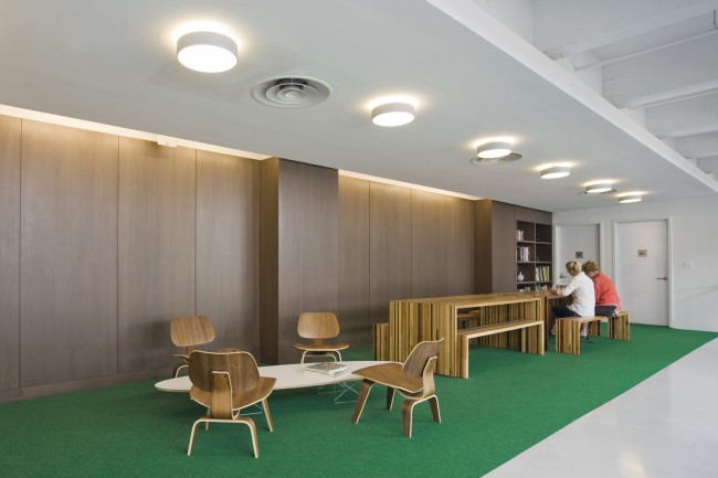
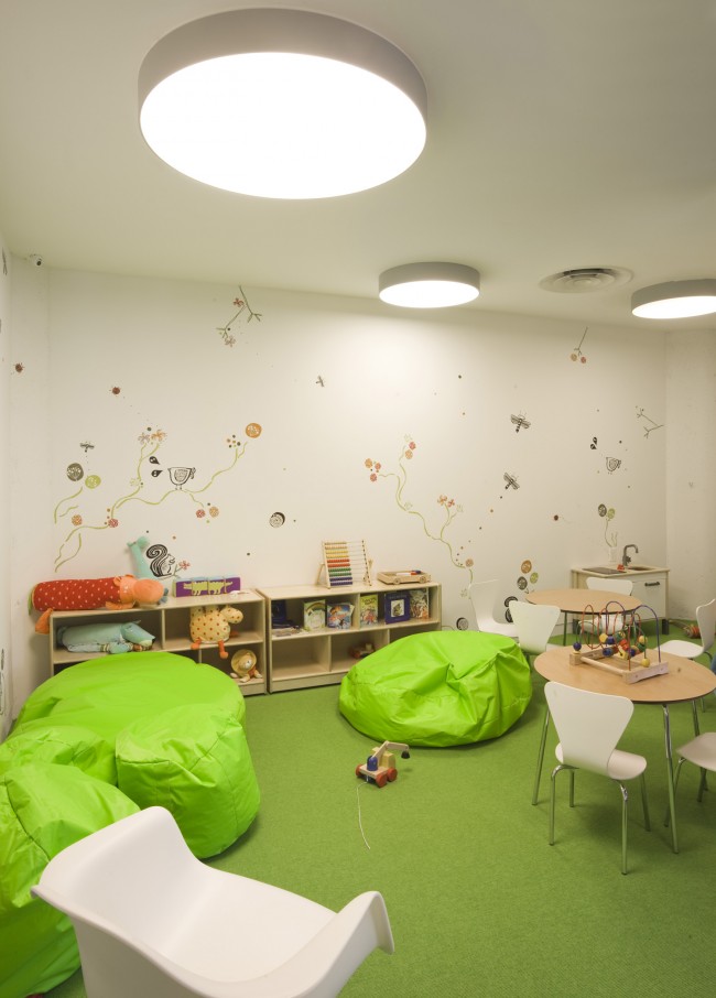
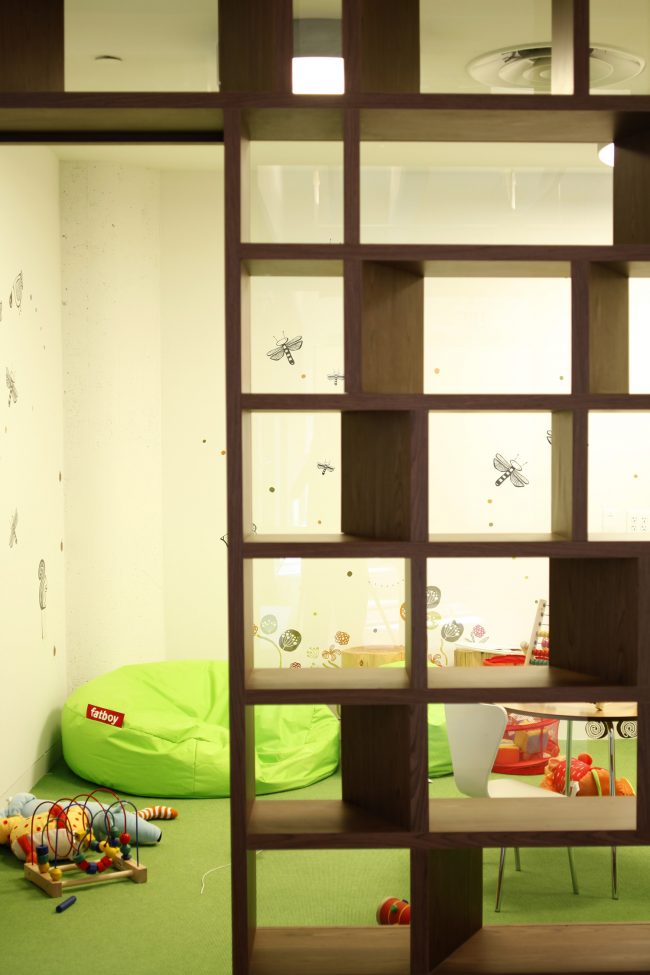
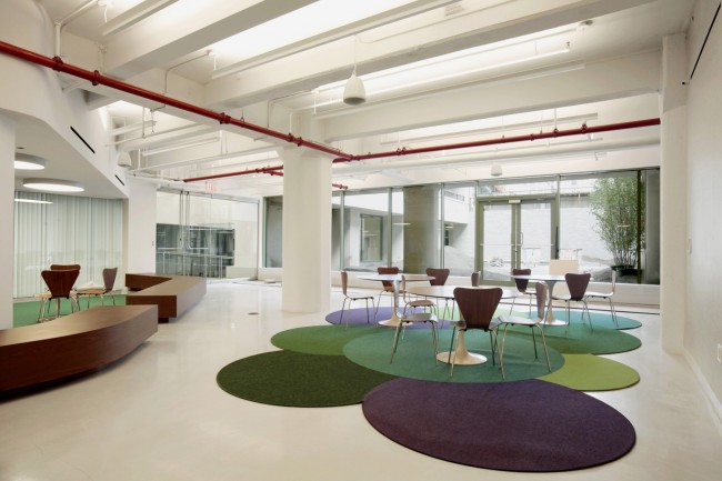
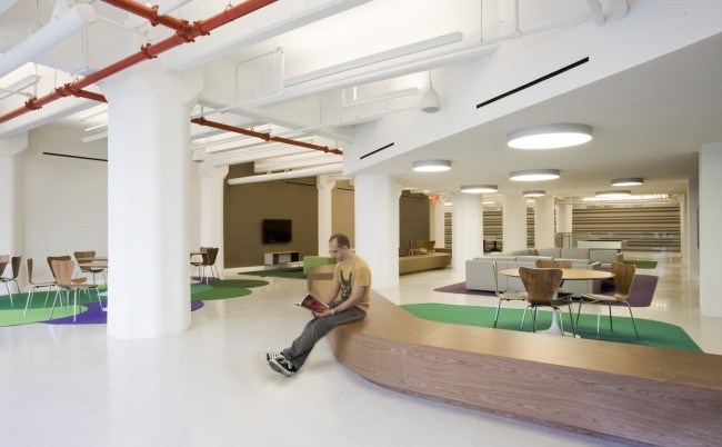
| 10:37p | 184 Kent Ave by SLADE ARCHITECTURE A half-million square foot industrial/commercial-to-residential conversion project in Williamsburg by Slade Architecture. This project received both 2011 Building Brooklyn Awards – Winner for Adaptive Reuse and 2010 Interior Design Magazine Best of Year – Award of Merit for Public Space.
The building program calls for over three hundred units across a variety of apartment types. The modules for kitchens and baths were designed to accommodate the particular conditions in each unit. This exercise was especially challenging as the pre-existing industrial shell has a substantial column grid that resulted from the non-standard conditions in the units. The architects worked directly with kitchen and bath vendors to accomplish design goals in the most economical fashion. Understanding vendors’ fabrication constraints and designing around those, while standardizing as much as possible, has achieved an apparently luxurious design aesthetic on a tight per unit budget. In the public spaces Slade Architecture strove to create a design that incorporates the elegant industrial shell of the existing building shell while customizing it to its next phase as a residential building. The characteristic concrete shell is the largest presence. The intrinsic appeal and distinguishing characteristic of this building will ultimately be the marriage of modern design with industrial heritage. In that spirit, the junction of concrete with new material introduction is articulated clearly, allowing the occupant to appreciate and understand both conditions. The extensive public amenity program includes a lobby, several lounges, game areas, gym, children’s room, flexible conference space and kitchenette. |
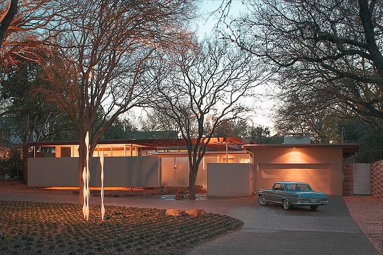
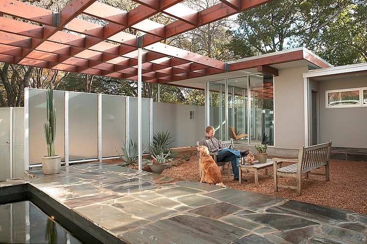
| 11:00p | Tarrytown Residence by Steinbomer, Bramwell & Vrazel Architects Steinbomer, Bramwell & Vrazel Architects updated, expanded and restored this 1950′s modernist residence located in Austin, Texas. |
| 11:21p | Colorful Illustrations by Ella Tjader
Inspired by fashion, nature and flowers, Zurich, Switzerland based illustrator created colorful intricate images balanced elegantly with line and flowing shapes. |
| 11:46p |
| << Previous Day |
2013/05/28 [Calendar] |
Next Day >> |


