[Most Recent Entries] [Calendar View] [Friends View]
Wednesday, May 29th, 2013
| Time | Event |
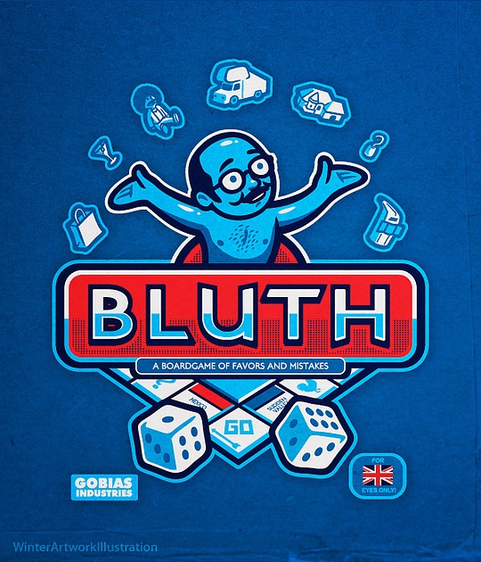
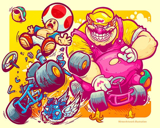
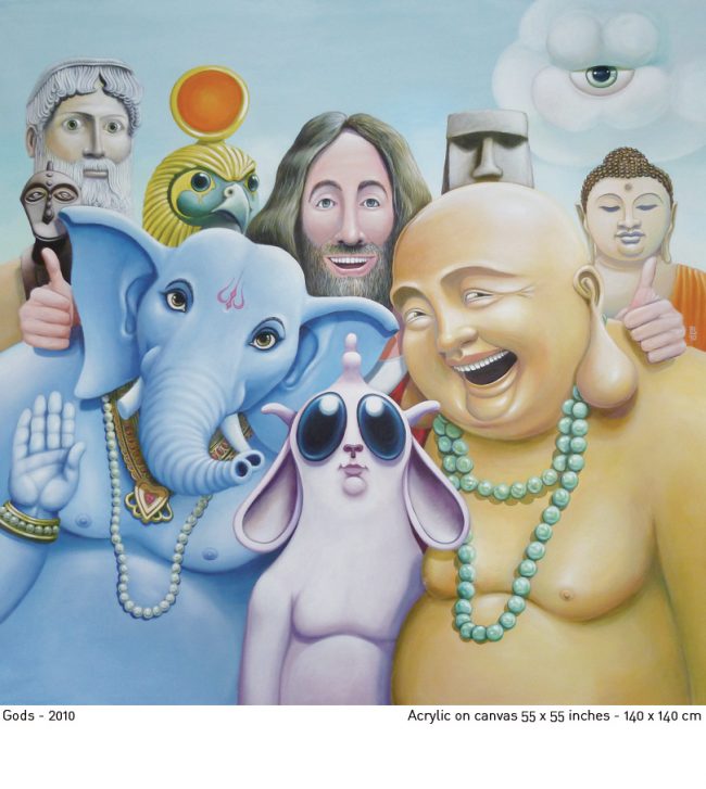
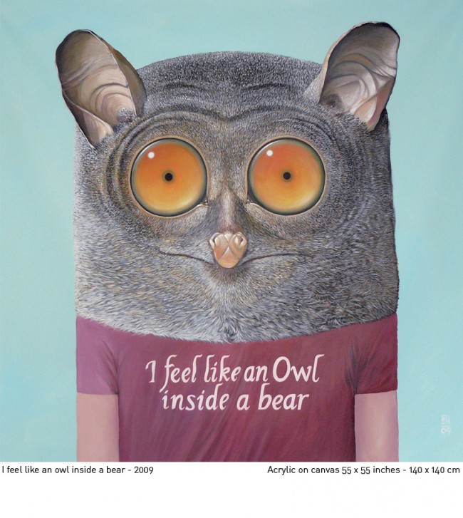
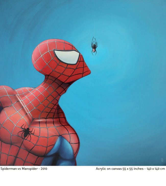
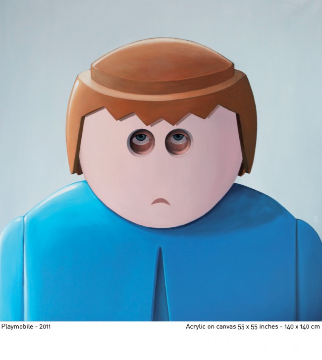
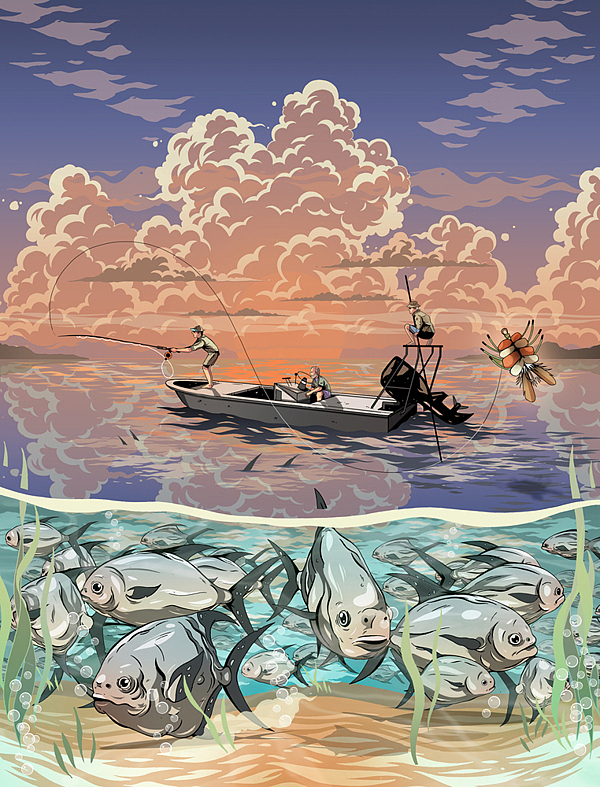
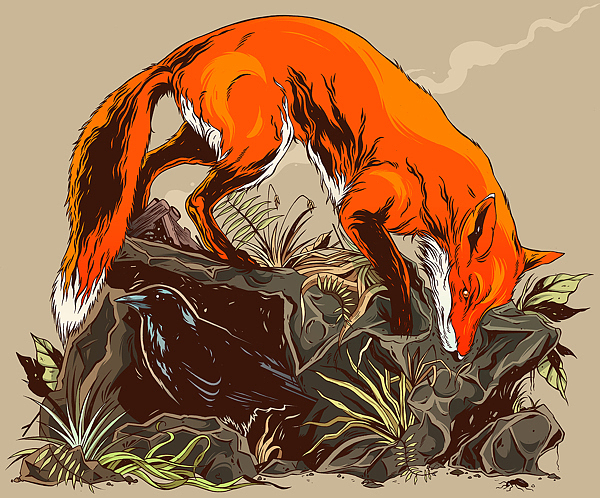
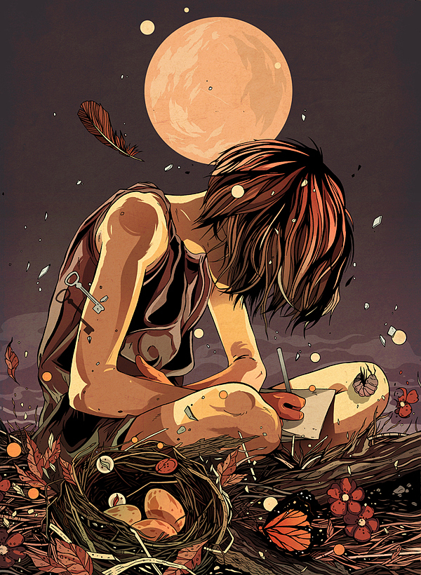
| 12:01a | Awesome T-Shirt Illustrations by Winter-Artwork Various creative T-shirt illustrations and logo designs / mascots by talented 30-year-old freelance artist from Barbados. Enjoy our picks! |
| 12:18a | 8 Celebrities With Tattoos of Other Celebs Faces
Tattooing somebody’s face on your body. It’s either an extreme declaration of love, or the dumbest decision of your life. |
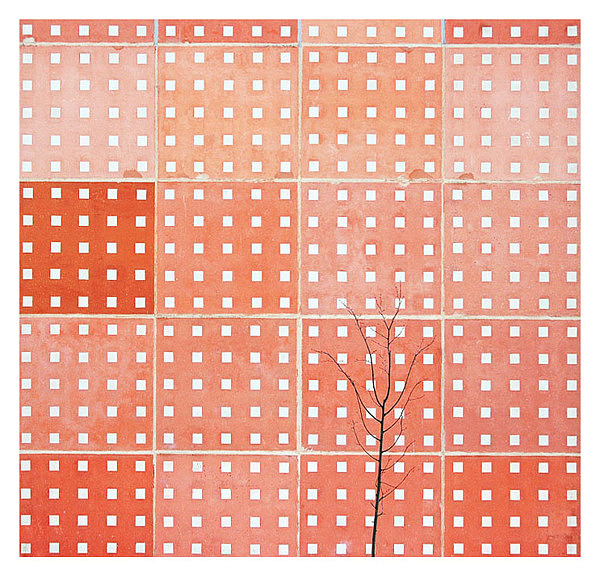
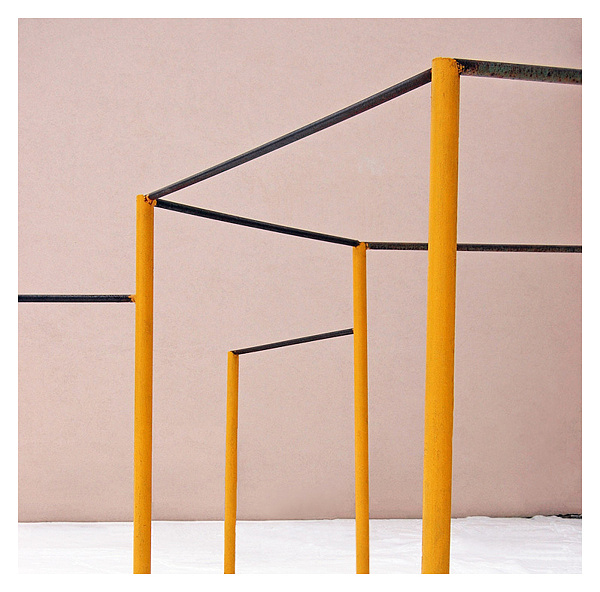
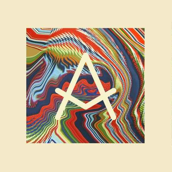
| 1:00a | Color Minimalism by Tauras Beliavcevas More than anyone else I love the colors geometry and minimalism. |
| 1:30a | 20 Perfectly Timed Photos That Define Right Place, Right Moment
The most hilarious and off-the-wall images are taken at the right time and right angle. But capturing these bizarre moments is not a piece of cake for many. |
| 2:00a | |
| 3:03a | |
| 3:08a | |
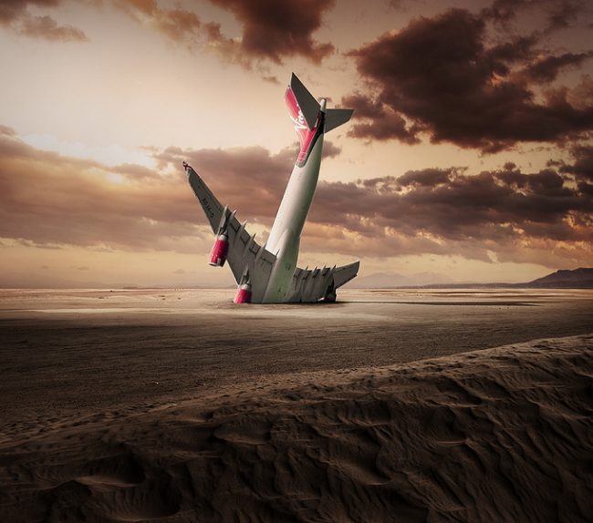
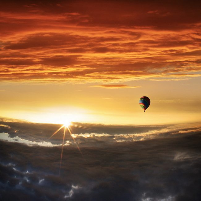
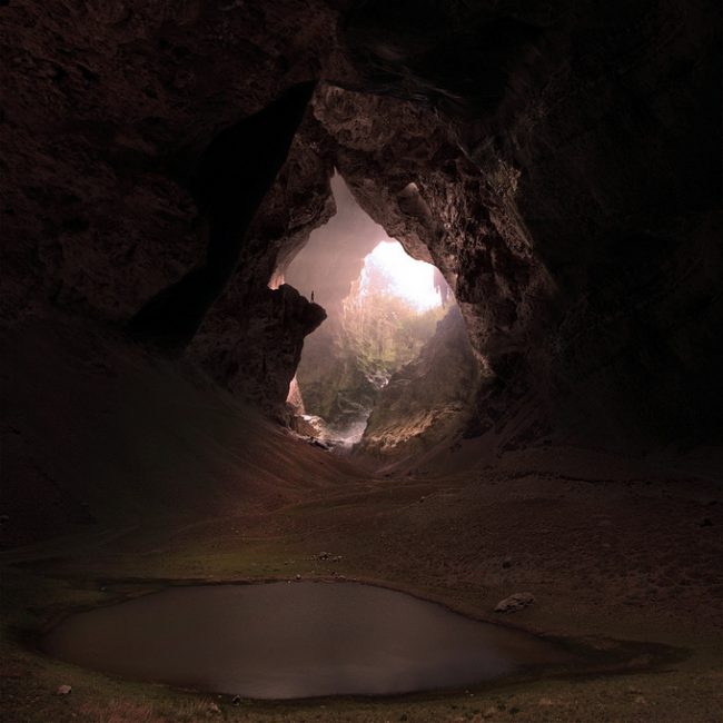
| 3:28a | 30 Creative Effects in Photography In our showcase the photography from the creative effects in photography are collected and I am sure it will take your breath away.
Join My FB Page |
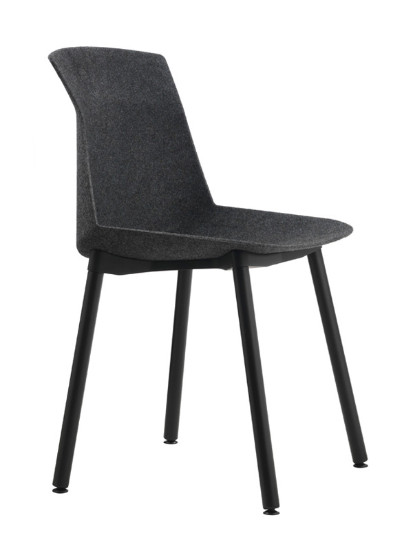
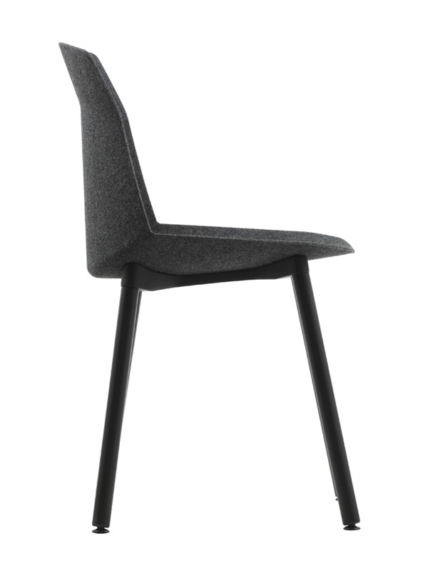
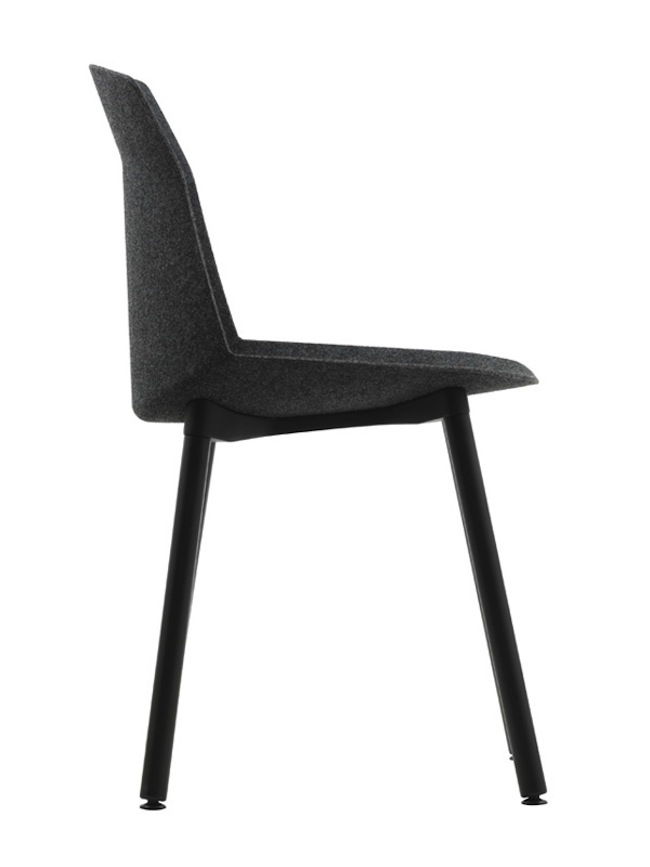
| 4:06a | Motek by Luca Nichetto Motek is a minimalist design created by Italy-based designer Luca Nichetto. The inspiration behind Motek chair is a sheet of paper, which is flexible and lightweight by its very nature. Originally, a sheet of paper cannot bear weights, but the Japanese art of origami – which, with a series of folds, creates forms and structures that can support weights – the same sheet takes on a new lease of life. Thanks to a new technology for Cassina, such as pressure molding, a sheet of felt is folded, which will bring the necessary rigidity to the body of the chair for it to support weights without losing the lightness of the original material. See more minimalist designs at Leibal |
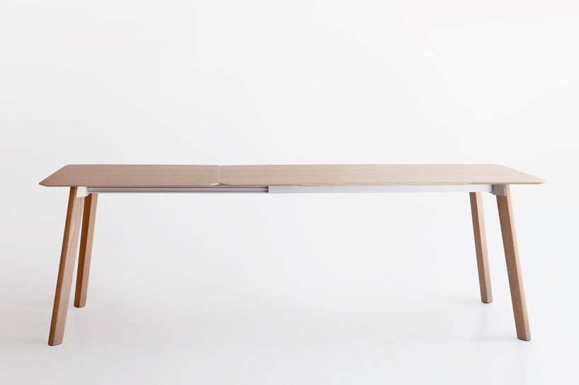
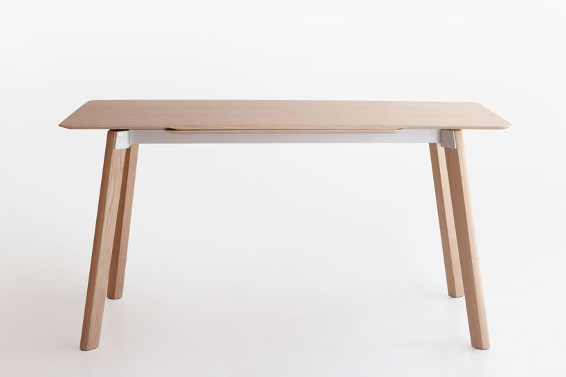
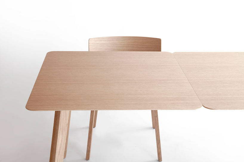
| 4:18a | Translapina by CuldeSac Translapina is a minimalist design created by Spain-based design firm CuldeSac. A new type of extending table, reminiscing on the past but achieving an absolutely contemporary creation – light, dynamic and functional. This table takes up the challenge of extending to a larger size in a much more straightforward, lateral way, where technical aspects do not define the final aspect, but rather the other way around – the extended design determines the extension mechanism. See more minimalist designs at Leibal |
| 4:21a | 20 Celebrity Look Alikes
Stars always find ways to make us turn our heads and do a double take, but when you’re basically a carbon copy of a fellow celebrity |
| 4:26a | Manuel Coffeemaker by Craighton Berman Studio Manuel Coffeemaker is a minimalist design created by USA-based designer Craighton Berman Studio. Coffee is best when it’s carefully prepared one cup at a time. Much like other culinary pursuits, the craft of preparing coffee can be just as enjoyable as the end product. MANUAL is a ‘slow coffee’ appliance that was designed to quietly sit on your countertop and provide the control of the pour-over brewing process in a single-cup preparation. See more minimalist designs at Leibal |
| 4:42a | |
| 5:03a | Brick Bible: The New Testament in LEGOs 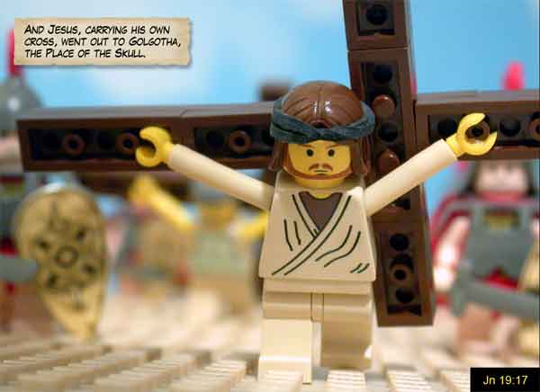 Brick Bible: The New Testament in LEGOs Creative Lego artist Brendan Powell Smith says he was “shocked” by what he read in the Bible in his Twenties and he couldn’t understand that most people weren’t aware of the Bible’s stories.” To help people familiarize with the Bible in a way that’s engaging and fun he started turning Jesus stories into LEGO scenes. See more photos at InspireFusion. |
| 5:11a | Roofing Repairs in an Emergency Situation (703) 855-8638  Roofing repair Northern Virginia, Roofing services Northern VA, Local roofing companies Northern Virginia You can make a crisis roofing repair northern virginia until the professional can get there. If you do not know what you are doing try to get the recommendations of somebody who has know-how doing crisis top covering repairs or expert top cove ringer. |
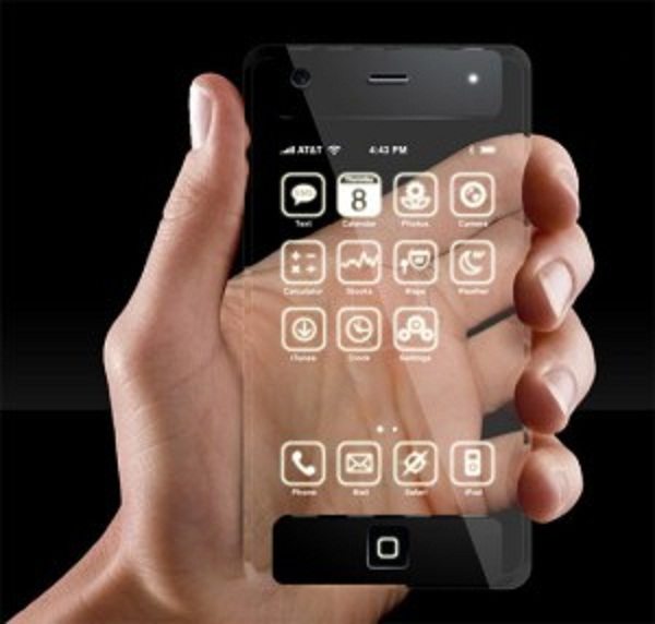
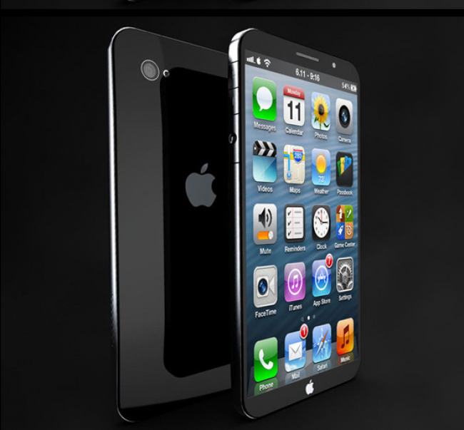
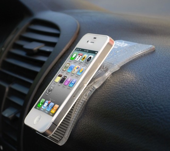
| 5:48a | iPhone 6 Rumours For Ultra-sensitive Transparent Touchscreen There are some rumors for the next iPhone as it will feature ultra-sensitive transparent touchscreen in iPhone 6. Also from some sources it is expected that iPhone 6 will have a 4.8-inch Retina+ IGZO screen that seems to make the iPhone 6 display thinner, brighter and much clearer.
As per some rumors earlier for iPhone 6 that the Apple will be focusing on to come up with a budget iPhone in its next release so it may be that the next iPhone have some mini and XL versions of the current iPhone but the recent rumours are just oppose it. Let see what the new thing coming up with new iPhone 6 to hit the market. Just wait and watch. |
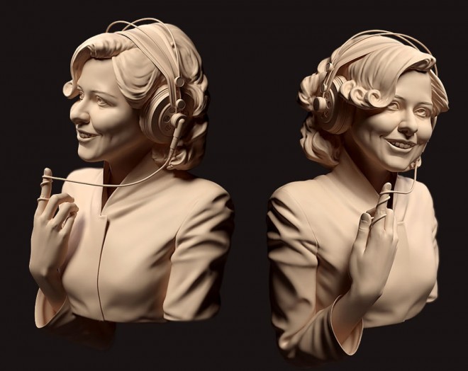
| 5:49a | 25 Fresh 3D Character Designs and CG Girl models for your inspiration
|
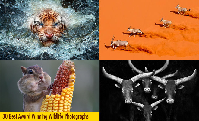
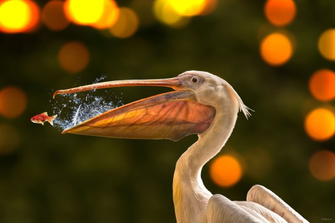
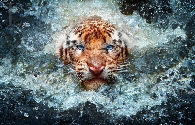
| 5:50a | 30 Best Award Winning Wildlife Photography examples around the world
|
| 5:53a | One Year to the XXII Olympic Winter Games 2014 in Sochi The Radugadesign company create big installation “One Year to the XXII Olympic Winter Games 2014 in Sochi”. |
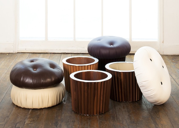
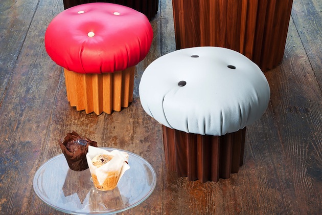
| 6:26a | Leather and Wood Muffin Pouffe Seating
|
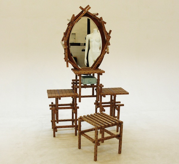
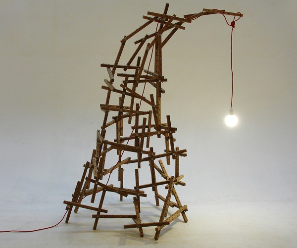
| 6:28a | Real Life LEGO Inspired Furniture With Oak Blocks
|
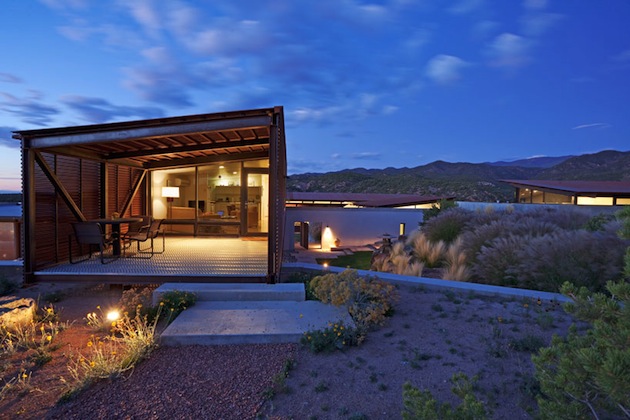
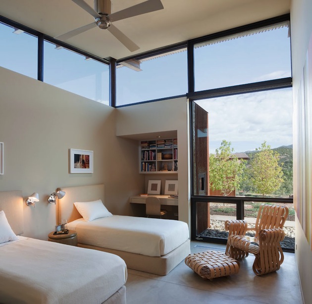
| 6:30a | Contemporary Southwest Home In The Santa Fe Desert
|
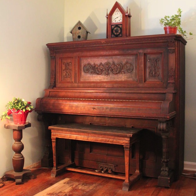
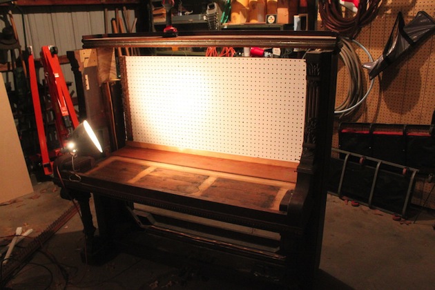
| 6:31a | DIY Piano Workbench
|
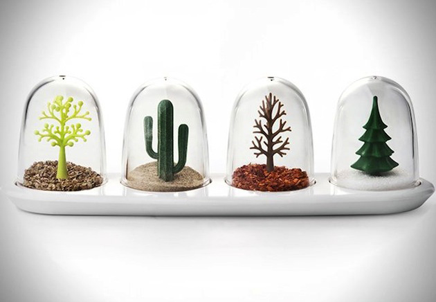
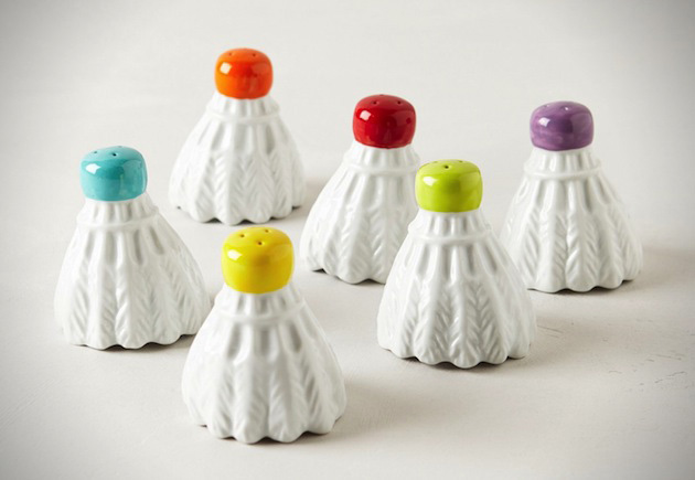
| 6:32a | Fantastic Salt & Pepper Shaker Designs For The Home
|
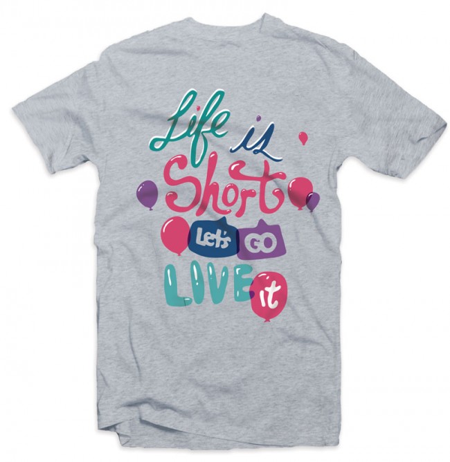
| 6:49a | Life is Short “Life is short, let’s go live it.” – John Aldean Available at Quoted Tee (Typography shirts for $11)
|
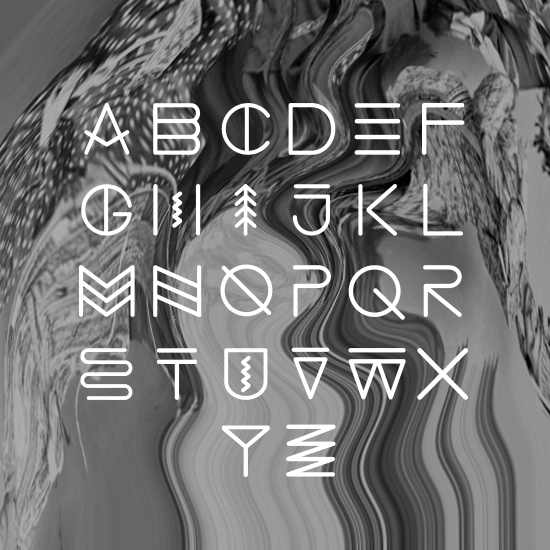
| 6:51a | Swing sans font on Hellofont.com This Quebec vernacular font was used for the logo of the Swing brewery. The shapes of the letters were inspired by Native American petroglyphs considering many Quebecois identity symbols are borrowed from Native American culture. (The racket sinew, bark canoes, fur, etc. ..) Native American petroglyphs illustrate these concepts and elements of natureas the Amerindian language was primarily oral. We can observe a river (s), spruce (i), etc… HelloFont is a showcase of the world,s fonts available from one easy-to-use website. HelloFont provides the largest collection of fonts ever assembled for online delivery and offers convenient ways to find and purchase them online. We would like to give other designers an opportunity to sell their fonts and typefaces. Therefore we open a new website www.hellofont.com We invite you to share your fonts on our website. |
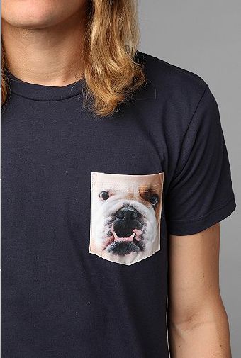
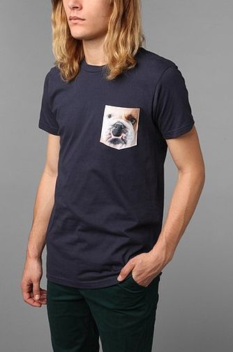
| 7:03a | Bulldog Pocket Tee t-shirt design by urbanoutfitters Soft cotton tee with printed patch pocket at the chest. |
| 7:21a | Blend logo and corporate identity design by Utopia Branding Agency Logo and stationery design for Blend, a consulting company focused on business process transformation, management consulting, system architecture, system engineering, system integration, application management, hosting solutions. Stationery package contains double sided letterhead, envelope, two sided business card design. More logo design and identity projects at www.weareutopia.com |
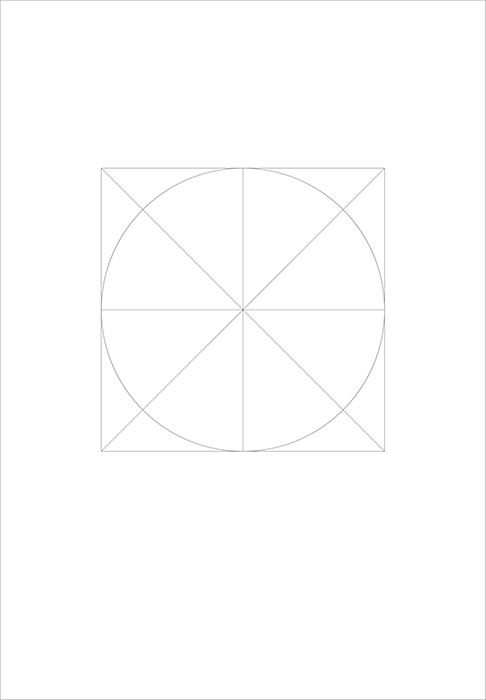
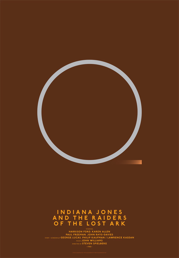
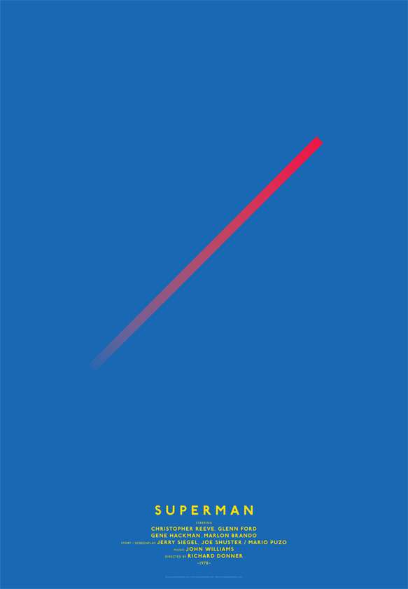
| 7:43a | Minimal Classic Grid Movie Posters by Michal Krasnopolski
The basic concept was to create a very modernist, minimalist poster series for movie enthusiasts. The idea is based on a very simple grid: a circle and two diagonals inscribed in a square. It surprised me how many posters I could create based on this very simple approach; the possibilities are theoretically unlimited.
|
| 9:02a | |
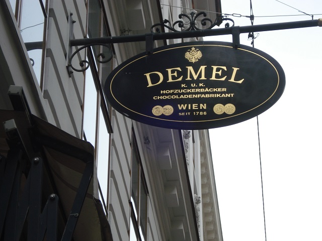
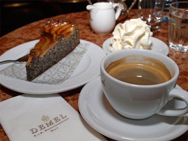
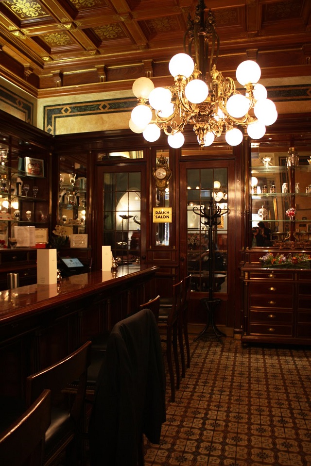
| 9:02a | Viennese Kaffeehaus DEMEL: one of the best! Viennese Kaffeehaus DEMEL: one of the best! >> Wohn-DesignTrend << your german blog for design, decoration and lifestyle
|
| 9:05a | |
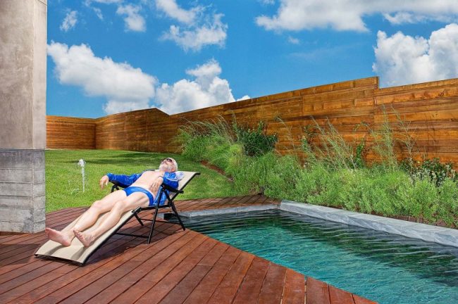
| 9:07a | Surreal Photography by George Christakis Amazing shoots by George Christakis, talented 24 years old photographer from Heraklion, Crete who currently based in Athens, Greece. via Photography Blogs.
|
| 9:13a | |
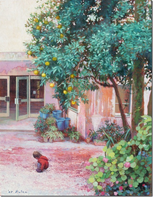
| 9:15a | Oil Painting – Light up your inspiration Oil painting is the process of painting with pigments that are bound with a medium of drying oil—especially in early modern Europe, linseed oil. Often an oil such as linseed was boiled with a resin such as pine resin or even frankincense; these were called ‘varnishes’ and were prized for their body and gloss. Other oils occasionally used include poppyseed oil, walnut oil, and safflower oil. These oils confer various properties to the oil paint, such as less yellowing or different drying times.
Access more oil paintings here |
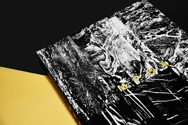
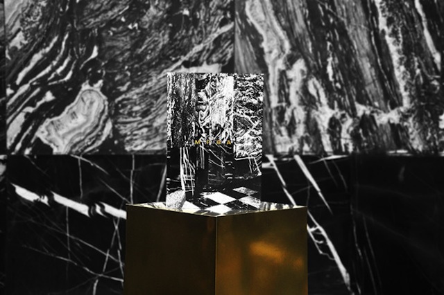
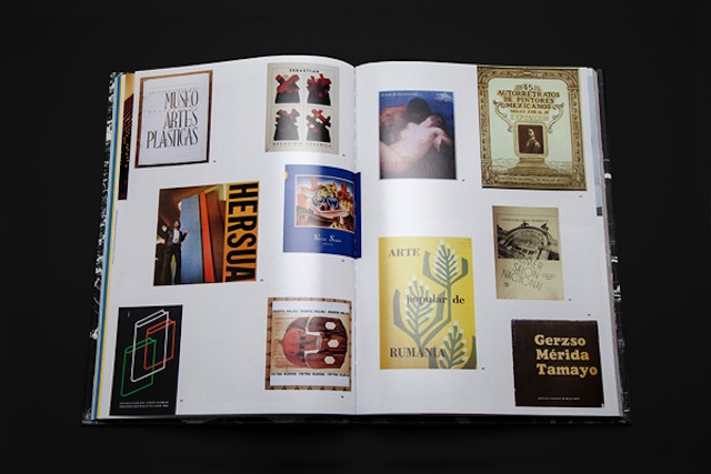
| 9:15a | Mpba Editorial Design
|
| 9:20a | Must Have Gadgets for the Summer
|
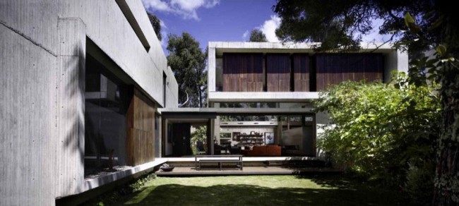
| 9:22a | Twin Houses in Colombia by MGP Architecture
|
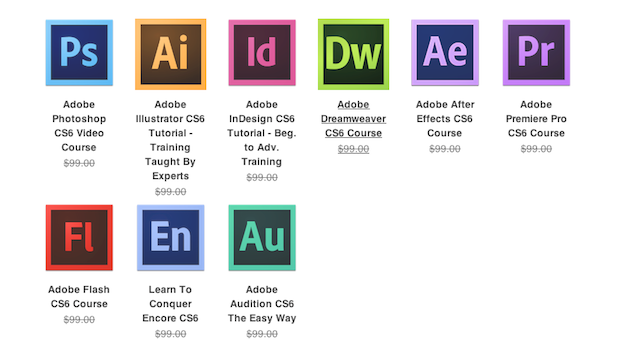
| 9:24a | The Adobe CS6 Training Bundle
|
| 9:36a | |
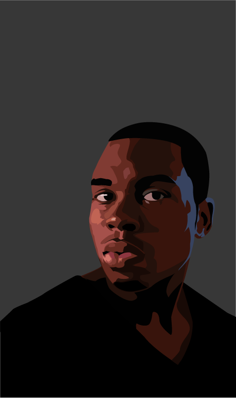
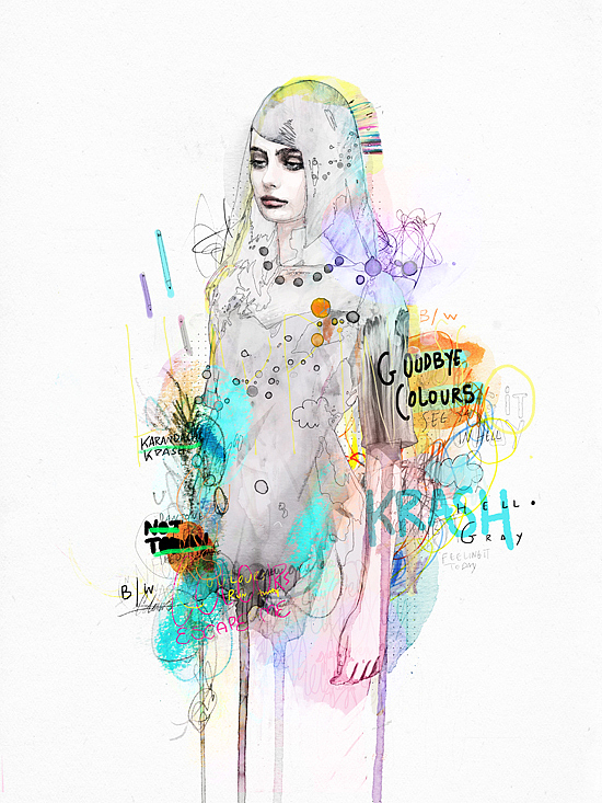
| 9:48a | “Vo” a Digital Portrait by Emanuel Williams for The Company Creative
Fine Art in the digital medium. Long Live Rebel Designer Emanuel Williams replaces the easel with computer and tablet. The experience is a modern answer to figure painting. thank you for feeling my vision. |
| 9:57a | Benefits of an engaging landing page The landing page is the first page which comes in front of a client or a reader when he/she clicks on the link to a particular website. The core purpose of a landing page is to persuade the readers and the visitors of the website into the buying of the particular product or service in which the website deals. The lead generation is thus the sole aim of a landing page. There are myriad benefits which are associated with the landing page. Let’s unveil the various benefits of the landing page through this article. Have a look:
Saves the Time Wasted In Navigation The landing pages are armed with the necessary space where the exact information or the keyword can be entered in the information one is hunting for. This saves the time of the visitors spent on navigating from one page to another in search of the desired information. Thus the landing page augments the effectiveness of a generate landing page. Hit With the Readers The landing page is usually equipped with a charming main title and various enticing subtitles. There are the spots for the testimonials and videos about the various products and services. It also lists the various advantages which can be reaped in through the product or service. The content placed on the landing page, thus appeals to the customers in the most direct way, and acts as the catalysts for making the visitors indulge in purchases. Augments the Conversion Rates With the traditional methods, the visitors were first required to enter the website and browse through the necessary information by making use of the index. However, with the presence of the landing page, the visitors are made to enter the required web page which is loaded with the information as desired by the visitors. This is the first step to convert the leads.
Immediate Effect on Sales There is a direct nexus between the landing page and the number of sales made. A single engaging landing page is capable of earning lots of money by convincing the visitors to the website to indulge in purchases. Thus there is no need on the part of the website or the company to spend a considerable amount of money just to usher in the visitors or the customers to the website. Yardstick for SEO measures The landing page is effectively used for the purpose of measuring the effectiveness as well as the progress of the SEO measures which are undertaken by the marketer. There are tools present on the landing page which can aid in calculating the exact number of individuals who clicked for the pay per click campaign. Also, when steps are taken for ameliorating the landing page, there is a definite possibility that the online measures of marketing will also receive an enhancement. The landing page is thus an optimal tool in the kitty of a marketer which is designed to optimize the online visibility and bring in more sales. Landing pages are all about reaping awards for the efforts one puts in. The landing page if designed and constructed with an intelligent set up, it can surely bring in loads of brownie points. Capture the sales with a captivating landing page!!! |
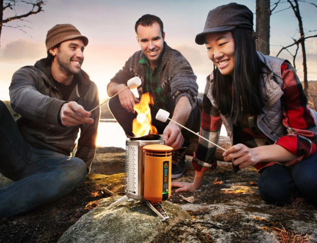
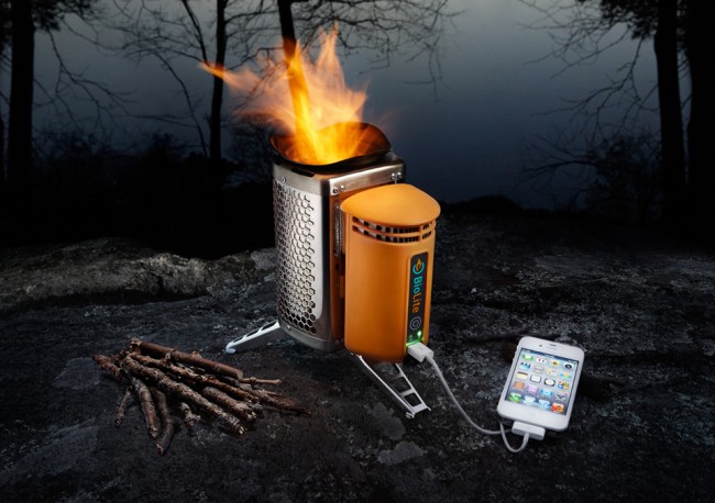
| 9:59a | BioLite Campstove For camping lovers, this is a product to put in your shortlist. The BioLite Campstove burns cleaner than petroleum gas, and provides fire and electricity just simply using twigs you can collect outdoors. The BioLite Campstove is compact, comparable to a 1-litre water bottle. Now you can charge your iphone while having a marshmallow bbq with your friends! Source: IPPINKA |
| 10:06a | Game Characters by Dmitry Grebenkov
Dmitry Grebenkov is an artist who is currently living in Stavropol, Russia and working on illustrations, digital art, cartooning. His works are composed of awesome fanart, pin-up and game characters. |
| 10:08a | Peopleofdesign in Google Currents
If you like peopleofdesign.ru, if you have iPad, iPhone or some android device – please welcome to Google Currents. Subscribe please. |
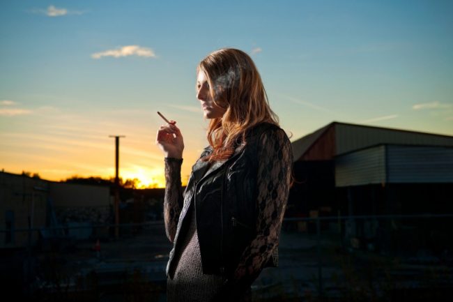
| 10:15a | Fashion Photography by John Urbano John Urbano, photographer and director, grew up in Rensselaer, Indiana and studied illustration and advertising at the Columbus College of Art and Design. via Photography Blogs.
|
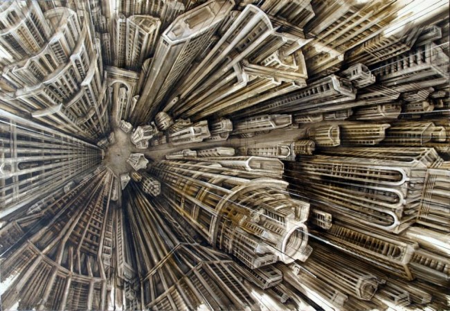
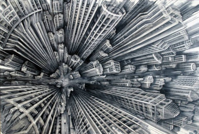
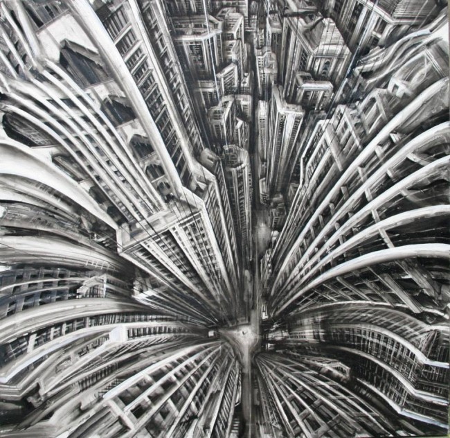
| 10:23a | Vertigo Paintings by Fabio Giampietro ‘Vertigo’ is a series of paintings by artist resident in Milan Fabio Giampietro Cityscapes viewed from a dizzying height, so the images give the feeling of free falling…
|
| 10:30a | |
| 10:38a | Looking for motivation? www.sotherainbow.com is here for you whenever you’re feeling down or you just want to remember to be positive in your personal or professional life.
|
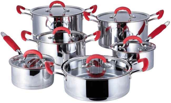
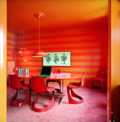
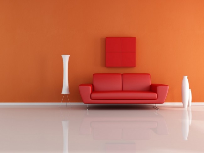
| 10:47a | A cooking set made my DATE!! What if I told you that a normal deal turned into an abnormal experience for me? What if the best in the world became the worst of them all? What if the solid-expectation from a kitchen-equipment blew your whole event off? This is somewhat explanatory of what happened with me in the past few days with a super deal that did not work out that superbly. This event took place a month ago when I ordered one of the steel cookware sets from an AMAZING website, and you might have guessed which one it would have been. The site showed me approximately 21 results when I searched for an appropriate dining table apparatus for an upcoming event that was majorly important for me! Having chosen one of the options that was neither too expensive nor too cheap; I planned to cook a dish by myself for the most important person in my life, so that I could tell her what I felt about her. The perfect plan was all set and the only thing missing was the formatting with the presentation of my preparations. The table cloth to the spoons that should match it, the red coloured theme all around the room to catch it; everything needed to be in just the right way for it to turn out awesomely. I only had a day to dress everything up in the way I wanted it to look and feel. She liked red and orange more than anything so I amalgamated them both in a way which made it all the more adorable for the female gender! The table was orange while the chairs with it were more into pinkish-red. A long tailed ceiling light-set was there to top it all up when the night would pull down after we end up watching one of her favourite movies. I guess everything has been defined upright till now so you would have guessed what messed up in the very end! It was unfortunately the dish that disordered my orderly evening and that was partly my fault as well. What really happened was, that I mistakenly left the Italian (she loves Italian food) baked prawns within the steel-mesh like tray inside the oven and forgot to turn in off. I normally run my oven at 30% integrity so as to get the food internally cooked along with the outer sides getting all reddish! I was in the middle of my ultimate dish when she rang the bell and that is why I had to leave the kitchen ASAP! Welcoming her inside my place for the first time took a bit longer than I thought it would and that is what misaligned my ideas. The sound of a BANG invited us both in the kitchen as we ran towards the unfortunate event. She looked at me and I looked at her all puzzled at what to say! But what happened later on was a miracle I suppose; as she smiled at first then burst into laughter! Suddenly came in close and hugged me tightly as she understood what my intentions were. The rest of the night was spent somewhere in the middle of the self-explanatory phrase “AWESOME” as we ate and watched movies. Laughing, crying and clapping high-fives with her all night long, it was one adorable momentous 13-hour period that I can never forget!
Get better steel cookware sets from international market. Story Credits: Max Cooper; & Pictures: Web (these resemble my ideas appropriately) |
| 10:51a | Photography by Misty Keasler Misty Keasler is a native Texan who started taking pictures at 7 with a Polaroid camera. After receiving her undergraduate degree from Columbia College Chicago she began shooting projects and assignments around the world. via Photography Blogs.
|
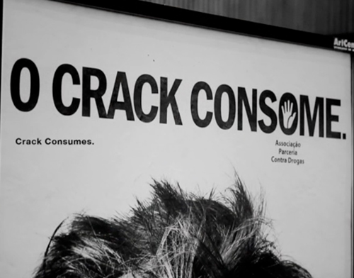
| 11:00a | Crack Consumes A printed campaign to avoid “the first try” of Crack Cocaine in São Paulo – Brazil. |
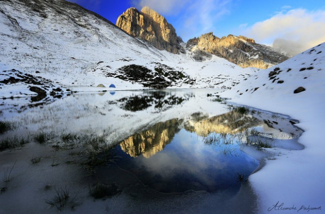
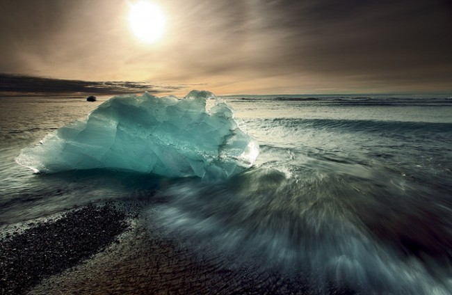
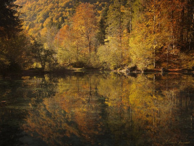
| 11:16a | Nature Photography by Alexandre Deschaumes Beautiful nature landscapes by Alexandre Deschaumes, telented self thaught photographer since 2003 from France who currently based in French Alps, Between Chamonix, Annecy & Geneva. via Photography Blogs.
|
| 11:17a | New Artworks + Pop-up Shop: GREATeclectic at The Alchemical Theatre Laboratory // NYC
GREATeclectic POPup Shop 6.13 (NYC) – Art Nouveau Magazine and The Socials invite you to a night of music and art. Thursday, June 13, 2013 for one night only Miami based artist GREATeclectic will open a pop-up shop at The Alchemical Theatre Laboratory / NYC.
|
| 11:26a | Design Projects by Abraxas Interieur Whether you are into classic or contemporary, these guys can pull it off. Their portfolio is full of well thought out interior spaces. Their classical interiors are well packed with luxurious vintage items but without looking too Victorian or cluttered, the focal points of the rooms are kept intact, be it the couches on a living room, or the bathtubs in the bathrooms, these central points all stand out among the other furnishes. Dark creamy tones are cozy on the eyes and provide an ever present feeling of relaxation. Details are added where emphasis is needed. But things change quite a bit when we move on to their contemporary interiors. The rooms feel much more spacious and clean. Although the same color tones are predominant, they feel more energetic and lively, almost as if there was an event going on.
Commercial spaces are also one of the areas of domain of this company. From their work it seems they are focused on transmitting a luxurious ambiance to the shopper, with the use of velvety curtains, carpet floors and chandeliers. In a very smart way, showcases enveloped in a large painting frame, emphasize the products on display, just like they would a painting. They can also transmit these elements outside of the commercial arena and into your home. The decadence theme on their portfolio is such an example. High contrasts but unsaturated colors, golden and chrome tones, velvet and furs in abundance, will throw you into a high class world of opulence and luxury.
|
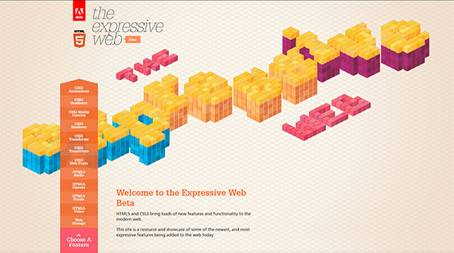
| 11:34a | 18 Interactive HTML5 Websites
A useful collection of 18 interactive HTML5 websites that not only load faster but are also compatible with most of the modern web browsers.
To check all the interactive websites click here. |
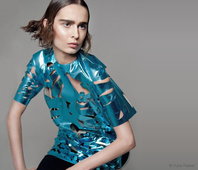
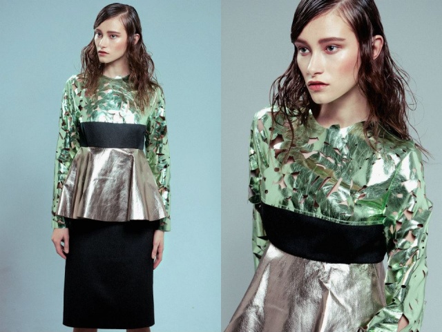
| 11:35a | Yulia Paskal fall/winter 2013 The fall/winter 2013 collection by the Ukrainian designer Yulia Paskal. Via THEmag.it |
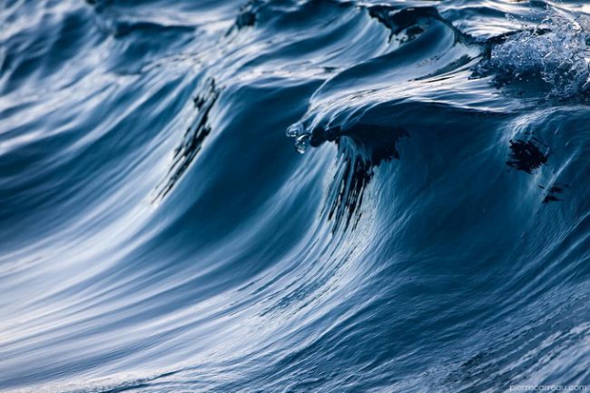
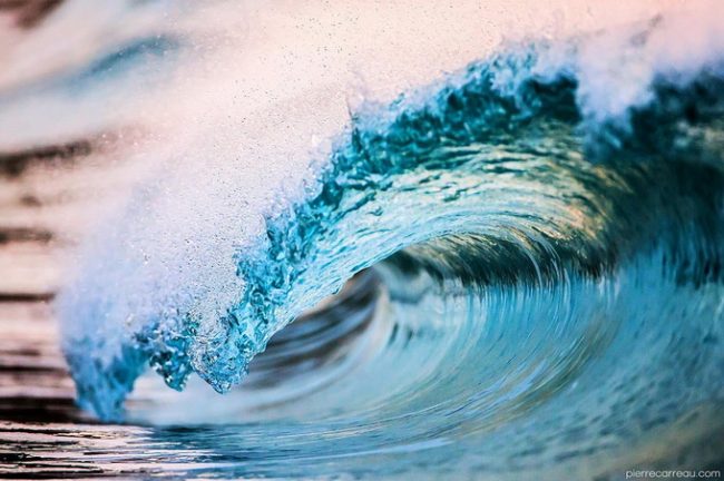
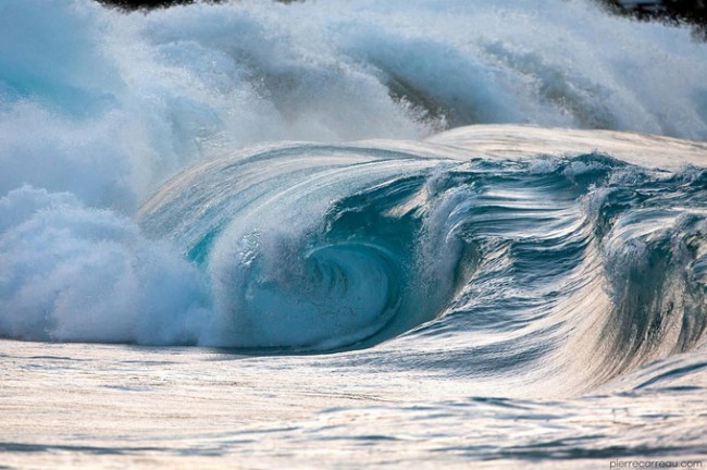
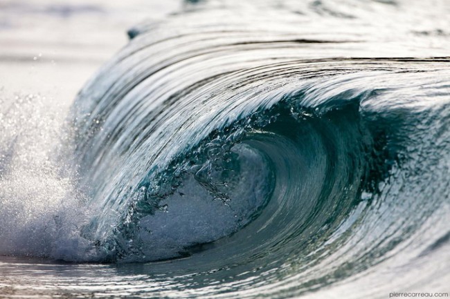
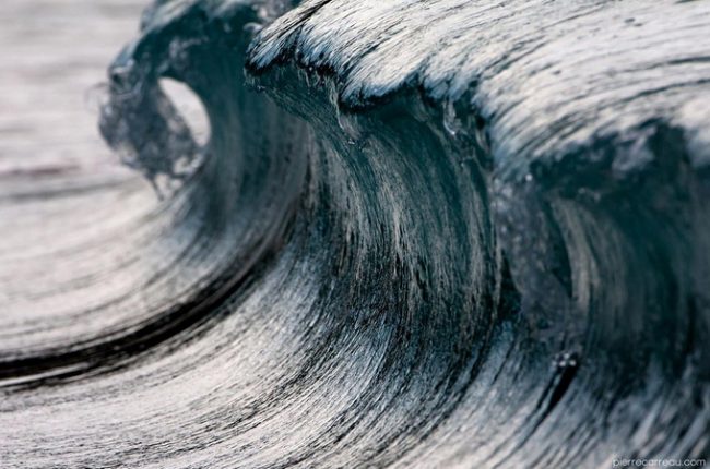
| 11:44a | Waves Photography by Pierre Carreau Pierre Carreau was born in 1972 near Paris surrounded by artistic influences. His family includes a photographer, a talented sculptor and painters. via Photography Blogs.
|
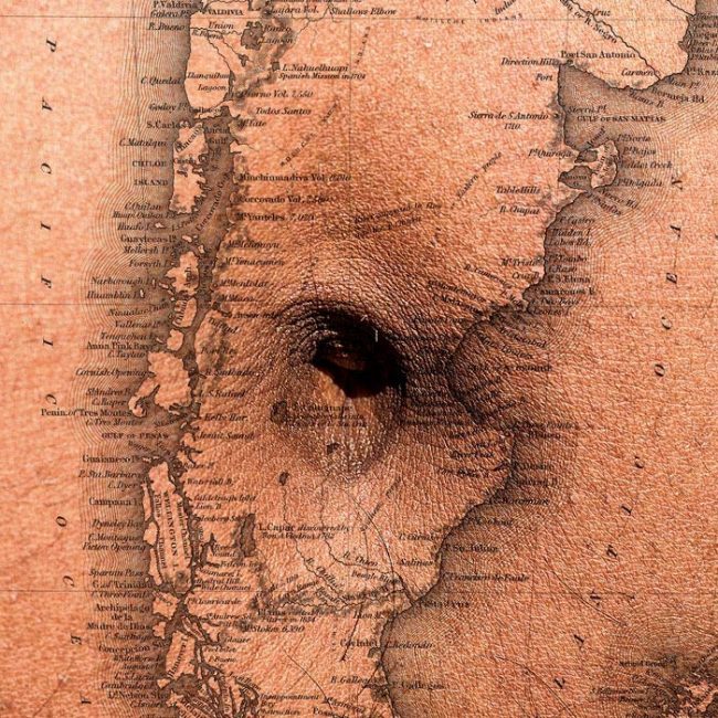
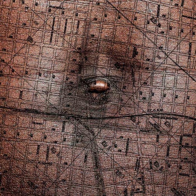
| 11:48a | Sergio Miranda’s Photo Exhibition The Patagonian photographer, based in Kingdom of Bahrain (Middle East) is having his first solo exhibition. He’s is showing images from three different series. The first two series belong to collections of images made to be printed in silk scarves of 120x120cms size. The third series is part of his work “Ombligo” which mixes navels from people of all around the world with maps that represent hometowns. The link between this three series is the square format of the images, that resembles the amazing Hasselblad 6×6 format, and nowadays, the popular Instagram format. You can see more in www.sermiranda.com
|
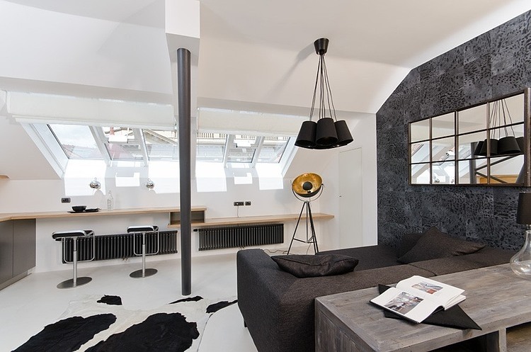
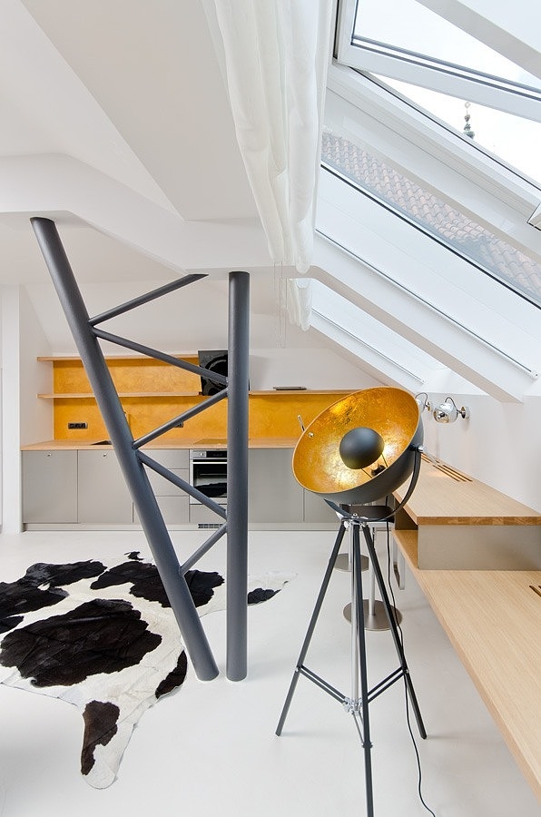
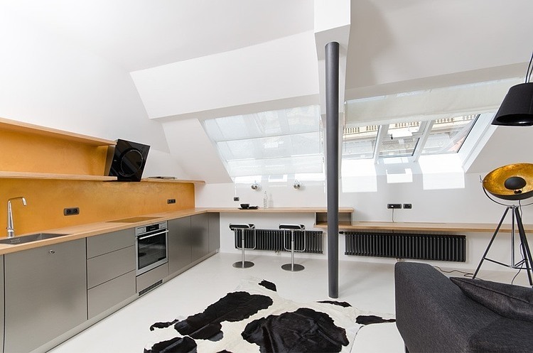
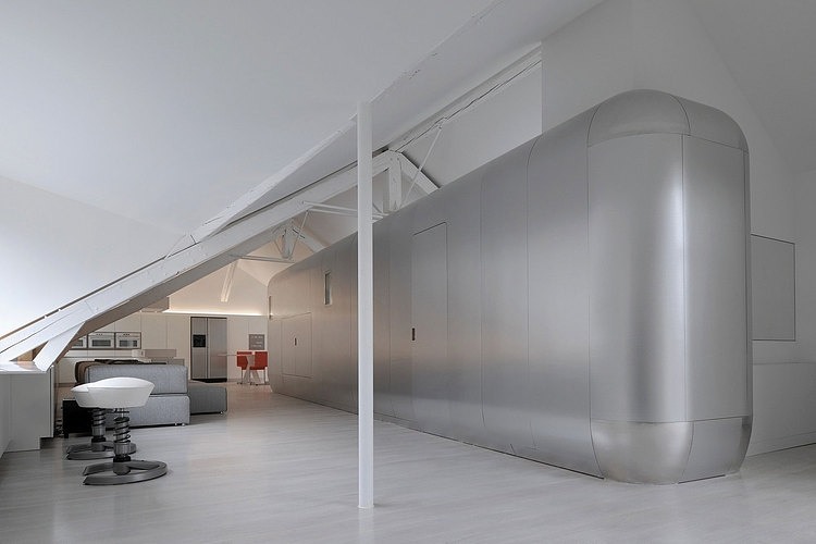
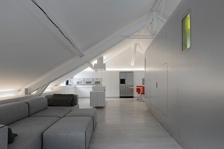
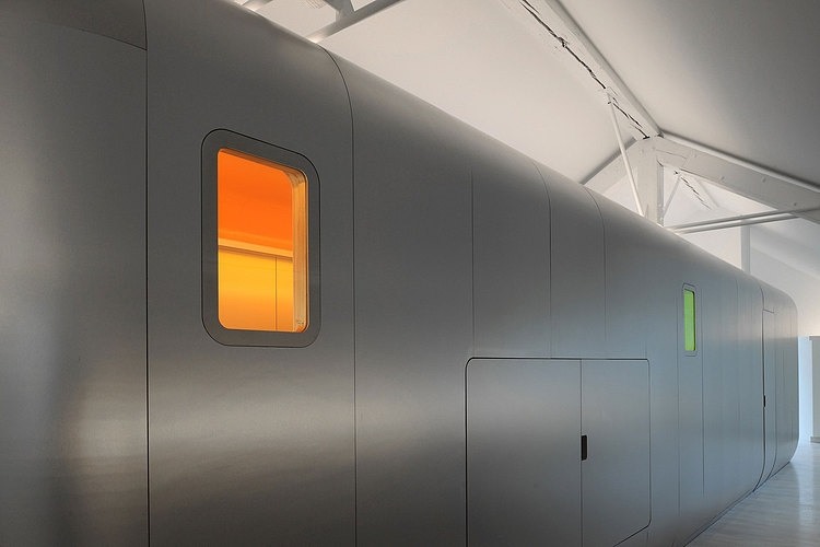
| 11:58a | Little Loft by Oooox In the centre of Prague, Czech rep., Radka Valova and Pavla Dolezalova of OOOOX designed this beautiful tiny loft apartment. |
| 12:00p | Various – 2012, 2013 by Alexander Wells Various personal and commercial work from 2012 and the first half of 2013. Sorry for the incredibly long wait between uploads. Thanks! |
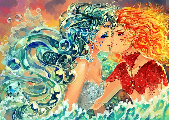
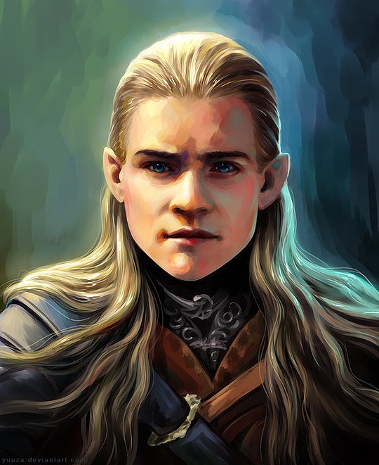
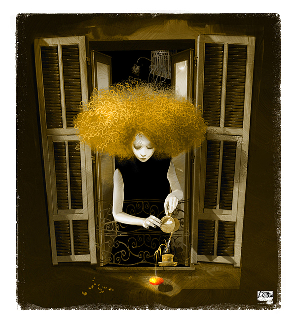
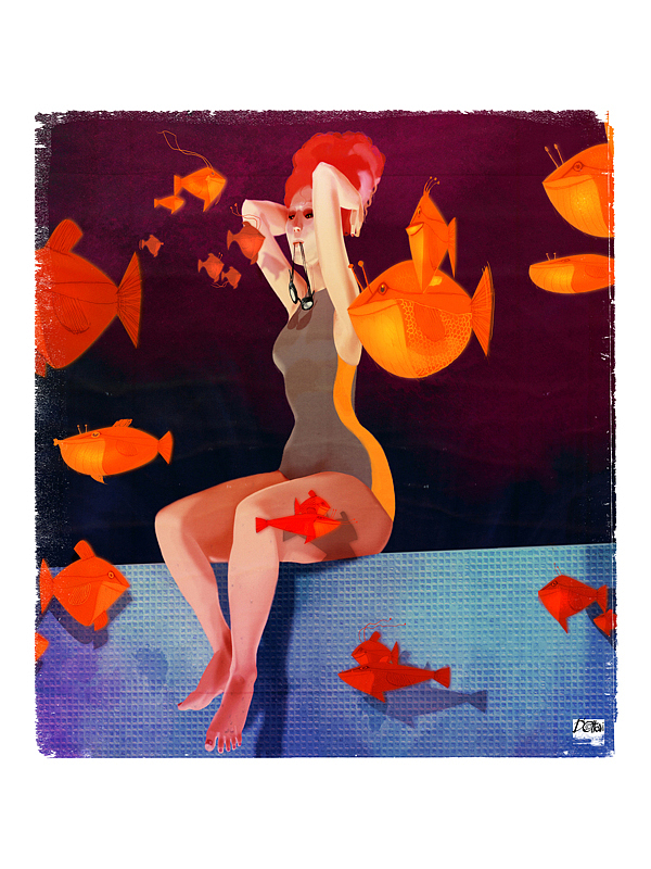
| 12:01p | Beautiful Concept Illustrations by Yuuza Yuuza is a talented female digital artist / anime illustrator from Bucharest, Romania. She’s completely self taught and her inspiration has always been the anime shows she watches and the books she reads. Let’s take a look at some of her artworks. Enjoy! |
| 12:06p | The Wheel House A rolling stone gathers no moss, but a rolling house will definitely gather audience. The Wheel House by UK’s Acrojou Circus Theater features a live performance of two acrobats as they live in a unique circular house – complete with bookcase, pots and pans, and other household accoutrements – rolling slowly on a straight path to nowhere. |
| 12:06p | How To Boost Workplace Safety Employers need to be proactive to be able to contain workplace accidents. Here in this infographic, we have shown how safety system of a workplace can be improved to a great extent by following some simple to follow tips.
Image Source - www.parking-posts.com/how-to-boost-workp |
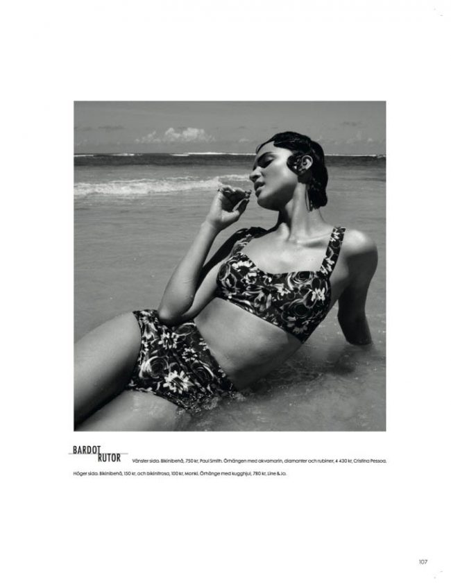
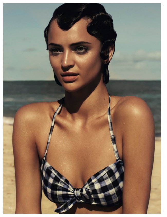
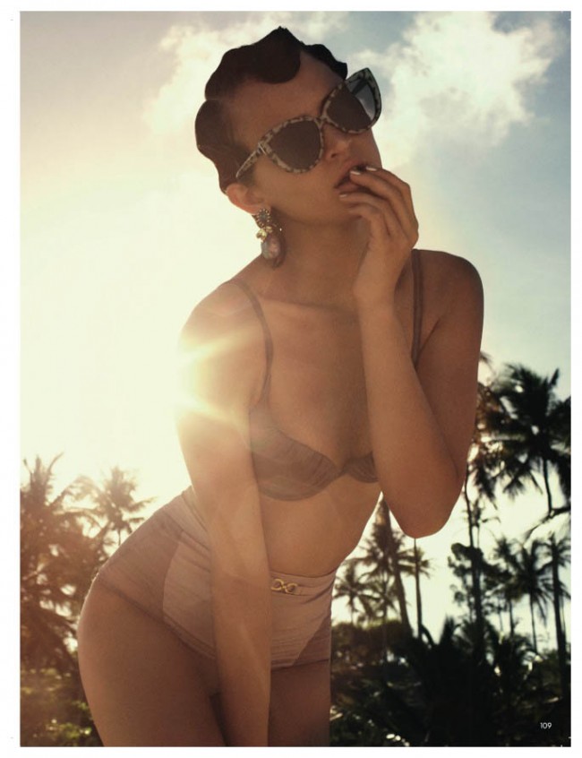
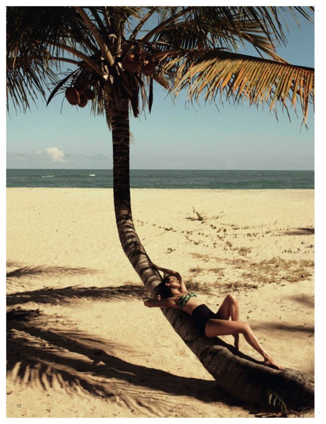
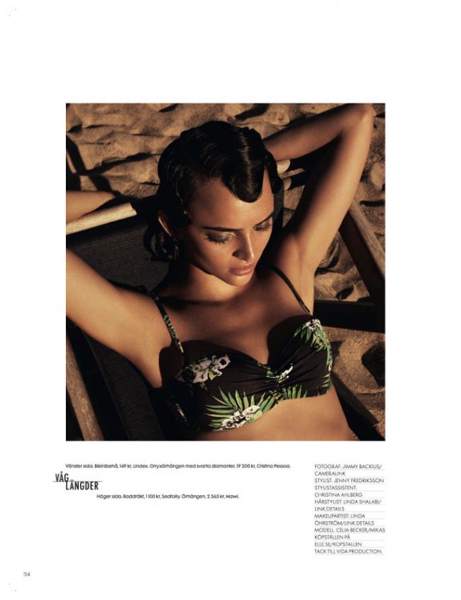
| 12:07p | Celia Becker by Jimmy Backius Amazing brunette model Celia Becker photographed by Jimmy Backius on the sunny beaches of Trancoso, Brazil for Elle Sweden’s June 2013 Edition. via PhotoHab.
|
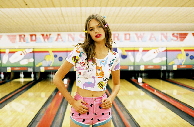
| 12:33p | Lazy Oaf X Nasty Gal Summer 2013 Lookbook
For Summer 2013, The highly anticipated capsule collection of London based label Lazy Oaf and LA based online retailer Nasty Gal is finally here. The two released a 20-piece capsule collection inspired by candy packaging and sticker albums they’ve collected during the 90′s.
|
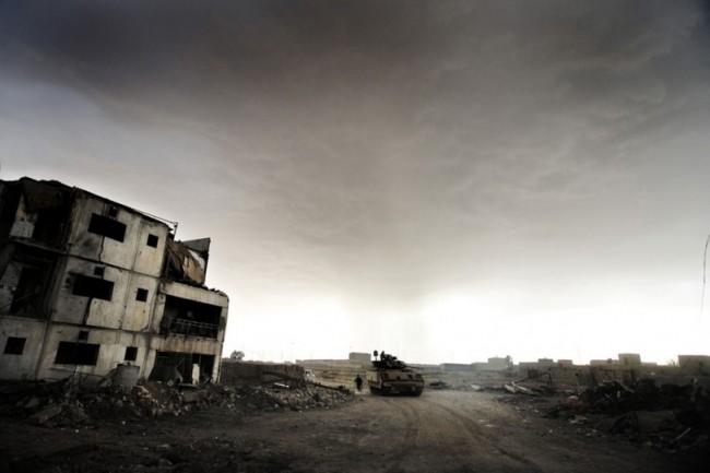
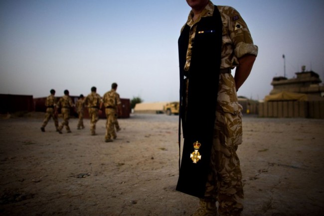
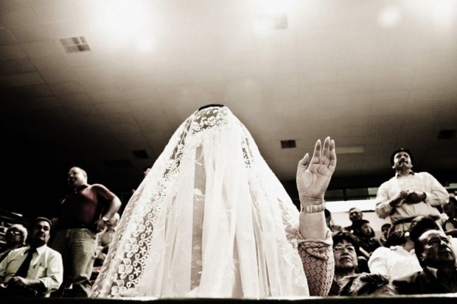
| 12:41p | Reportage Photography by Eros Hoagland Eros Hoagland began working as a photojournalist in 1993 covering the aftermath of El Salvador’s civil war. He has continued to work in countries stained with violence and un-rest across the globe including Iraq, Haiti, Mexico and Colombia. via PhotoHab.
|
| 1:00p | With a Little Help of My Heart
A team of climbers, including 80-year-old Japanese mountaineer Yuichiro Miura, stand on the summit of Mount Everest. Miura, who has had four heart operations, reached the top of Mount Everest on Thursday, becoming the oldest person to conquer the world’s highest mountain. He took the standard southeast ridge route pioneered by Sir Edmund Hillary and Tenzing Norgay 60 years ago, reaching the top of the 8,848 metre (29,028 feet) mountain at roughly 9:00 a.m. local time (0300 GMT). He was accompanied by three other Japanese climbers, including his son, and six Nepali sherpas. (REUTERS/Kyodo) |
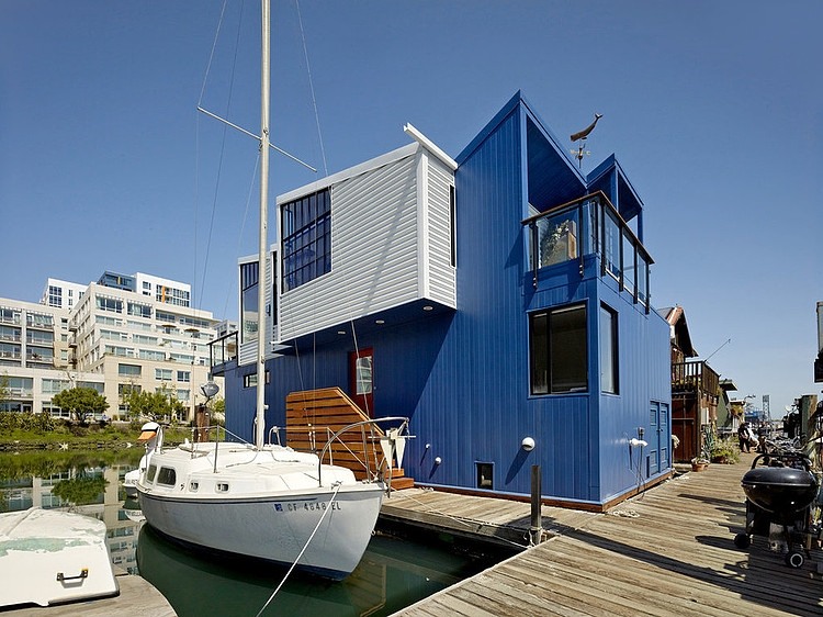
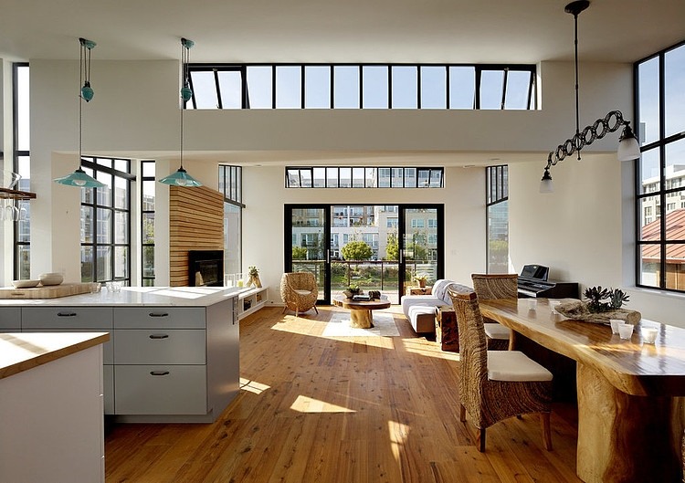
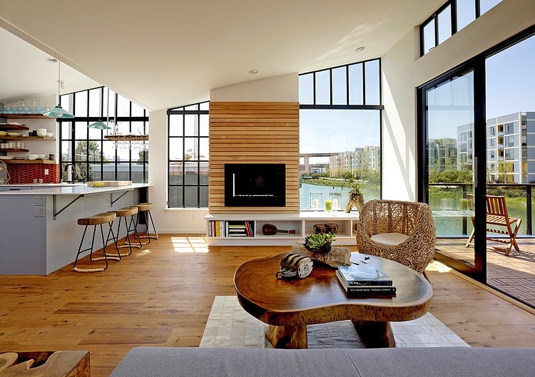
| 1:00p | San Francisco Floating House by Robert Nebolon Architects A modern contemporary floating home designed by Robert Nebolon Architects located on Mission Creek in San Francisco, California. |
| 1:02p | |
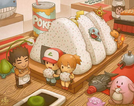
| 1:04p | Pikachu Art by Ryan Shiu Ryan “Ry-Spirit” Shiu is a Sydney based award winning digital artist who has received a number of achievements and gained popularity through his artworks online. Ry’s gallery consist of both fan art and interesting original characters. |
| 1:07p | Tactical BBQ Apron
Tactical BBQ Apron from thinkgeek which features a MOLLE system for holding everything a Grill Master needs. Check out where you can buy it. |
| 1:20p | Collection of Best Flat Websites
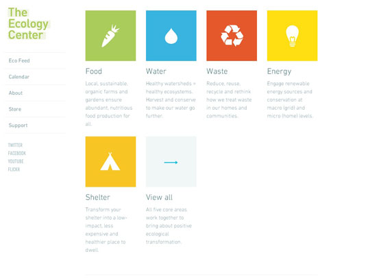
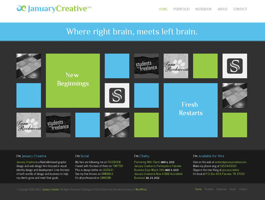
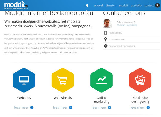
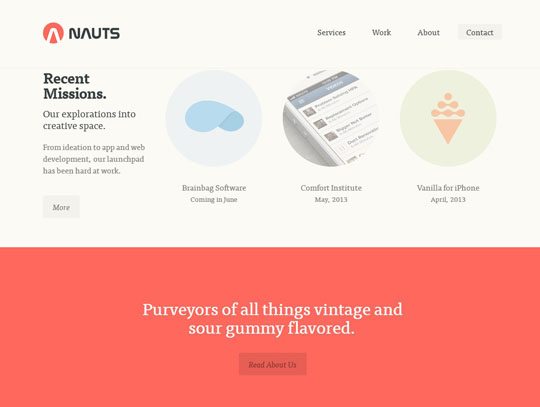
Take a look at the Windows 8 by Microsoft. That is the flat design style. This trend is now taking its prime in websites designs as many sites and themes are built with flat color blocks. The buttons, functional menus, content blurbs are now in edgy blocks with appealing colors. This flat design offers great senses of elegance, professionalism and modernism. |
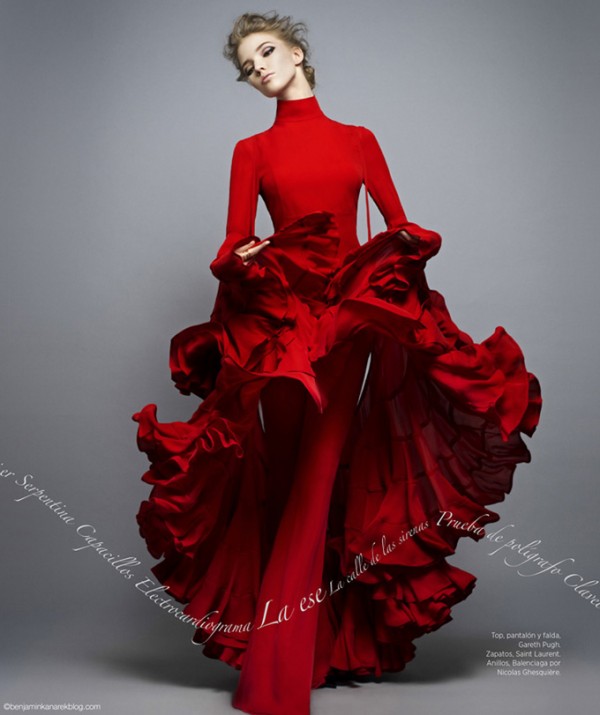
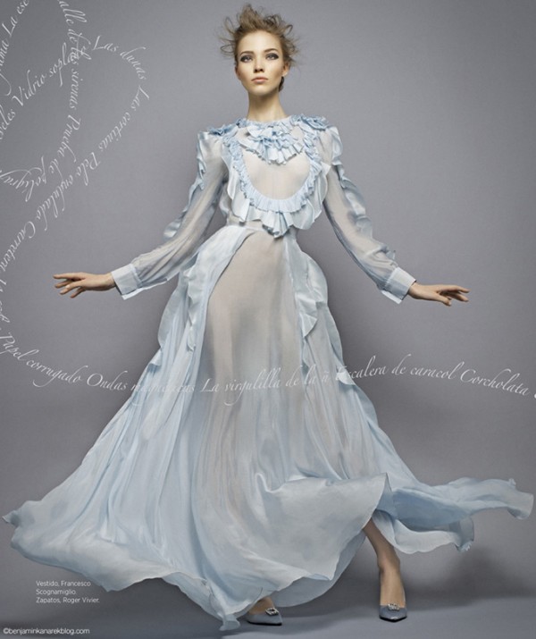
| 1:20p | Model–Sasha Luss
Sasha Luss is a professional Russian fashion model who started modelling in 2007 but her career realy took off when she walked for some of the big names in Paris during the S/S 13 haute couture season. She Appears in Russian Vogue editorial, and a fashion magazine Harper’s Bazaar. |
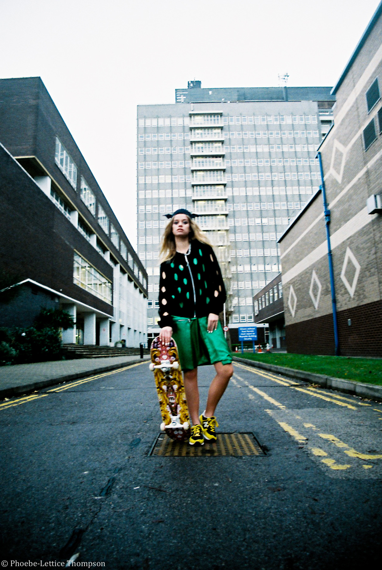
| 1:22p | Phoebe Lettice
Phoebe Lettice is a London based photographer and fashion assistant at Conde Nast Publications. There is not too much photography by her, but it’s definitely worth to take a look at. The photographs are kept pretty basics, but she manages to create interesting subtle vibes in every one of them. See for yourself. See much more of her work at WhiteLies Magazine (whiteliesmag.com)
|
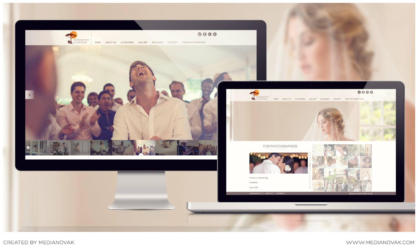
| 1:31p | Photography Site Design | 5 Mistakes Photographers Make Starting a Business Site (along with example
Have you taken the time to develop a brand that uniquely identifies you and your business? You don’t have to be a marketing expert to know that your logo and brand should be consistent. As a photographer, you’re selling yourself. You’re the main product. Potential clients are buying into you and your skills. This starts with your website. Follow the Link to Read the Whole Article!
|
| 1:47p | |
| 1:52p | |
| 1:53p | ZiniDesign – Black Snake – FREE SHIPPING
Get FREE SHIPPING on our collection of products >>>> CLICK HERE. |
| 2:00p | Kempart Loft by Dethier Architectures An abandoned industrial bakery located in Liège, Belgium was turned into original modern loft apartment for a couple with no children. |
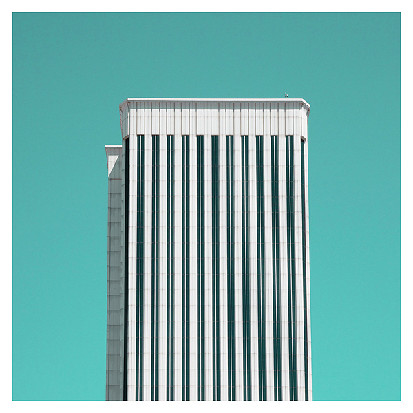
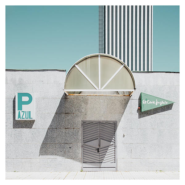
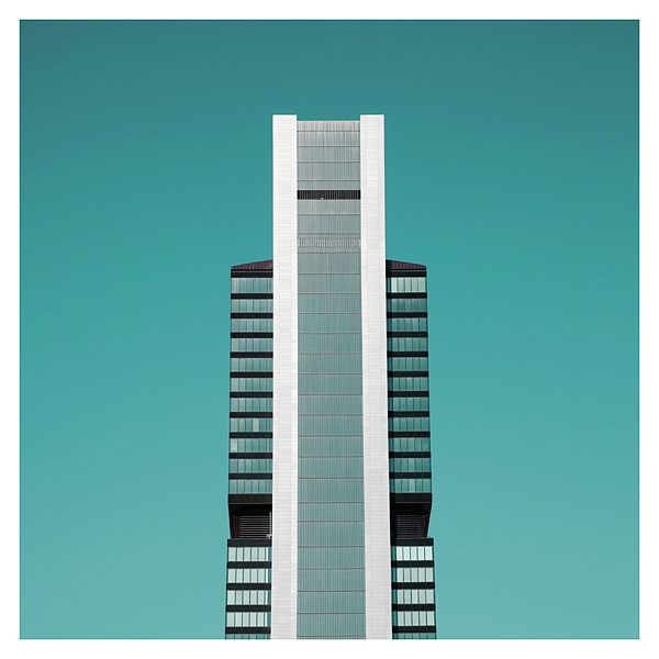
| 2:02p | Reflexiones by Matthias Heiderich Examples of contemporary architecture in the cities of Madrid, Santiago de Compostela, Avilés, Bilbao. |
| 2:04p | Original Illustrations by Valérie Bastille Canadian illustrator Valérie Bastille has always been drawing, but started being serious about it five years ago. She took various drawing classes and studied 2D Animation at the Cegep du Vieux Montreal and Illustration & Design at Dawson College. Let’s take a look at her artworks! |
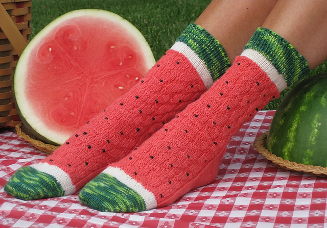
| 2:08p | Watermelon Slice Socks
On Ravelry, knitter Wendy Gaal has made her pattern for Watermelon Slice Socks available to purchase.
|
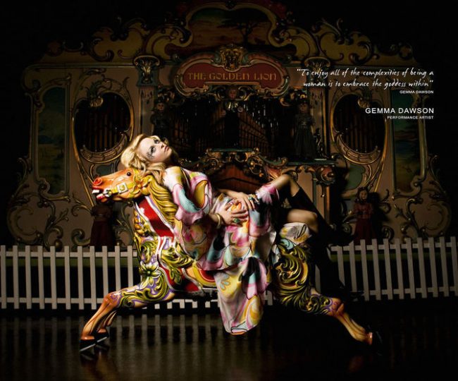
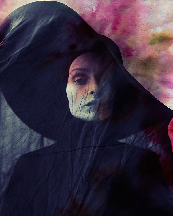
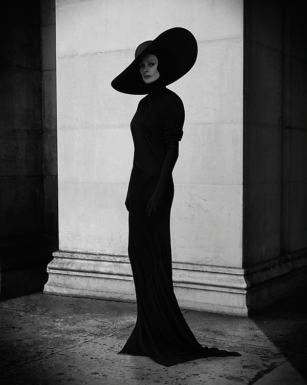
| 2:08p | Glamour Photography by Alexia Sinclair Alexia Sinclair is an award winning Australian Fine Art photographer and digital artist. Her distinct style is easily recognisable and highly original. via Photography Blogs.
|
| 2:21p | 10 Amazing Adventure Gadgets for the Great Outdoors
|
| 2:41p | Photography by Paul Allen Beautiful photographs by Paul Allen, musician singer song writer; plays guitar, bass, mandolin; an talented semi-professional photographer based in Dunedin, New Zealand. via Photography Blogs.
|
| 2:46p | Grunge Era Game of Thrones Characters by Mike Wrobel
|
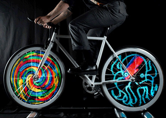
| 2:46p | Motion Activated LED Graphic Light Display for Bicycle Wheels
|
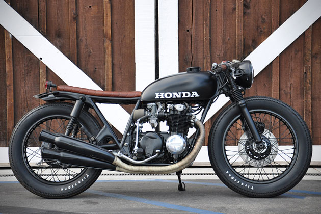
| 2:46p | Seaweed & Gravel: Custom Honda CB550 Motorycle
|
| 2:46p | MP3 Player Made For Underwater Swimming
|
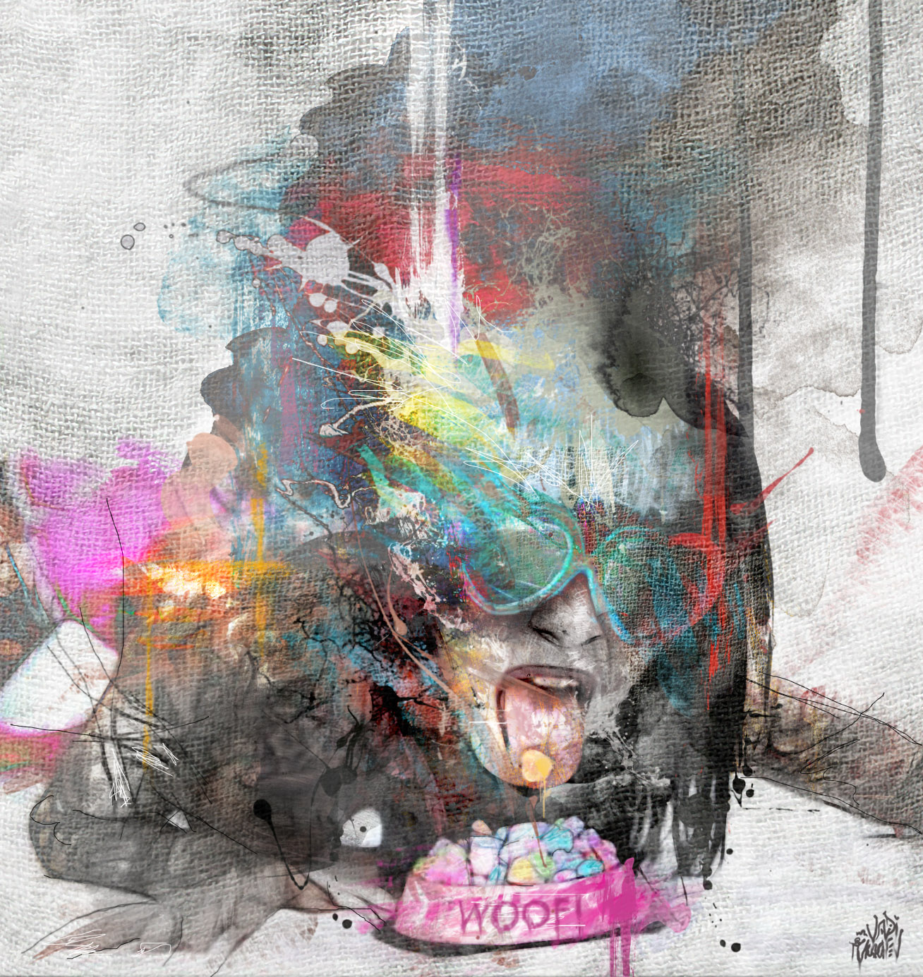
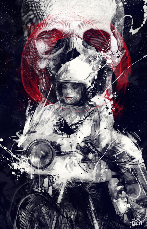
| 2:56p | Staggering Illustrations by Vadi Tkachev Vadi Tkachev is a Russian artist, designer, and illustrator from Moscow. I’m absolutely in love with his creative chaos paintings, which are created using acrylic, ink, spray paint, and markers. Each painting is loaded with hidden gems to grab your attention. If you stare long enough, you’ll start to notice more elements which you might have missed before. We hope you’ll enjoy his staggering work!
See the rest illustrations here! |
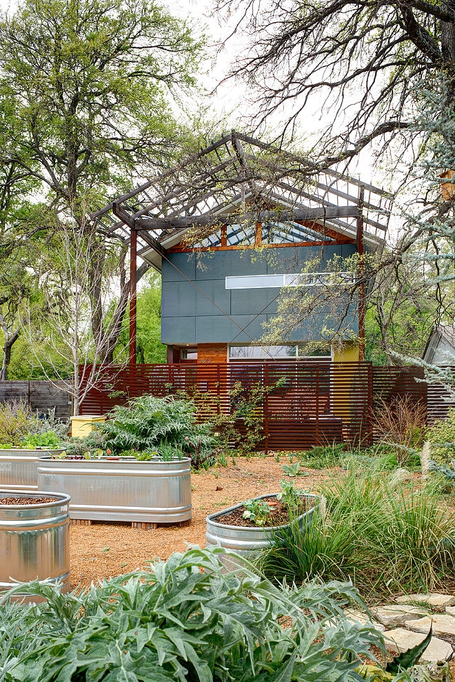
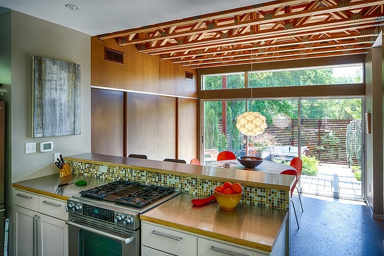
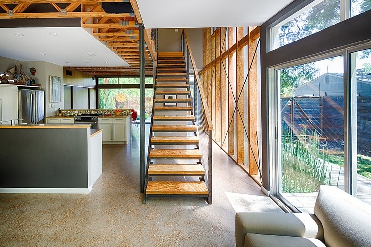
| 3:00p | Groveland House by A.GRUPPO Architects This small house, on a typical 50′x150′ lot in East Dallas was conceived of as way to facilitate a connection to the site. The client was an avid gardener and challenged us with problem of how to live on the entire site. This desire, coupled with a modest budget, necessitated a small footprint. At 1600 sf the house lives much larger than that due to it’s connection to the outdoors and the thoughtful use of natural light. |
| 3:02p | |
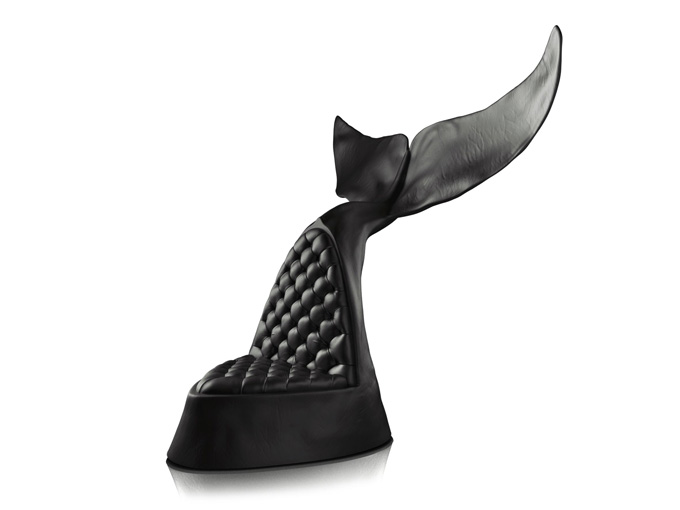
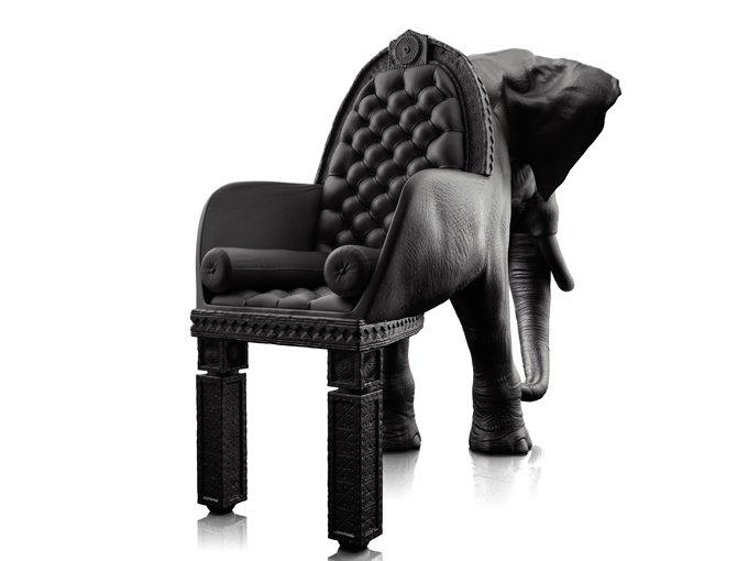
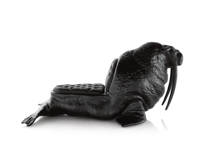
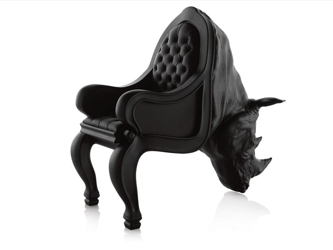
| 3:04p | Limited Edition Animal Chairs by Maximo Riera Born in Asturias, Northern Spain, Maximo Riera has been a practicing artist for over thirty years. Maximo has now retired from his professional life in the medical industry, and dedicates his full-time to his imagination. He spends almost every day painting and sculpting in his studio. His latest project is the Animal Chair collection. “Each chair retains the animal’s natural vitality whilst being totally biological accurate in their appearance. This collection is homage to these animals and the whole animal kingdom which inhabits our planet, as an attempt to reflect and capture the beauty of nature in each living thing.” – Maximo Riera
|
| 3:15p | |
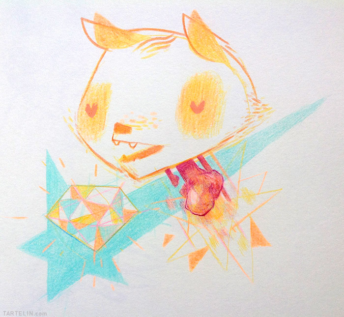
| 3:21p | color pencils Illustrations 2013
illustrations by Stephane Tartelin |
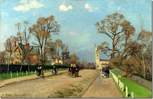
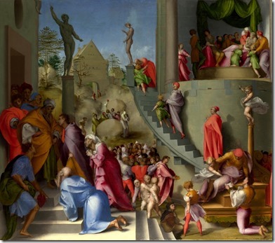
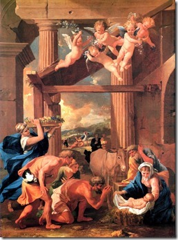
| 3:26p | HD collection of classical paintings from European artists Part 2 In this post, we continue to explore the European paintings from many well-known artists such as Camille Pissarro, an Impressionist and Neo-Impressionist painter; Nicolas Poussin, the leading painter of the classical French Baroque style or Andrea Previtali, an Italian painter of the Renaissance period … They represent for various kinds of art style in the medieval age at Euro. Many of them have give a lot of inspiration for the modern artists nowadays. The Avenue, Sydenham by Camille Pissarro
Joseph in Egypt by Jacopo Pontormo
The Adoration of the Shepherds by Nicolas Poussin
More classical paintings from European artists here. |
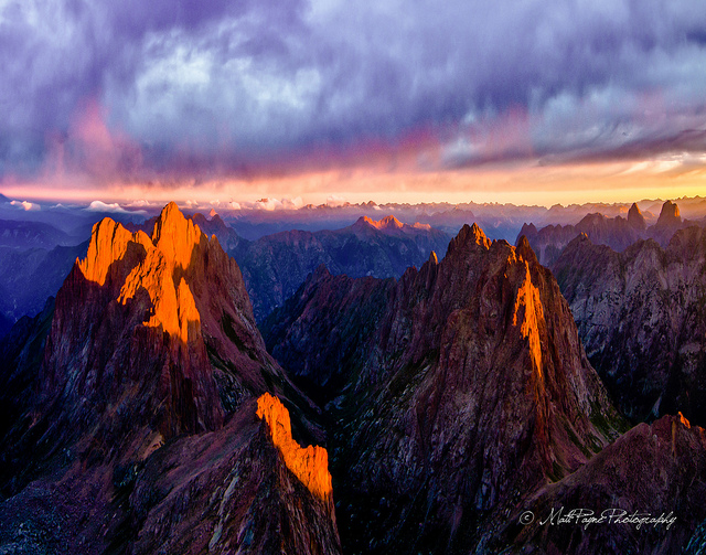
| 3:29p | Landscape Photography by Matt Payne Beautiful nature landscapes by Matt Payne, photographer, non-profit director, father, husband and mountaineer who offers freelance photography services from Colorado Springs, Colorado. via Photography Blogs.
|
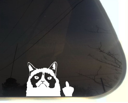
| 3:30p | Grumpy Cat Car Decal
Have Grumpy Cat wave her hand from the back of your car at oncoming traffic. Check out where you can buy it. |
| 4:00p | Armadale Residence by Canny Elegant two-storey single family residence designed by Canny located in the city of Armadale, Australia. |
| 4:02p | Tech Based Marketing For Businesses Marketers today are facing constant new challenges about how to get their message across to the public. The old traditions of marketing are no longer effective for all businesses. Even businesses that are able to use traditional marketing methods well are also looking for innovative new techniques. Despite all of these challenges, there are a lot of new channels open in the tech world that you can use to market your business. With marketing potential existing in social media, mobile devices, and new tools like geo-targeting, there are endless opportunities available and possible. |
| 4:02p | REMEMBER 68 by Kenyon Manchego Marque de prêt-à-porter REMEMBER 68 |
| 4:02p | |
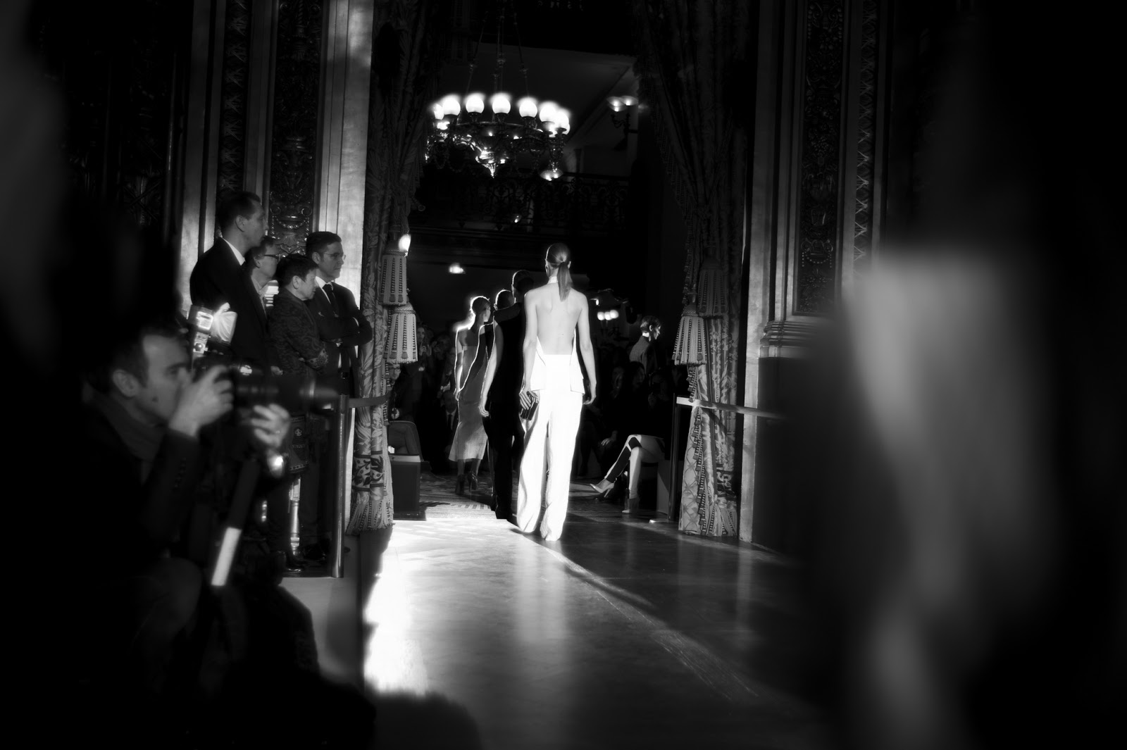
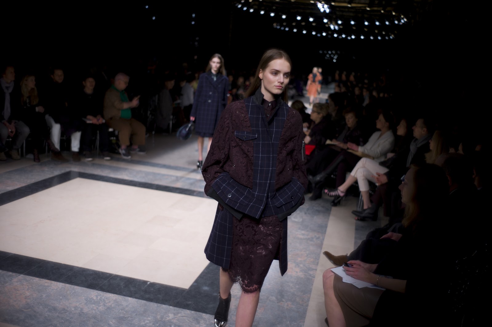
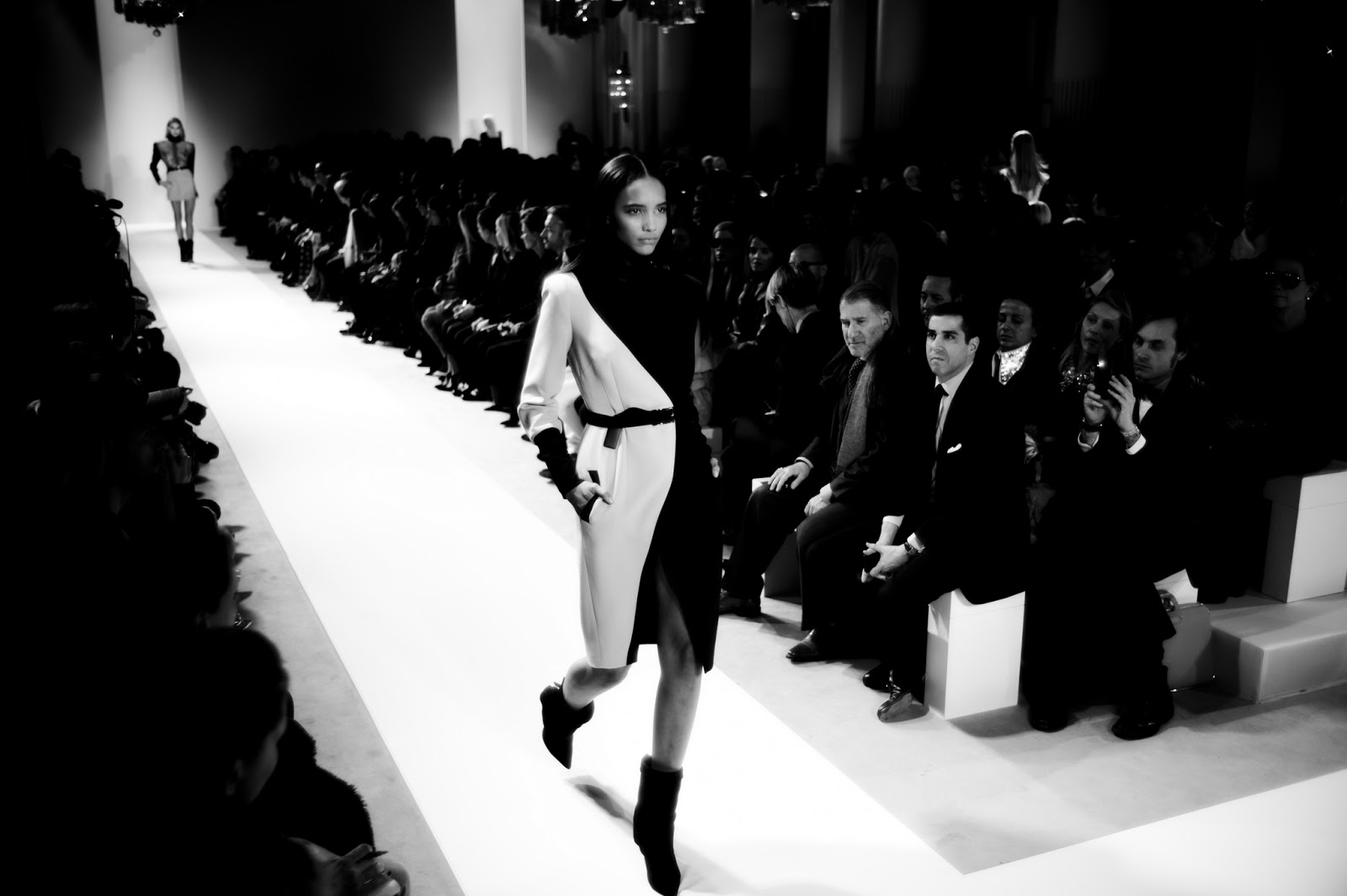
| 4:10p | Relive PFW A/W 2013 with Skylar Williams – Day 6: Paco Rabanne, Stella McCartney
Relive Paris Fashion Week AW 2013 through the lense of Las Vegas based photographer Skylar Williams. Every day for one week we are presenting you his coverage of one day of PFW. The sixth day features the shows of Ungaro, Sacai, Paco Rabanne and Stella McCartney . Look out for a new spread featuring Chanel, Zadig & Voltaire and many more tomorrow. See all the pictures (50+) on WhiteLies Magazine (whiteliesmag.com)
|
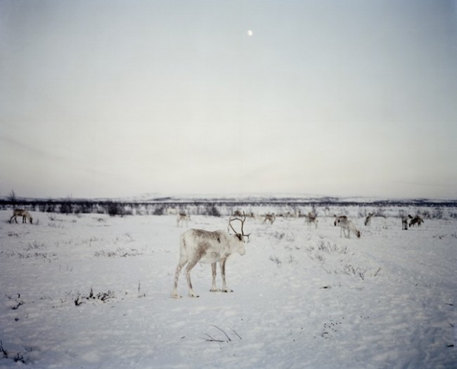
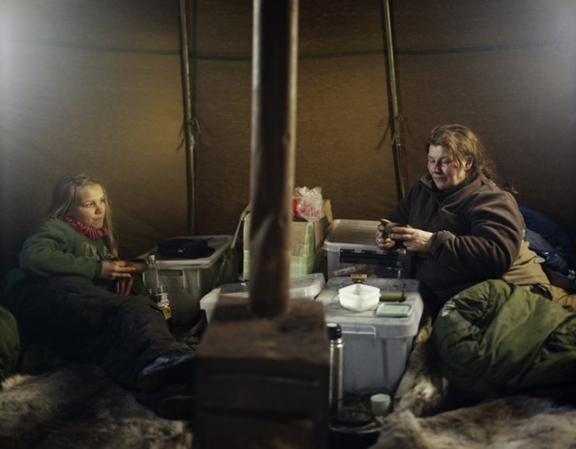
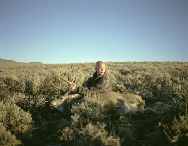
| 4:12p | Photography by Erika Larsen Erika Larsen’s work uses photography, video and writing to learn intimately about cultures that maintain strong connections with nature. via PhotoHab.
|
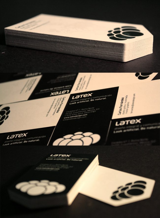
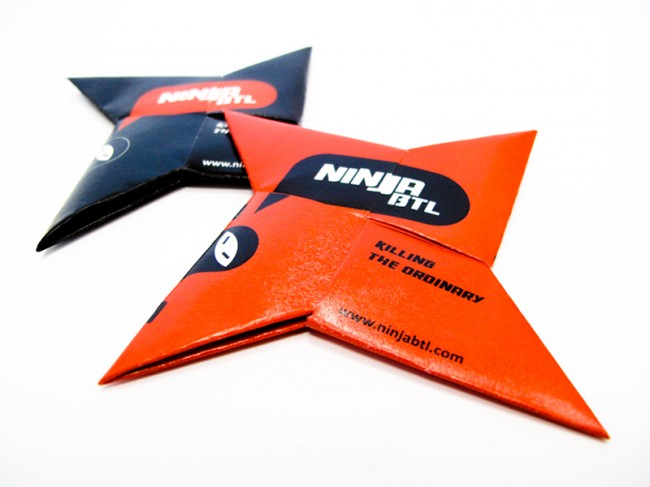
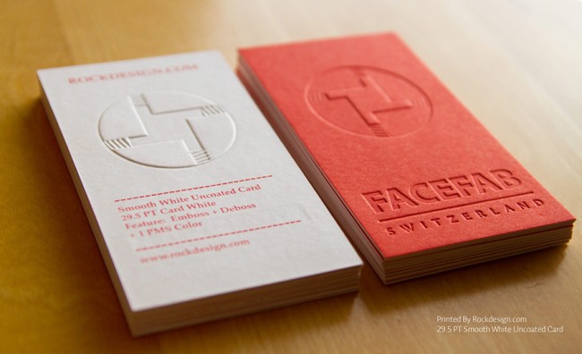
| 4:39p | Examples of Creative Business Card Ideas If you lack the inspiration to design your business cards, then you might want to check out these really cool and awesome business cards from the list below. They come in different colours, shapes and styles. Thus, you just have to combine some details from here and there and you should have something in less than an hour. Get Inspired and Get Started! See All Creative Business Cards » |
| 4:49p | Alessandra Branca It’s easy to be familiar with Alessandra Branca’s trademark secret and her definitive usage of red and yellow. Her style is always rich with color, gorgeous fabrics and strong architectural design elements. Together all the surrounding elements create comfortable and elegant spaces. More in Best Interior Designers Blog |
| 4:56p | Photography by Matthew Mahon Matthew Mahon’s vibrant images leap off the page and have a 21st century awareness, combining elements of irony with a postmodern sensibility. via Photography Blogs.
|
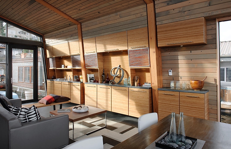
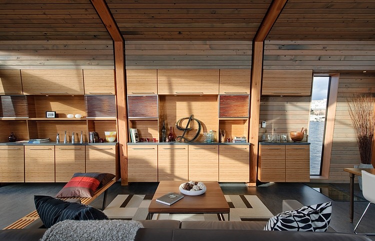
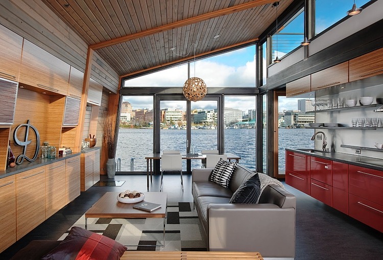
| 5:00p | Seattle Floating Home by Dyna Contracting Ryan Mankoski of Ninebark Design Build and Dyna Contracting collaborated to create a floating residence featuring cohesive design with an open layout. The result has two glass sides wide open to spectacular views of bay waters, the University of Washington and the mountains beyond. |
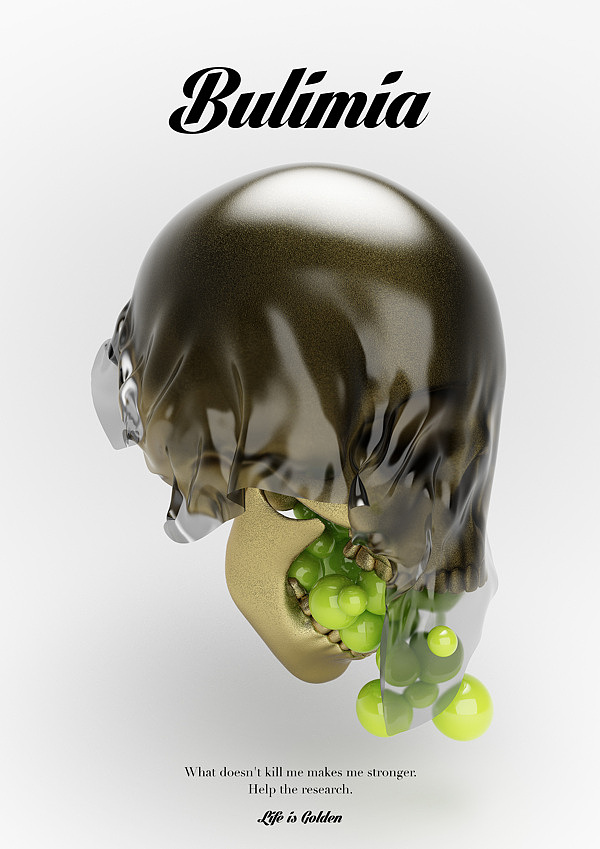
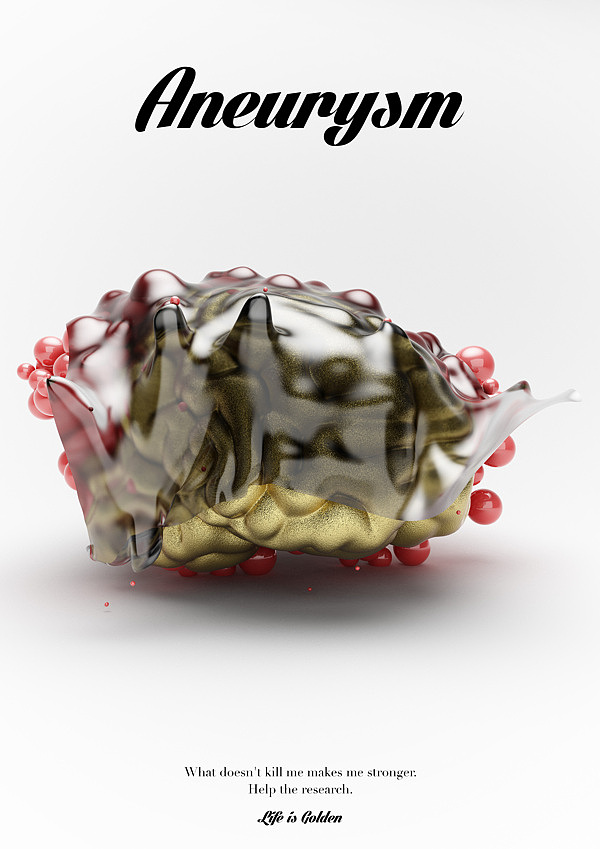
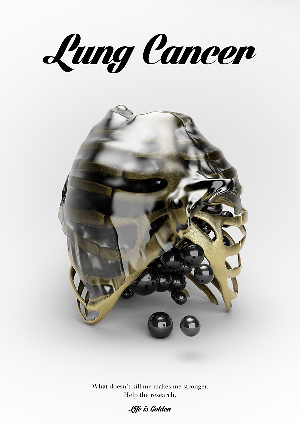
| 5:02p | Disease – Life is Golden Breathtaking 3d digital artworks by Matteo Gallinelli and Giuliano Antonio Lo Re. Enjoy! |
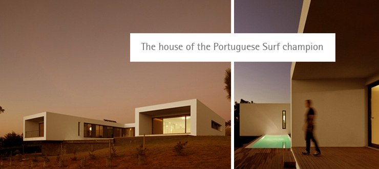
| 5:04p | The house of the Portuguese Surf champion Ericeira, a World Surfing Reserve, was designed for José Gregório three times national Surf champion and a well known big wave rider, his wife and two daughters. This 300 Square meter house was design by the portuguese architect Jorge Graça Costa, it occupies a big lot surrounded by a dense mesh of trees, on top of a hill overlooking Saint Lorenzo Bay. The mutual interest in sustainability didn’t keep us from wholeheartedly embracing modern design. The goal was to avoid green pronouncements, allowing to achieve ascetics and exciting architecture solutions, instead of designing a building fully controlled by superfluous green technologies and merely aggregating raw materials. More in Portugal Brands Blog |
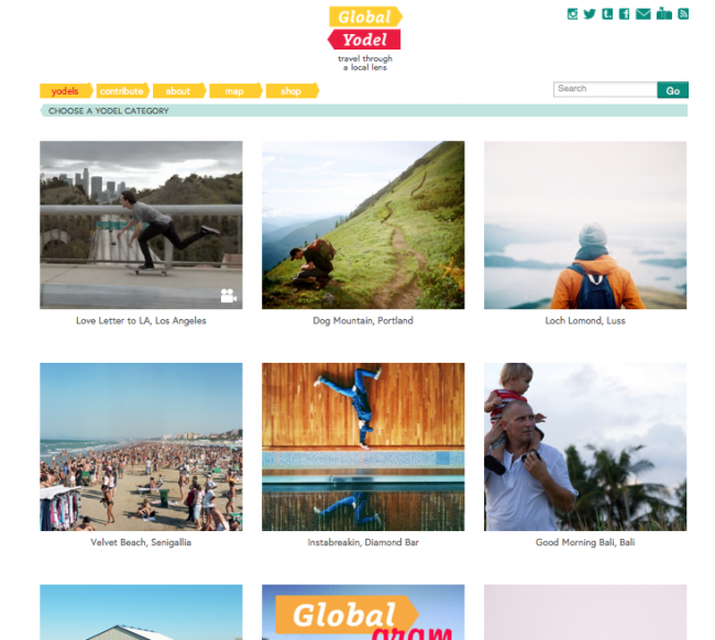
| 5:05p | Global Yodel Launches a New Website After a year in the making Global Yodel launches a new website. The new site features some slick UI/UX design and an amazing lineup of photographers, filmmakers, designers, and writers. Check it out! www.GlobalYodel.com |
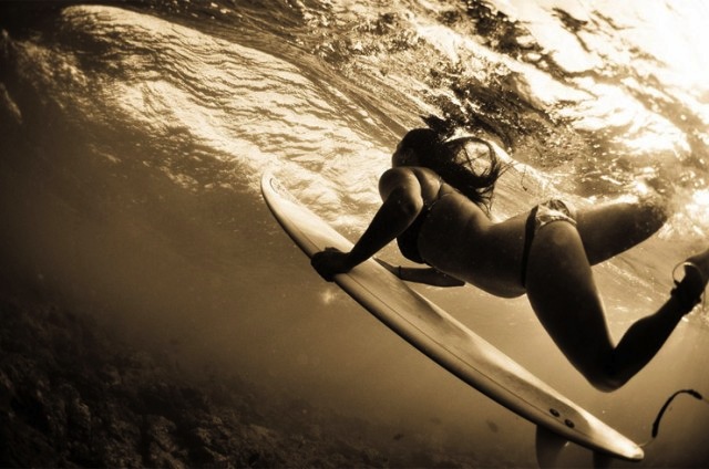
| 5:10p | Underwater Photography by Micah Camara
Underwater Photography by Micah Camara – a 20-years-old photographer from Lihue, Hawaii.
|
| 5:13p | |
| 5:23p | Mary Kay: Landscape Photography “I was born and raised on a little Greek island and my earliest and most precious memories are of long days at rocky, isolated beaches and expeditions exploring the few woods of the island.A camera never accompanied me during those moments though. Photography came much later on in my life and changed it forever. In the summer of 2008 my companion, himself a dedicated landscape photographer, taught me the basics of photography and in doing so he opened a door to a whole new way of seeing and appreciating the world around me, a new philosophy and way of life. I realized that up till then I merely glanced and never noticed, never fully grasped nature’s beauty and meaning and its healing effect.” – Mary Kay MORE PHOTOS: —> [LINK] |
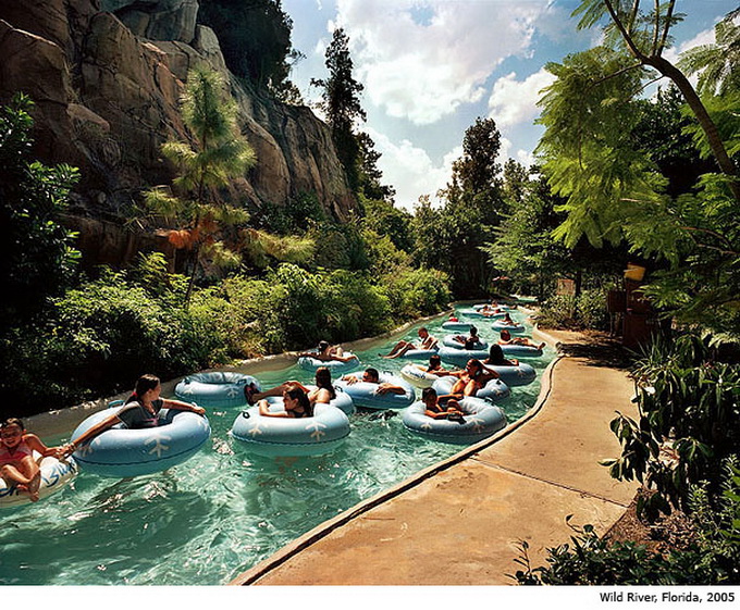
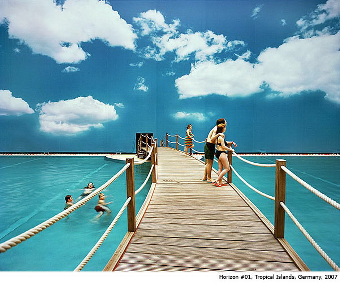
| 5:27p | Reiner Riedler’s Fake Holidays Series Austrian photographer Reiner Riedler created a series of «Fake Holidays», in which the combined actual landscapes with fictional situations, associated with recreation and holidays. MORE PHOTOS: —> [LINK] |
| 5:58p | Brownsville, Brooklyn, New York – travel through a local lens GLOBAL YODEL – because your home is someone else’s destination |
| 6:00p | |
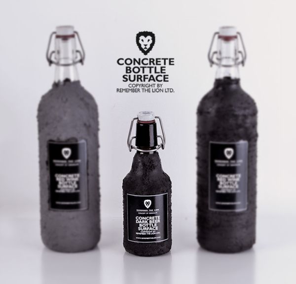
| 6:08p | Beer glass bottles with solid concrete layers
Concrete it seems has finally made its foray as a credible material used for home decor items. Previously we have come across pendant lamps and ping-pong tables made from this sturdy composition. And, now we remarkably have beer bottles coated with layers of ‘left-over’ concrete. In a startling turn of events, Hungarian design team Remember The Lion stumbled across this novelty of product design, when they dipped their beer bottles in surplus concrete during a house renovation project! |
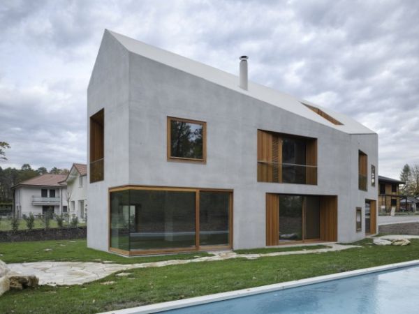
| 6:09p | Two in One house – A geometric wonder encased in minimalist skin
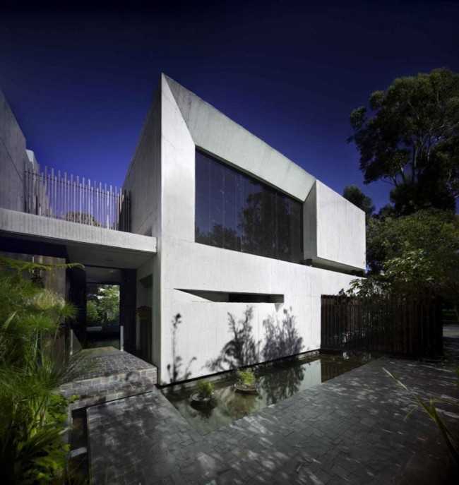
Now, if we ask – what strikes you about the above pictured building, the bulk of the answers would relate to the oddly minimalist facades of the structure. However, in truth, the most unique feature of the building is its circulation credentials as opposed to its post-modernist aesthetics. Christened as the ‘Two in One house’, the structure (designed by Clavienrossier Architectes) is located in the outskirts of Geneva, Switzerland. And, as can be somewhat comprehended from its name, the house remarkably integrates two separate apartments of differing size, segregated by a large contiguous wall. |
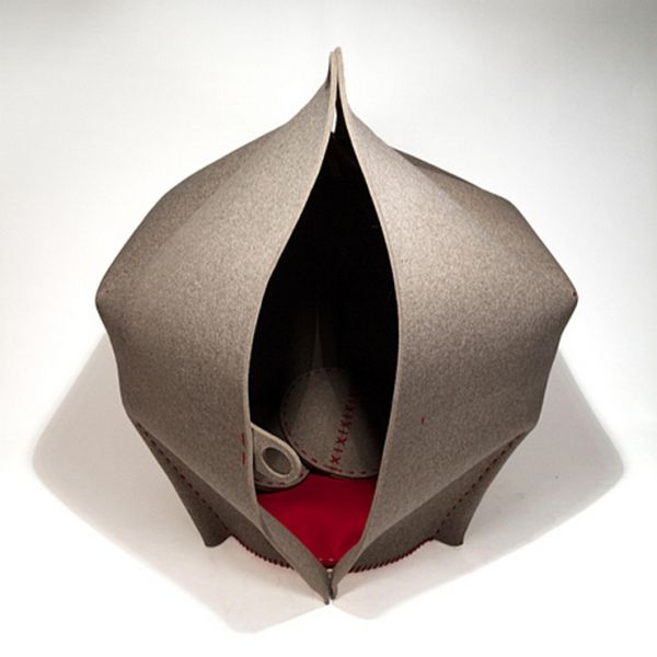
| 6:10p | Freyja Sewell’s HUSH – A private resting pod for public areas
When it comes to public places like an airport or an office, the essence of a personal space is lost among the ‘common area’ retreats like a waiting room or a canteen area. The aptly named ‘HUSH’ (by Freyja Sewell) has been envisaged for such zones, where you can enjoy your solitude and rest in a safely enclosed space free from outside circulation. Comprising of a felt pod which is entirely composed of biodegradable materials, the form of the design resembles a mini-tent with a singular access point. This entrance ‘gap’ stretches from top to bottom, thus making the HUSH a semi-private pod with easy connection to the surrounding space. |
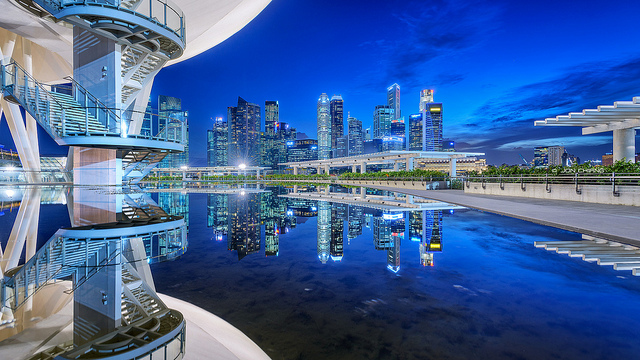
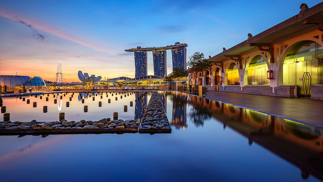
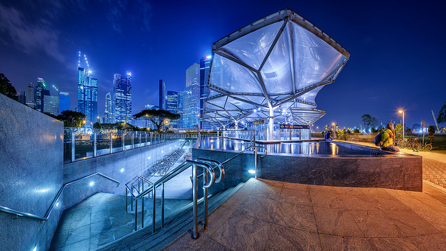
| 6:13p | Urban Architecture Photography by Jon Chiang Creative cityscapes by Jon Chiang talented urban photographer from Singapore. via Photography Hubs and BLogs.
|
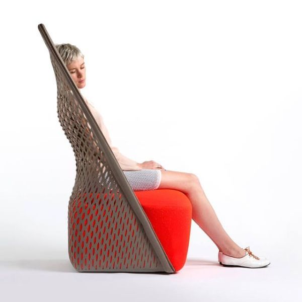
| 6:18p | Cradle chair: A unique lounge chair by Benjamin Hubert
Recently we discussed about the membrane chair, which was one of the elegant furniture designs created by the talented British designer Benjamin Hubert. This chair was an Eco design lounge chair that made use of industrial materials in its construction and was unveiled at the Milan Design Week 2013. Another of his magnificent designs, the Cradle Chair, also got the opportunity to be showcased at Salone Del Mobile 2013. He collaborated with Italian furniture brand Moroso to create this minimalist lounge chair. This lovely design intermingles two variant classifications of seating. One of which is a net structured hammock and the other one is a traditional upholstered chair . |
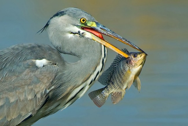
| 6:32p | Beautiful Birds Collections
Beautiful collection of birds taken at a perfect timing in photography blog incredible snaps.
|
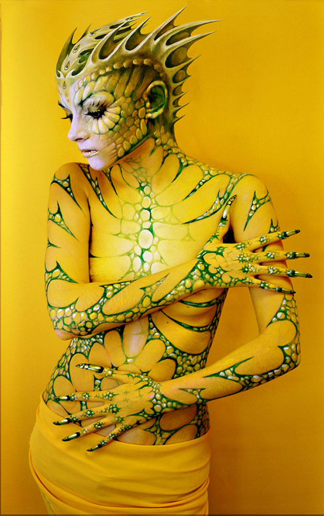
| 6:41p | Beautiful Body Painting Today here are some of the best breath taking body painting artwork is collected in our showcase for you.
|
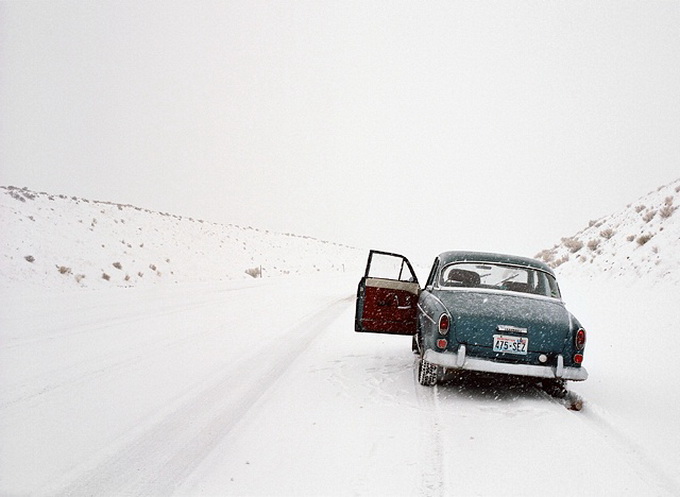
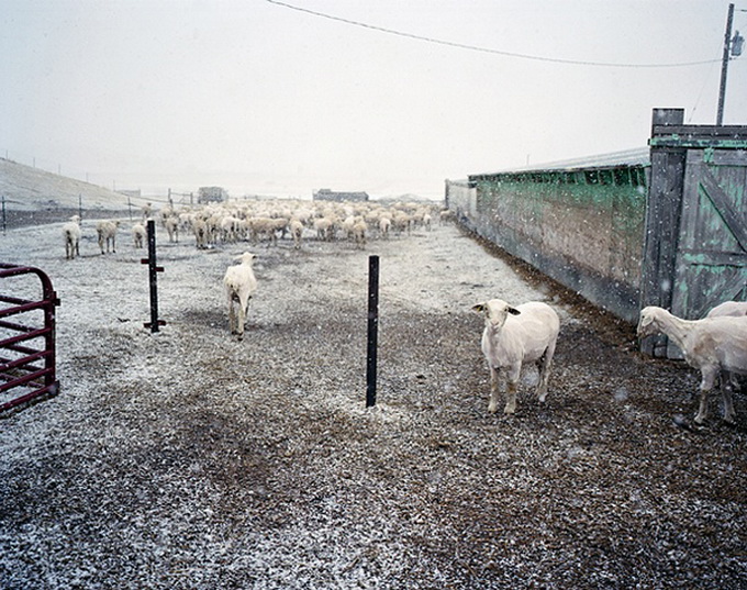
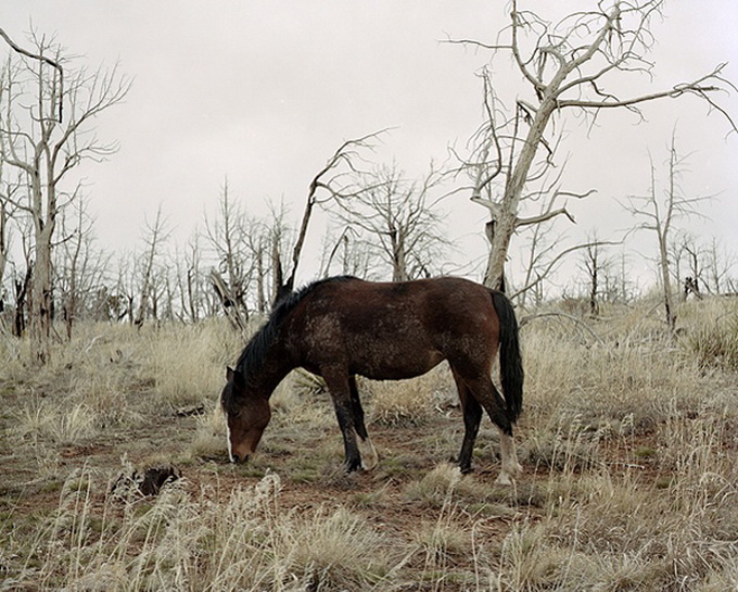
| 6:55p | Nich Hance McElroy Photography Photographer Nicholas Hance McElroy finds the most distant corners of North America to create beautiful images. MORE PHOTOS: —> [LINK] |
| 7:01p | |
| 7:01p | Awesome Paintings by Inna Vjuzhanina
Inna Vjuzhanina well know painter in ukraine. His works are amazing and very realistic.
|
| 7:04p | Quote a Bluth The long-awaited premiere of Arrested Development’s fourth season graced our senses this past Sunday, more than six years after the show was cancelled because of dwindling ratings. Fans of the show have rabidly declared their love of the show in the form of memes, gifs, and random quotes -across every social network conceivable. Since the show’s departure. Fans now have the ability to enjoy a brand new fourth season of the beloved Bluth family. To jog your memory, take a look back at some of the funniest quotes from the first three seasons of the show in this Quote a Bluth interactive created by Column Five. |
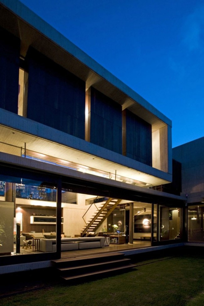
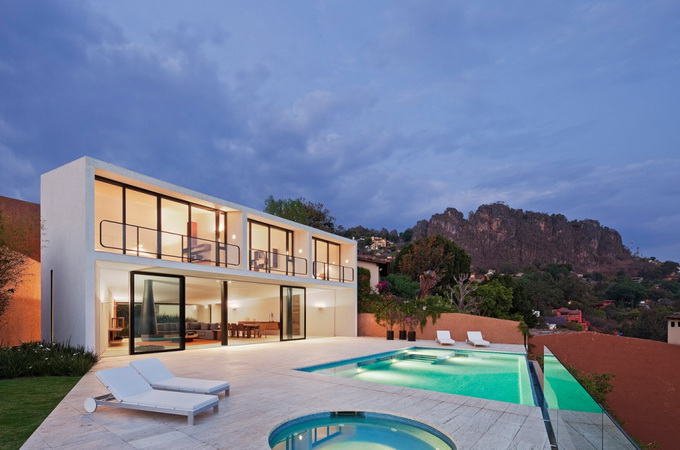
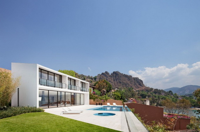
| 7:15p | Casa Cardenas in Mexico Casa Cardenas is a contemporary residence designed by Parque Humano and located in Valle de Bravo, Mexico. Its exterior appearance and floor to ceiling windows allow the project to integrate well in its landscape. MORE PHOTOS: —> [LINK] |
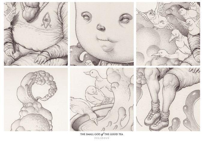
| 7:20p | Amazingly Stylish Illustrations by Felideus Bubastis Spanish illustrator Felideus Bubastis working towards the surreal tale. Author of Madrid. Engaged in graphic design, animation and scripting. MORE PHOTOS: —> [LINK] |
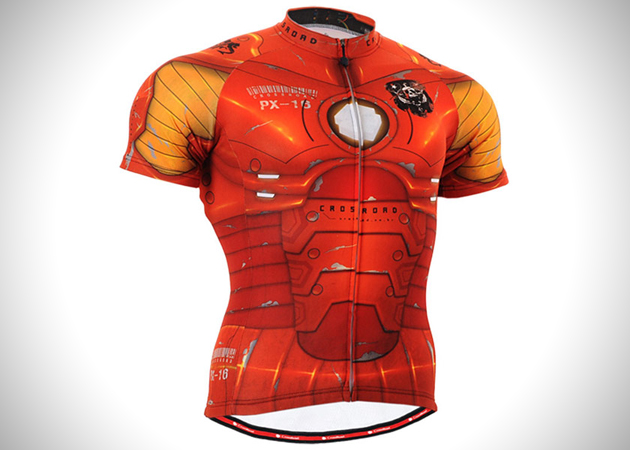
| 7:23p | Short Sleeved Iron Man Jersey for Cycling
|
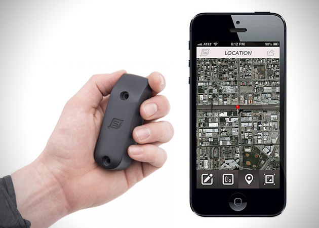
| 7:23p | Recover Stolen Bikes with BikeSpike
|
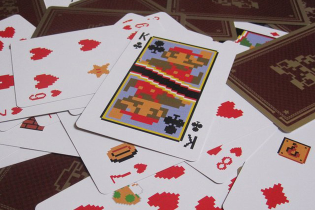
| 7:23p | Old School Mario Playing Cards
|
| 7:23p | Lightweight Packable Kammok Hammock
|
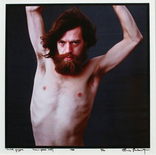
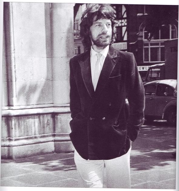
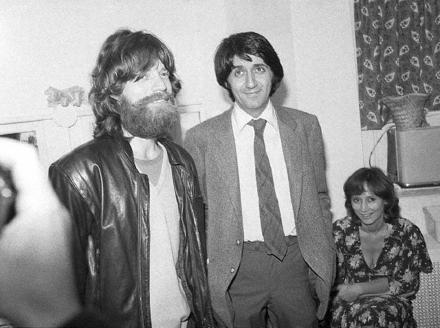
| 7:35p | Mick Jagger with Full Beard in 1970s Awesome photos of Mick Jagger with full beard in 1970s More at vintag.es |
| 7:49p | Interior Photography by Preston Mack Preston Mack is a professional photographer based in Orlando, Florida. His portraiture has appeared in publications such as People, Reader’s Digest, Sports Illustrated, Forbes and ESPN The Magazine. via Photography Blogs.
|
| 8:01p | |
| 8:17p | Doctor Jimenez, brand & Identity design by Pedro Espino Brand & Identity design for Doctor Jiménez, a spanish rheumatologist. Pedro Espino is an art director and multi-disciplined graphic designer based in Málaga, Spain. See more at Behance |
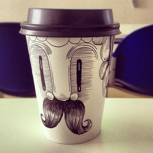
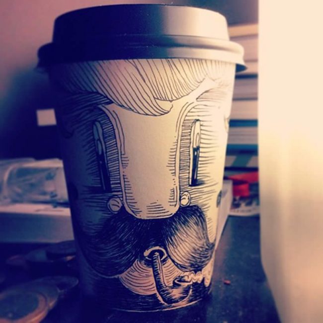
| 8:36p | Mr. Moustache
Chilean illustrator Kartess has named this furry-mouth guy, “Senor Vaso.” Drawing on coffee cups has also been trendy among artists such as Brock Davis, Cheeming Boey, and Tomoko Shintani.
(Photos © Kartess) View more at Illusion |
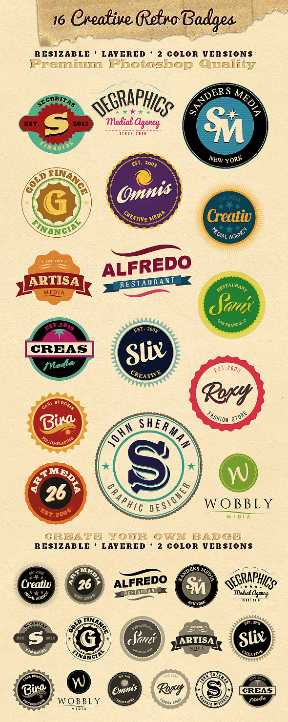
| 8:40p | Cool stuff for web and print designers Cool templates and mock-ups for graphic desiners. Enjoy ;) Toy Bricks Photoshop Actions Photorealistic Logo Mock-Up Vol.1 14 Modern Marketing Badges 3D Wall Photo Mock-Ups 1 16 Resizable Retro Badges |
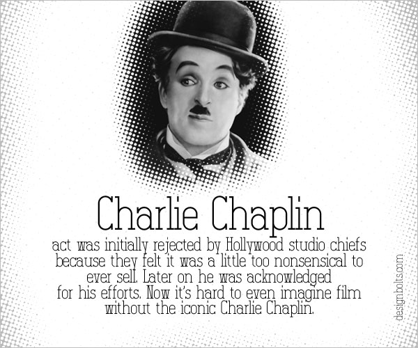
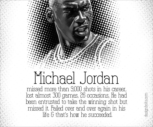
| 8:46p | Famous Failures of the Most Famous & Successful Personalities
What drives us crazy is actually a driving force that fetches us forward to the goals we… |
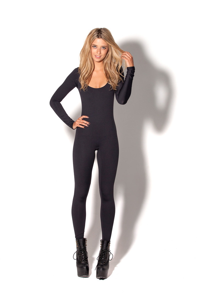
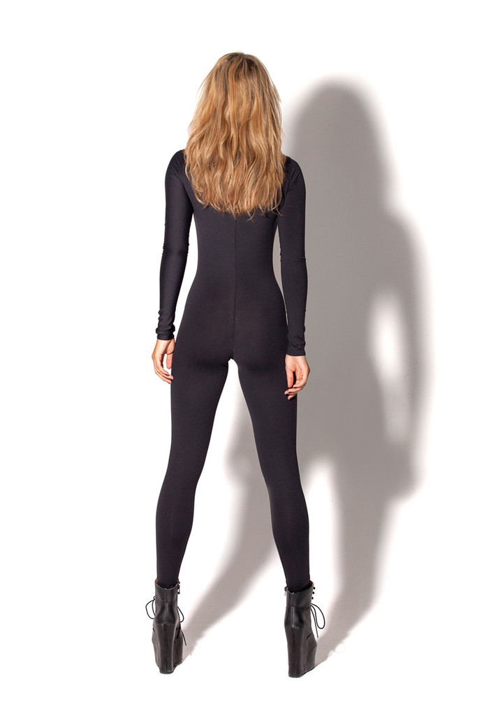
| 9:04p | New Matte Black Long Sleeve Catsuit This is a fantastic fabric that I know you are going to love. We spent a long time looking for a matte fabric that we could use for our clothes, and we found it. These are pieces that I think girls are going to be wearing VERY often. |
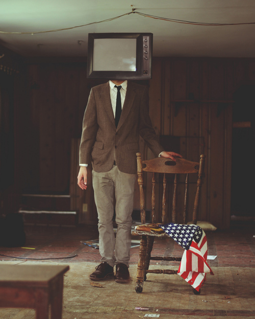
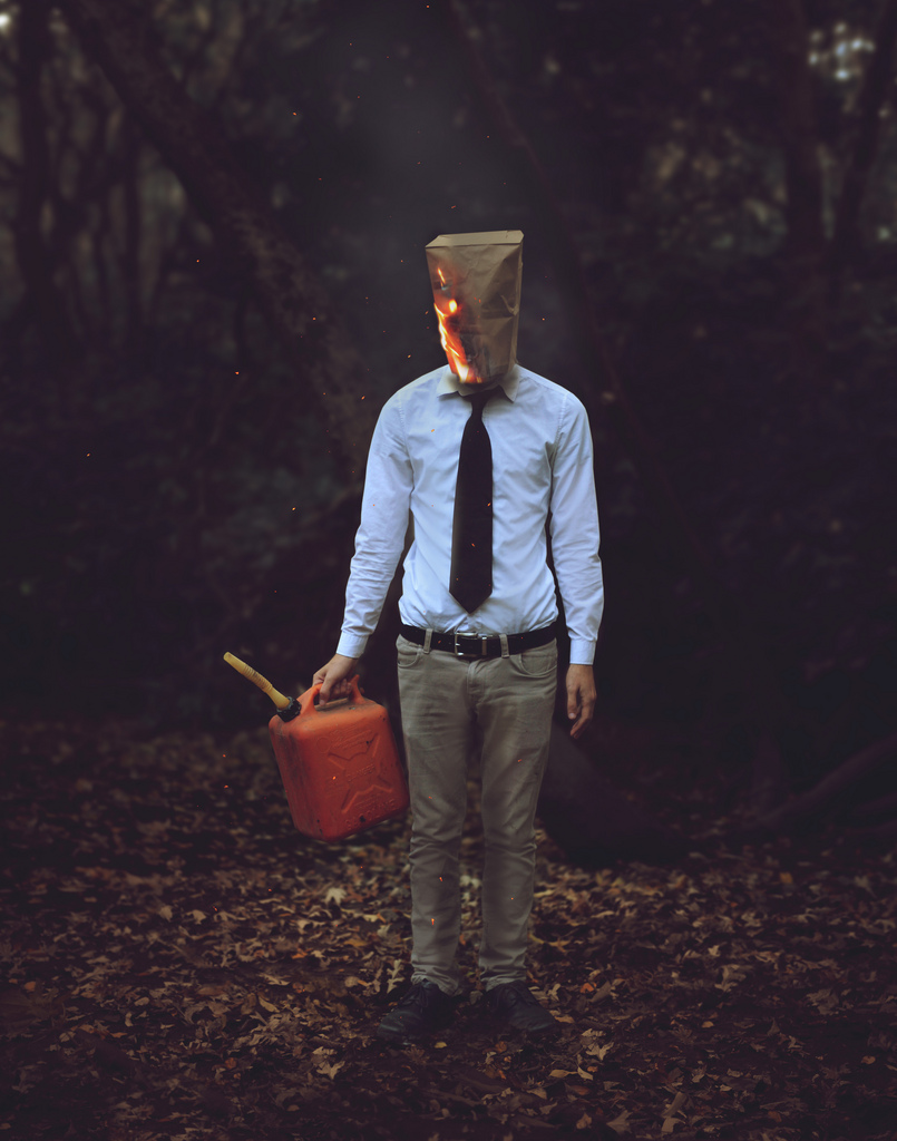
| 9:50p | Kyle Thompson
Kyle Thompson – 20 year old photographer from Chicago. “I use a Canon 60D with a 50mm 1.8 lens. I also use a remote timer and a tripod. ”
Like us on Facebook to stay tuned |
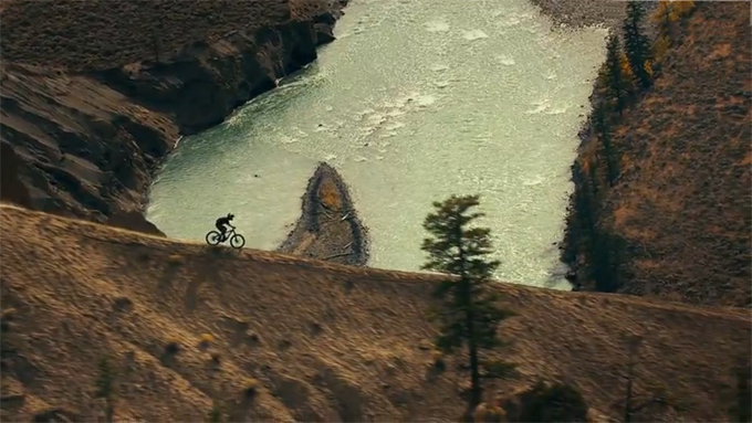
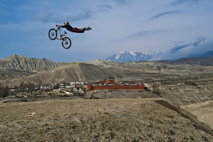
| 10:08p | Where the Trail Ends
21 the film will be released in theaters, Where the Trail Ends, dedicated to mountain riding, and sponsored by Red Bull. The film is full of dynamic and exciting species.
MORE PHOTOS HERE: —> [LINK] |
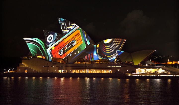
| 10:38p | Magnificent Light Projection on the Sydney Opera House
|
| << Previous Day |
2013/05/29 [Calendar] |
Next Day >> |
