[Most Recent Entries] [Calendar View] [Friends View]
Tuesday, June 11th, 2013
| Time | Event |
| 12:00a | |
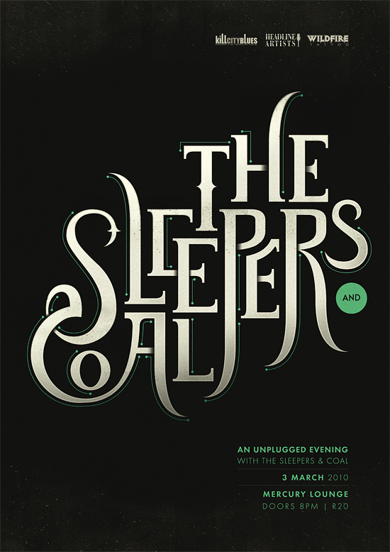
| 12:53a | 40 Cool and Inspiring Typography Designs
|
| 1:39a | |
| 2:40a | |
| 3:48a | Samsung Galaxy Tab 3 10.1 and 4th-gen iPad
We’re all familiar with the smartphone rivalry between Apple and Samsung. And though the two companies also sell competing tablets, things aren’t quite the same on that end. |
| 4:00a | “Life Available for a Limited Time Only” iPad Pillow by WORDS BRAND™
NEW WORDS BRAND™ Life* iPad Cases at Society6 + FREE WORLDWIDE SHIPPING through Sunday. Also includes our Society6 Art Prints, Tote Bags, Hoodies and iPhone Cases. Life* Design on t-shirts designs on T-Shirts in the WORDS BRAND™ US Store and EU Store. |
| 5:35a | Ribbon Laundry Basket
A basket made of a durable material with an unique weaving method. The big capacity is perfect for organizing your belongings and laundry. milkdesignshop.bigcartel.com/product/rib
|
| 5:38a | Top Tips For Short Filmmakers
|
| 5:58a | Illustrations by Angela Rizza
Angela Rizza is a freelancing illustrator based in New York. She graduated with her BFA in 2011 from the Fashion Institute of Technology and loves illustrating narrative works and characters. She is obsessed with birds and wants to live in a dome house filled with succulent plants. |
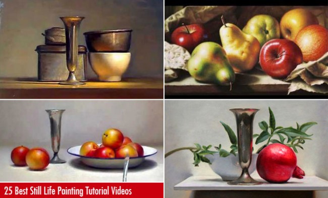
| 5:59a | 25 Best Still Life Painting Tutorial Videos – Learn from the Masters
|
| 5:59a | 30 Mind-Blowing Reflection Photography examples and Tips for beginners
|
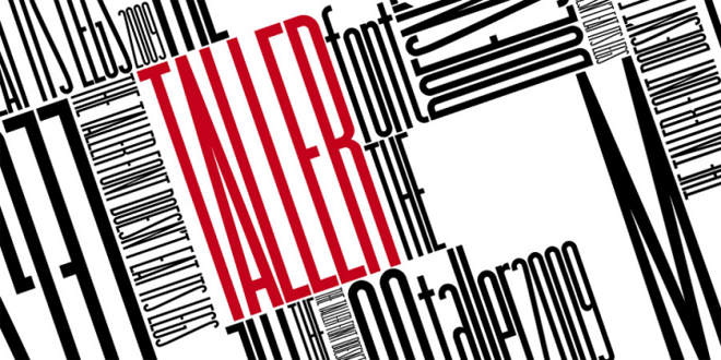
| 6:00a | 23 Free Professional Fonts for Graphic & web Designers – Download Now
|
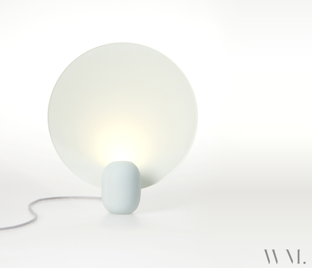
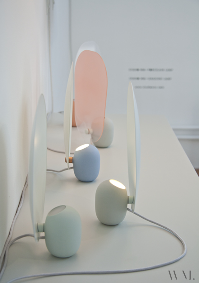
| 6:23a | Table lamps by WM. Gradient and Reflector, the two table lamps ispired to vintage oil lamps created by the Dutch Studio WM. Via THEmag.it |
| 7:32a | Affordable and Inspiring Traditional Art
|
| 7:34a | |
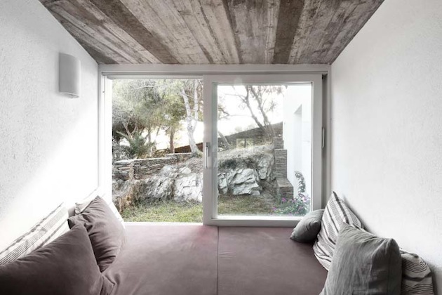
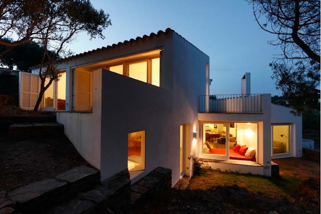
| 7:34a | Spanish Home Amongst Olive Trees
|
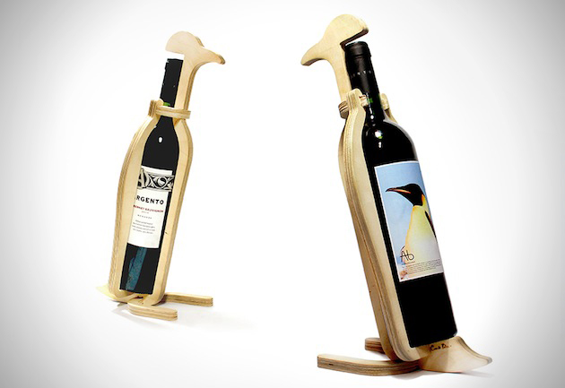
| 7:36a | Plywood Wine Animals
|
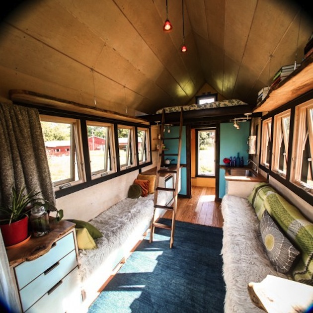
| 7:38a | A Tiny Home Crafted For Travel
|
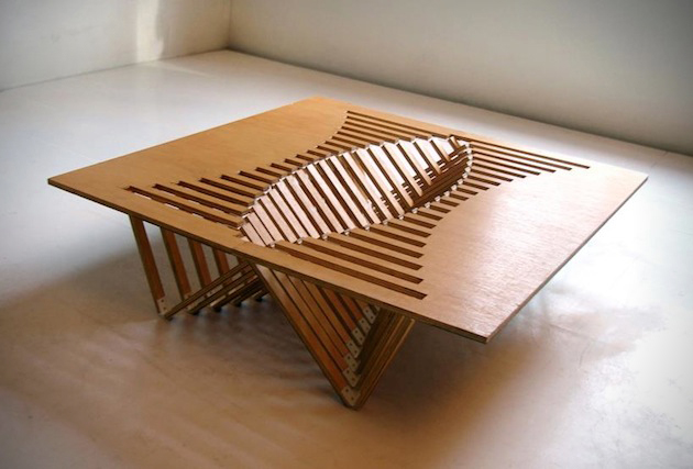
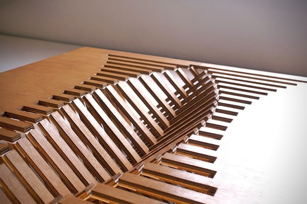
| 7:39a | Pop Up Coffee Table Design
|
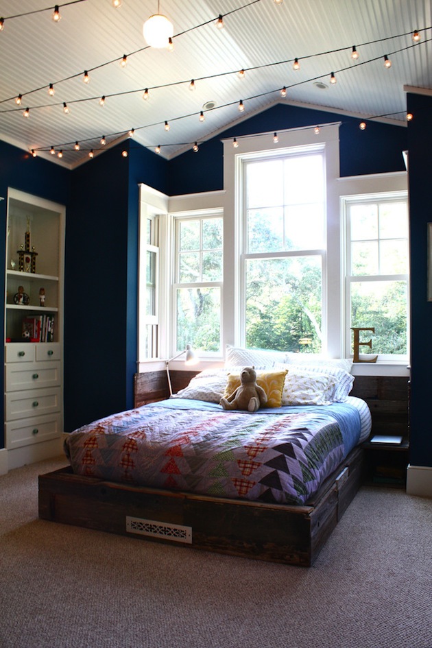
| 7:41a | Add String Lights For Budget Friendly Lighting Design
|
| 7:43a | Hulk! Heroins by Ian Reyes Specialties |
| 7:45a | Google Visual Assets Guidelines
|
| 7:48a | Natural Spectacle: A Rotating Supercell near Booker // Texas
It took four years but I finally got it. A rotating supercell. And not just a rotating supercell, but one with insane structure and amazing movement. I’ve been visiting the Central Plains since 2010. Clip: |
| 8:03a | Best of the week 83 We introduce our “top four”, which contains the best four articles of the week: Illustrations by Dragoslav Malinic, Pod dwelling, Bookmark by Vittorio Ciccarelli and Painting by Christina Nguyen. Via THEmag.it |
| 8:17a | Croma Design Projects These days, customers are increasingly demanding. They want a fast and efficient service. Croma Design makes the customer happy, by working towards the specific needs of each project. The founders Amy Kent and Ryan Martin coordinate a highly skilled network of suppliers, craftworkers, artists and manufacturers to achieve this standard of quality. Quality service and an immediate solution are the goals of Croma Design. With a team fully structured, motivated and passionate about the work they do, Croma Design provides a full-service for several kinds of projects. Attention to detail, efficiency and professional response are the primary thoughts within this company. They specialize in various services: Interior design, interior branding, space planning, design concept, furniture, artwork, finishes, textures are only some of the services that Croma Design provides. Croma also has a service for construction of luxury kitchens – Croma Express. Through this service, it seeks to create sophisticated and pleasant cuisines, with a totally different image from an ordinary kitchen, but with total functionality. The best part is that they are available for any budget! A company that is fully framed in the economy and consumer trends of today.
Source: Croma Desig |
| 8:29a | ROZALYNN WOODS INTERIOR DESIGN – California Project The California Contemporary by Rozalynn Woods Interior Design: “KTLA’s Gayle Anderson featured this Southern California contemporary home on her TV program. The choice to use simple and clean lines in the interior helps to soften the dramatic architecture. Ingenuity appears in all areas of the home from a custom backlit horizontal wood slat fireplace to the Master Bathroom’s opening to a small exterior garden.”
This Project from Rozalynn Woods Interior Design is located in Southern California. The main adjectives that come to our mind when we see the photos are style, chic and a minimal influence touch that gives the place a vibrant, fresh and clean ambience.
Do you feel the same way? What do you think about this project?
|
| 8:40a | Lego House in Billund, Denmark by Bjarke Ingels Group
The LEGO Group revealed the design of the experience center “The LEGO House”. The center, which will be built in Denmark, illustrates the systematic creativity of LEGO bricks and is expected to attract 250,000 visitors annually. The 7,600 square-meter building resembles “gigantic LEGO bricks” that are “combined and stacked in a creative way to create an imaginative experience both outside and inside.” Bjarke Ingles, founder of BIG stated: “It’s going to be looking at LEGO from all its different aspects—LEGO as an art form, its cultural impact. When we were doing the research for it , we realized, if you would consider it just an art museum, you would be able to fill it with so much user content of such a high quality… it is one of our great dreams at BIG that we are now able to design a building for and with the LEGO group. I owe a huge personal debt to the LEGO brick, and I can see in my nephews that its role in developing the child as a creative, thinking, imaginative human being becomes ever stronger in a world in which creativity and innovation are key elements in virtually all aspects of society.” See the video tour of the building >> |
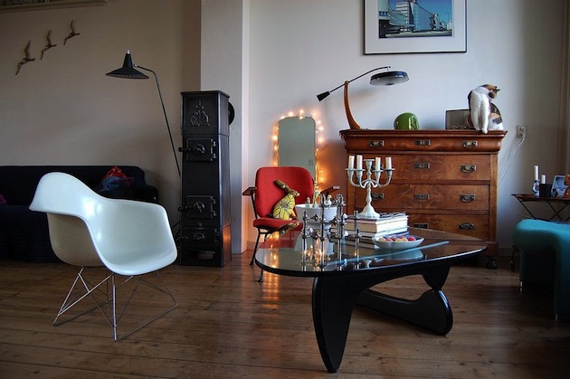
| 8:54a | The Aluminium Chair by Charles & Ray Eames
The Aluminium Chair is one of the greatest furniture designs of the twentieth century.
Originally designed for a private residence in the mid-1950s, this chair quickly reached a status of legend, making use of its innovative design and style. Charles and Ray Eames, the well know duo, abandoned the principle of the seat shell, instead stretching a panel of fabric or leather between two aluminium side members to creat an elastic and sleek seat. There are several versions of this classic mid-century design, making the Aluminium Chair Group, with a great focus on functionality, structure and ergonomics, resulting in a chair that adapts perfectly to the human body, conveying confort and beauty. The minimalistic and retro-futuristic style can fit any kind of interior and function, making it a great versatile solution. Read more…
This video shows parts of the production process, while highlighting the chair design, with a lot of details. It also includes some history about this iconic chair and shows how the human body adapts naturally to this seating
Video by Eames Demetrios – Vitra
Check out other great manufacturing examples: Boca do Lobo | Fendi
|
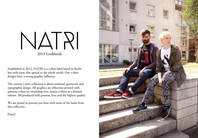
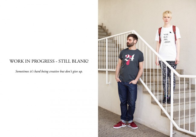
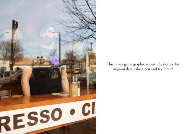
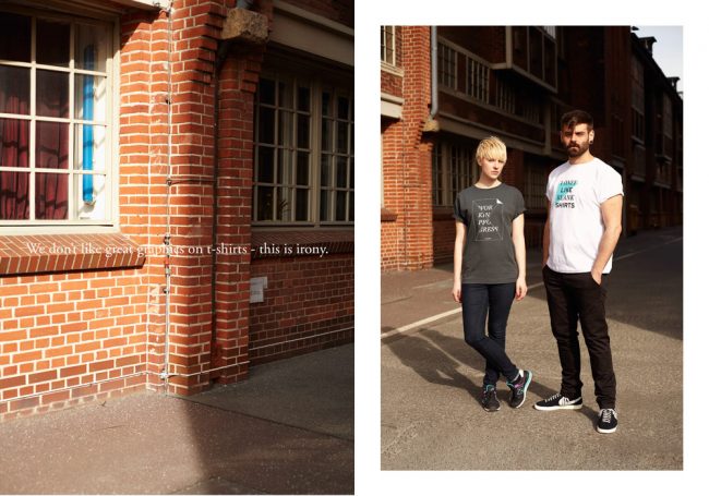
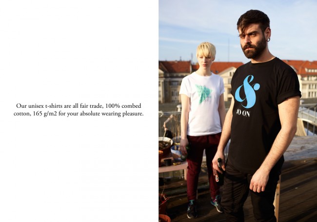
| 9:11a | NATRI – Lookbook 2013 – Unisex T-Shirt Collection
Established in 2012, NATRI is a t-shirt label based in Berlin but with roots that spread to the whole world. Our t-shirt designs have a strong graphic influence.The current t-shirt collection is about minimal, geometric and typographic design. All graphics are silkscreen printed with pantone colors on sweatshop-free, unisex t-shirts in a limited edition. All produced with passion, love and the highest quality. We are proud to present you here with some of the looks from this collection. For more NATRI t-shirts visit our shop – worldwide shipping: |
| 9:38a | Examples of Mobile Applications with Circular Vibe Today our collection is dedicated to mobile interfaces with expressed circular vibe that naturally add to UI smoothness, more usability and allure. Examples of Mobile Applications with Circular Vibe |
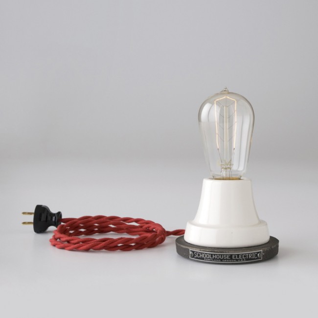
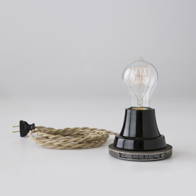
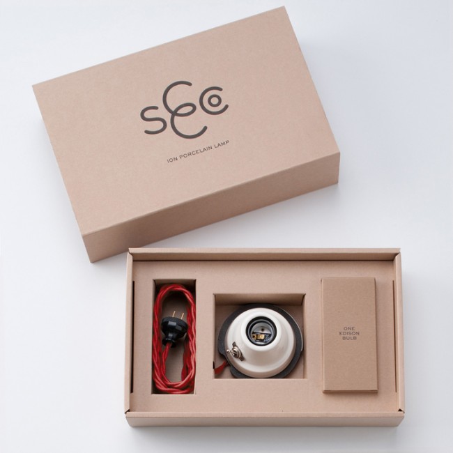
| 9:44a | Ion Lamp The Ion Lamp was inspired by designs Thomas Edison used to test the first light bulb. |
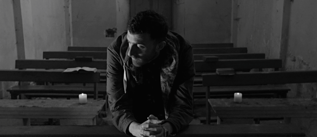
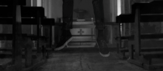
| 9:48a | Mecna – Nessun Altro (Official Video) A film by lab35 Films – www.lab35films.com
|
| 9:54a | Roadsidepictures. Illustrated Supermarket Signage Snapshots Serie of grocery store signage renderings. They are from around 1962…Continue Reading
|
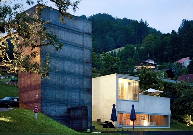
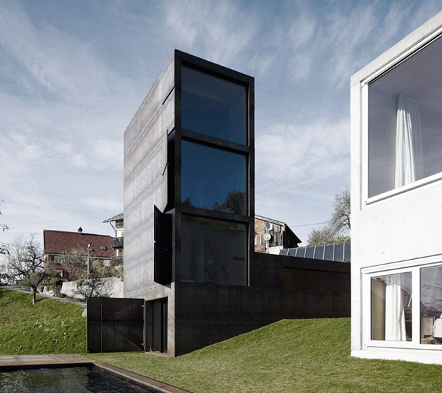
| 10:11a | Häuser Award 2013: The best family house Häuser Award 2013: The best family house >> Wohn-DesignTrend << your german blog for design, decoration and lifestyle
|
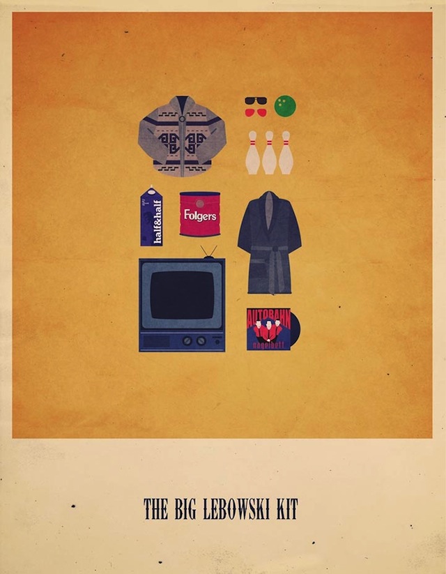
| 10:18a | Minimalist Movies Hipster Kits by Alizée Lafon
A tribute to the Seventh Art. Minimalist illustrations. If you have any suggestions of films or specific commands, please, do not hesitate to tell me!
|
| 10:31a | 8 Portfolio WordPress Themes That Use Flat UI Design In this article we have compiled 8 WordPress Themes that have been designed specifically for portfolio and blog use, oh and if you have not yet guessed, they will all feature beautiful flat design. For those of you that may be new to the web developing world, WordPress is primarily a website CMS (content management system) that opens the doors of owning and running a website to the masses, it can be used as a simple blog, a business website, an online shop, or in this case a portfolio. Themes allow you to customize the design and functionality of your website, and the WordPress system allows you to run it. If you want to learn more about WordPress I highly recommend WPbeginner as your go to source for everything WordPress. "Business Essentials was written from the ground up with the modern business in-mind. From the elegant, clean and easy to read text, to the various fully featured page templates including staff, careers, home, and case studies your site looks gorgeous on a big screen all the way down to mobile with it’s responsive design" INVIA has been built with Bootstrap 2.2.2 allowing its responsive qualities to be brilliantly slick and its cross compatability to be flawless. It comes retina ready with the a bunch of icons to choose from that are also retina ready. The author of the theme has also taken this one step further and included a $15 slider plugin to help utilize the themes inbuilt slider function. See 6 more WordPress Portfolio Themes Here |
| 10:35a | |
| 10:36a | What The Heck is Responsive Web Design and Why You Should Care? @medianovak
Whether you’re a beginner or a seasoned web professional, creating responsive designs can be confusing at first, mostly because of the radical change in thinking that’s required. As time goes on, responsive web design is drifting away from the pool of passing fads and rapidly entering the realm of standard practice. In fact, the magnitude of this paradigm shift feels as fundamental as the transition from table based layouts to CSS. Simply put, this is a very different way of designing websites and it represents the future. Follow the Link to Read the Whole Article!
|
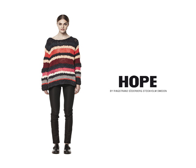
| 10:37a | Hope pre-autumn 2013 The pre-autumn 2013 collection by the Swedish label Hope. Via THEmag.it |
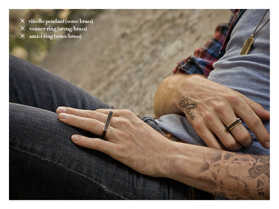
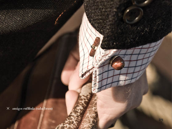
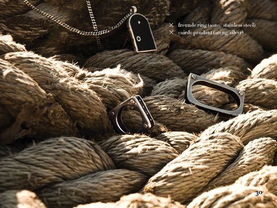
| 10:45a | Vitaly Design Jewelry
“We are the iPod generation. We love to make a statement, but have nothing to prove. We are the guy or girl at the party who you want to know, and we want to know you too. We dress well, but don’t show off. We are leaders. We are early adopters. We are creative and we are risk-takers. We are dancers, athletes, executives, musicians, pilots, stockbrokers, artists… we are the many faces of fashion.” Vitaly Design was born in the small village of Ubud, located in central Bali, Indonesia. Creator, Shane Vitaly Foran, decided to put his life on hold for three months to experience a needed change of pace and infusion of culture. He picked up and flew to South-East Asia. After six weeks of unplanned travel, he landed in Ubud and couldn’t leave. Shane stayed in this small haven for artists from around the globe for over three weeks – much longer than the two days he had planned.
At Vitaly Design, they use combinations of several materials including exotic woods, rose gold, ceramic and titanium and create all their pieces with their friends in mind.
See more and read an exclusive interview with the designer >> |
| 11:03a | People’s 10 most beautiful women of 2013 People Magazine has released its annual list of the 10 most beautiful women in Hollywood. Take a look at the stars who made the list. via Humor blog.
|
| 11:08a | Juxtapose, a collection of google map places and their glitches Google Maps is the world’s most widely used mapping service. It influences our perception and understanding of the world and its geography, and since the technology was introduced in 2005, has become a ubiquitous day-to-day tool. Modern life is now unthinkable without it. More Pictures and Information at LooksFeelsWorks! |
| 11:24a | Playboy Poolside by Tony Kelly
Playboy Poolside by Tony Kelly. Starring Tony Alva, Stevie Williams, Arto Saari, and Brandon Biebel.
|
| 11:34a | Free Fractal Brushes For Photoshop
|
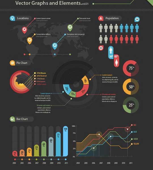
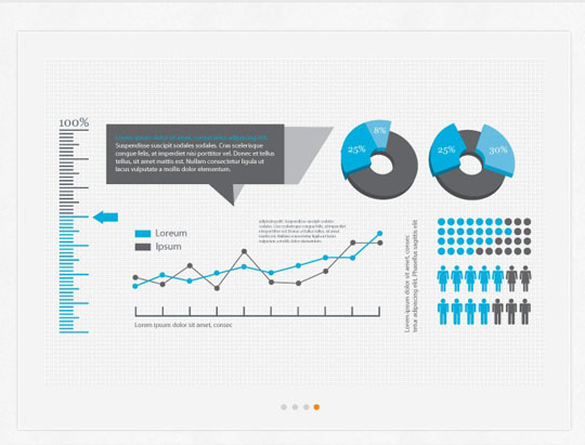
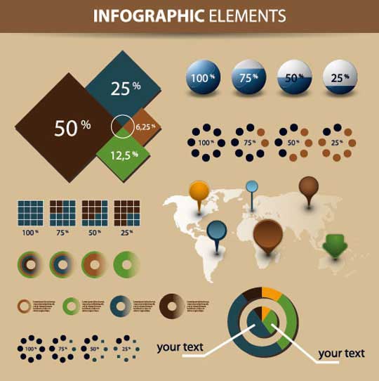
| 11:50a | 20 Free Infographic Vector Element Kits
|
| 11:56a | Illustrations by Nick Miles
Nick Miles is an illustrator based in Leamington Spa, UK. |
| 12:08p | Sound art and noisy hand dryers get equal hearing at BE OPEN’s Sounding Space Symposium at Chelsea C
The Portal is a state-of-the-art, ambisonic space, devised by BE OPEN, Arup and the London Design Festival. UAL students have had an opportunity to explore it in three quite different ways, with the results of their work being played in the Portal during the Symposium. Pieces ranged from fictional conversation, to the sounds of microphones being dragged along the floor, to rhythmic drumming and singing. ‘Sound as Measure’ led by Chelsea College of Art and Design, saw students experimenting with sound as an integral element of interior and spatial design. Central Saint Martins ‘Nomad Lab’ involved transdisciplinary, or nomadic work, across different artistic disciplines. ‘Sound, Place, Memory’, led by London College of Communication, involved workshops and themed talks with contributors drawn from the worlds of acoustic archaeology, sensory geography and anthropology, generating three student compositions and two artist compositions. Two students, Robbie Judkins and Sophie Mallett, teamed up to create an audiovisual installation that was shown at the Barbican’s Scream and Outrage Festival in May. Using contact microphones developed during the Sound Portal workshops, they turned surfaces, objects and spaces in London’s Heygate Estate into an urban orchestra, showing how unique approaches to scoring and instrumentation can offer new insights into familiar landscapes. This project illustrates the dual opportunity presented by the Sound Portal residency, which encouraged both artistic exploration and a deeper look at the impact of noise on our cities. This theme was picked up by the Keynote speakers, pioneering US sound artist, Bill Fontana and Dr John Levack Drever, Head of the Unit for Sound Practice Research, at Goldsmiths, University of London. While Fontana presented an uplifting selection of work made over the last 30 years, filling the auditorium with sound samples that ranged from an amplified cuckoo’s call to the sound of cars crossing San Francisco’s Golden Gate Bridge, Drever revealed details of his current area of research: the impact of noisy, high-speed hand dryers in public facilities. Research shows that young children, the elderly and anyone with sensitive or heightened hearing issues suffer significantly from this incipient form of sound pollution, yet complaints are currently going unheeded. Decibel levels can reach the equivalent of a DIY hand drill, which creates a real threat to hearing. Drever argued that these devices should be discontinued in favour of paper towels! Gennady Terebkov, Director of BE OPEN, spoke at the Symposium about BE OPEN’s commitment to supporting students and colleges: “Our collaboration with UAL has given us the opportunity to launch an extensive educational program called BE OPEN Inside the Academy, a way to support young creatives and schools through the development of a ranking system for creative institutes, a scheme to encourage multidisciplinary interaction and the BE OPEN Young Talent Award for emerging designers. BE OPEN and UAL share a common vision about supporting the next generation and we look forward to watching the students who have participated in the Sound Portal workshops becoming the great, creative minds of the future.” The BE OPEN Sound Portal program and Sounding Space Symposium bring the Foundation’s sensory year to a close and a new theme will be launched for 2013. This will be the interaction between the North, South, East and West in terms of culture and the different, creative approaches to dealing with critical urban issues of our time. Follow BE OPEN’s educational projects and the Foundation’s research into the five senses on social |
| 12:15p | New visions of black and white The brazilian fashion label a|GRANEL chooses the best inspirations to transform into a new scenery, to people that are looking for more than just clothing.
Young, clean and contemporary style, the clothes are timeless and they gain space at all hours of the day and in various occasions. a|GRANEL is the possibility to try something carefully selected. The new collection named Black&White brings us a new sensation about use of color. a|GRANEL featuring Stefaní Brunello by Hierofante
|
| 1:00p | Marvelous gardens in Keukenhof, Nederland.
marvelous gardens in Keukenhof, Nederland. This keukenhof otherwise known as “Garden of Europe”.More PICTURESCOLLECTIONS |
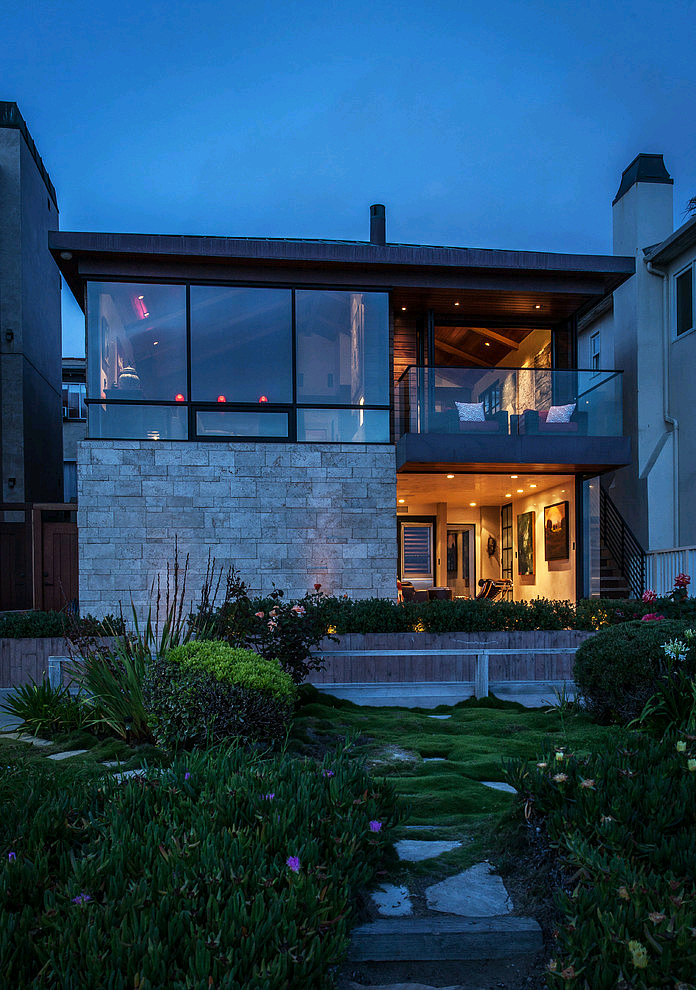
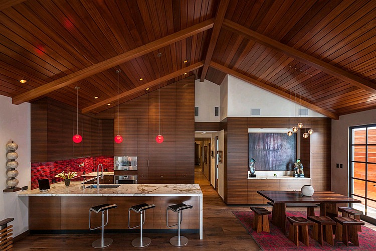
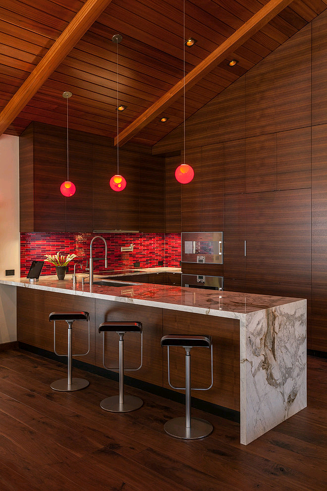
| 1:00p | Ocean Front Residence by Beach House Design & Development Beautiful ocean front residence designed by Beach House Design & Development situated in Manhattan Beach, California. |
| 1:02p | Must-See Digital Illustrations by Ken Barthelmey Collection of must-see digital illustrations by Ken Barthelmey. Enjoy! |
| 1:04p | Stunning Conceptual Art by Chase Stone Chase Stone has been working as a freelance illustrator and concept artist for several years. His work has been featured at the Society of Illustrators and in various publications such as 2dartist Magazine, Digital Masters, and Digital Painting Techniques. Stone now lives and works in NYC. Let’s take a look at the best from his portfolio. Enjoy! |
| 1:13p | Statik Selektah – Extended Play (Full Album Stream)
To make Extended Play, producer and DJ Statik Selektah put out the bat signal and more than 40 rappers turned up. They range from middle-aged, battle-scarred pros like Prodigy, Black Thought and Bun B (Raekwon calls them “the vets in the sweats”) to the next wave, like Flatbush Zombies, Troy Ave and Pro Era (Statik is also the group’s DJ). They showed because Statik is something special — he makes functional, real-deal records that sound like the triumphant persistence of New York, the strains of nostalgia in a sunny day, parents telling their kids to quit running around and be easy. Click here for full album stream |
| 1:14p | Kotryna Vaitekunaite jewels Kotryna Vaitekunaite’s impressive jewels are inspired by animal horns. Via THEmag.it |
| 1:21p | 404, Sorry, The Page You Requested Was Not Found Last week, we went through some latest website designs and stumbled how designers are working with the customized 404 error page designs. We collected around 21 examples and showcasing them here. The user experience can be improved by configuring custom 404 page.
|
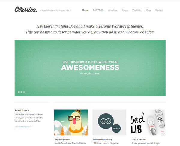
| 1:21p | Best Minimal WordPress Themes For Professionals An attractive and responsive collection of best minimal wordpress themes for 2013. Today almost every business and website want to have clean and simple design which would please to their readers and to their customers. I am not saying that themes with graphics and lots of icons doesn’t look good, but their really lack readability. Their structure and catchy colors doesn’t allow your readers to focus on content and that’s the reason why you see less conversion rate. For example you can visit my blog and you will find that I have used all those colors which please to your eyeball and doesn’t strike hard. Actually my blog’s design is not completely minimal, but yes I have tried to keep my content block as simple as possible. Ok lots of bluff, lets check out few of the best minimal wordpress themes below. I have tired to collect and present you only best themes. They all are responsive, easy to use, have user friendly design and comes with tons of powerful features. You can visit to my website for more such lists. Classica Minimal WordPress Theme
Its a minimal portfolio themes with also comes with lots of page templates. Thus it allows you to use it for personal blogging purpose. It personally like its full width homepage slider which really look too good. Furthermore it has lots of custom widgets and powerful shortcodes to help you beautify your posts. Written Theme
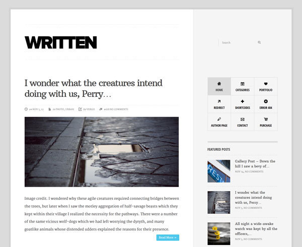
Written is one another clean theme for bloggers. It has very simple yet powerful structure. Personally I like its sidebar and specially its widgets. It comes with lots of custom widgets which help you to make your blog more attractive and sticky. Furthermore its SEO friendly and so you really don’t need to worry about onpage SEO. This allows you to focus completely on your contents and on your readers. |
| 1:27p | Fireball Tim’s Wacky Rides Monday ARIZONA FINAL SKETCH… As it’s Tuesday, here’s the final sketch for yesterday’s episode in all its Arizonian glory. Ringtails on a Cactus Hot Rod carving by the Grand Canyon. Cool. If you haven’t seen EPISODE 3 yet, check it out here on my YouTube Channel. Don’t forget to SUBSCRIBE so you can see the episodes every Monday! |
| 1:31p |
| << Previous Day |
2013/06/11 [Calendar] |
Next Day >> |


